

The FirstSpirit operating concept
| Table of contents |
The various FirstSpirit control elements are presented on this page. The concept behind them applies for both ContentCreator and SiteArchitect; however, the function and appearance may vary.
- Input elements (smallest control element)
- Sections (grouping of multiple input elements)
- Pages (presentation of sections and own input elements as website)
- Content that can be re-used (datasets)
- Structure (folders and stores)
The option to control elements
- via icons on framed control elements and
- via drag-and-drop is also described.
Input elements
“Input elements” are the most important and the smallest control element in ContentCreator. They are used to put content such as text, images, etc. onto a website. There is normally a special input element type for each content type and each application case.
Application / target | Example of a used input element |
|---|---|
Entering text on a website | |
Additionally formating and linking text in a manner similar to word processing programs | |
Adding tables | |
Uploading images and files in a system and/or placing them on a website | |
Incorporating links to other websites | |
Specifying the layout and design of a page | Various input elements |
Depending on the function, these input elements will be text fields, selection lists and dialogs, etc. How text entered in text fields by editors, images selected by editors, etc., is displayed on the website later on (the color of the text entered, for example, where the text or an image appears on the website, etc., etc.) depends on the project developer's specifications.
Input elements for a type can be configured differently depending on the project requirements. This means input elements for a type, such as the rich text editor, can vary in appearance and function. Normally, however, the input elements used should be self-explanatory and/or be provided with an informative title and tool tip by the project developer.
A list of the most important input elements can be found in the Input elements chapter.
Special case "Unknown input elements": During the life cycle of a project, input elements may no longer exist for various reasons. Unknown input elements are marked in ContentCreator with the following note:
There is no component registered as (...)
This misconfiguration must be corrected by a FirstSpirit template developer. For further information, see Template development / Forms (→FirstSpirit Online Documentation).
Sections
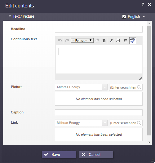
Example of an input form for a section
In FirstSpirit, many “input elements” are frequently condensed into what are known as “sections” (or more generally: “(input) forms”). This provides a way of creating simple, logical units on a website.
(A section in FirstSpirit is not always equivalent to a “typographical” paragraph.)
A conceivable and frequently used unit (i.e., a section) can contain the following, for instance
- A header,
- Continuous text,
- An optional image,
- A caption and
- A link to a secondary page
sample projects.
The input elements necessary for this could be selected as follows (see also the figure):
- Input element for single-line text
- Rich text editor
- Input element for internal references
- Input element for single-line text
- Input element for internal references
In contrast, other section types can contain other combinations of input elements or even just one input element. The composition always depends on the project developer's specifications. The input elements can be listed one under the other or, for a better overview, summarized in groups. Division into various groups represents what is known as grouping.
These section types are defined in FirstSpirit by the template developer using what are known as templates. The editor can then select the desired template from those available when creating a section.
Pages
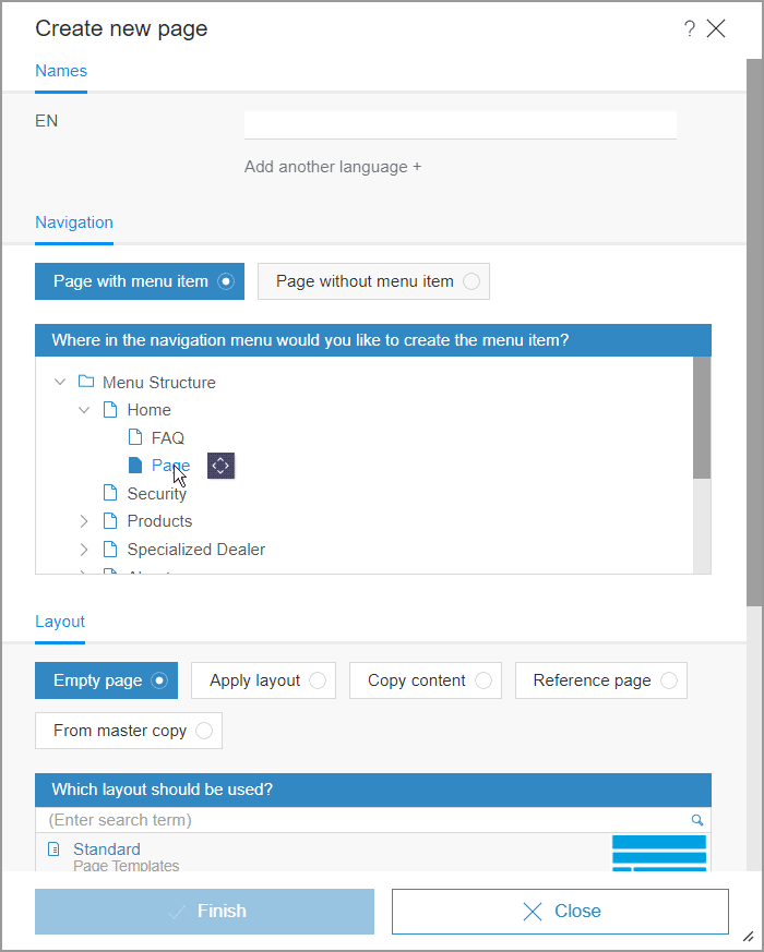
Dialog for creating a page
A ContentCreator page always corresponds to a page on the website. This allows the editor to see at all times directly in ContentCreator which pages have which content on the website and how the content is displayed.
For this purpose, a ContentCreator page normally contains one or more sections where the website content is collected and managed. Sections can never exist by themselves; they always require a page. New pages can only be created using the corresponding function in the New menu (menu entry Create new page) or with drag-and-drop.
In addition to sections, a page can also have its own input elements (all input elements displayed at page level in the editing window, also referred to as an “input form”) where information can be collected. These elements need to be available on every page of a page type, e.g., a page title to display in the browser, the company logo, a footer with copyright and last changed information, navigation, etc. The usable input elements are the same as those for sections. In many cases, however, such content can be output automatically with the help of FirstSpirit by using project developer specifications so that the editor does not have to worry about this information.
This content can be edited on the preview page using the  icon. In contrast to sections, there are no other editing options for page content (also referred to as “page level”).
For information about how to create pages see page Create new page, for information about how to move pages in the navigation and to rename menu items, see page Navigation. For information how to edit input elements on a page, see the Input elements chapter.
Tip
To make collaboration easier, the address can be copied from the browser address bar to share a page (“deep link”). Users can open the desired page directly by pasting this address into their browser address bar - presupposed they have appropriate permissions in the project concerned.
Reusable content
Aside from the sections, where content is primarily maintained on the website, FirstSpirit offers yet another important option for maintaining content. These are known as datasets.
This content type is used frequently for content that is well-structured and can be recorded and displayed in tables.
Examples:
- Press releases, which frequently contain the following information:
publication date | validity period | heading | subheading | teaser | continuous text | image | caption - Contact lists containing the following information:
title | first name | last name | telephone number | e-mail address | street | city | country | image - Product catalog containing the following information:
product name | product description | image | category | dimensions | weight
In addition, the relationship between multiple dataset types can be established. For instance, someone from the contact list could be selected for reference in a press release, or as the contact person for a product, or as the author of an entry. All or some of the persons selected as contacts could then be output for a press release automatically and would not have to be entered in multiple places in FirstSpirit.
In FirstSpirit, content of this type that is managed in these datasets can be:
- output in a flexible way.
For instance, press releases can be output automatically sorted by date without the editor having to worry about sorting. Furthermore, a number of datasets specified by the project developer (of the same type) can appear on one page. If more datasets become available they are automatically spread over multiple pages. A browsing function (e.g., “Back” | “Forward”) can be used to switch between pages.
This also means that the editor cannot always affect the location of content; instead, it is specified by the project developer - (re)used in multiple locations.
This means that if a dataset is changed on one page, the change applies on other pages as well.
These reuses can be displayed in the edit window of the relevant dataset and in the References report. - be maintained, like sections, in multiple input elements.
This allows the content to be structured for the first time. The input elements that are used are the same as those for sections - drawn from external databases.
This means that data that has been collected in other systems can be reused in FirstSpirit easily. - even just selected and not edited.
This means that datasets from external systems (and other data) can be protected against undesired modifications
See also the Working with Datasets page.
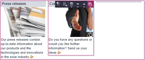
Highlighting and icons
A section in a preview page
The project settings determine where on a page content can be entered or edited.
When the mouse pointer is hovered over an area of the page that can be edited, this area is framed and corresponding icons are shown.
Consolidated icon bars
If two areas are nested within each other, two frames are shown as soon as the mouse pointer is hovered over the inner area. The corresponding icons are grouped together in an icon bar. A popup menu is then used to select the area for which the action is to be performed.
If a section already exists on the page, the icons available there can be used. Otherwise, there are project-dependent options, such as an icon or a button on the page: 
If the settings have been configured accordingly by the template developer, these icons / buttons also enable creation via drag-and-drop.
Structuring, content types and color symbolism
Since quite a lot of content is usually entered and managed in FirstSpirit, what are known as folders are used in many locations to structure content and improve retrieval similar to well-known file management programs such as Microsoft Windows Explorer. Folders also enable highly granular assignment of permissions to specific content. These folders can have as many subfolders as desired. Due to these subfolders, the paths are displayed in some locations.
Folders are symbolized by this icon: 
In ContentCreator, for example, folders can be created as needed for the purpose of structuring media when media are uploaded. In FirstSpirit SiteArchitect, other types of folder can also be created (for pages, for example).
Aside from folders, content in FirstSpirit is managed separately based on content types such as media, pages, and datasets. There is a "store" for each content type. Stores can be selected as filters in the Reference selection (FS_REFERENCE) input element, for example:
- Menu structure: The structure of the pages and navigation is managed here. Folders usually represent the menu items for the site. See also Creating pages. Store color:

- Media: All of the media that is to be used on the site (images, PDF files, video files, audio files, etc.) are managed here. See also Creating new media and Media Management.
Store color:
- Data sources: Content that can be reused is managed here.
Datasets with the same structure, i.e., the same input elements, are usually combined in what is known as a “data source”.
A contact list in which the contact data for the employees of a company is recorded and saved is an example of a data source. Then, for each dataset in this contact data source, the title, first name, last name, telephone number, e-mail address, street, house number, city, country, and an image can each be saved in a corresponding input element. Store color:
In addition, FirstSpirit offers even more stores, but they are less relevant to working with ContentCreator.
The system specifies in which store which content type is created. Therefore, in some cases, a default selection by store can occur when selecting content (e.g., for internal links).
Using drag-and-drop
Drag-and-drop (moving or copying elements by clicking and dragging with the mouse pointer) is an intuitive and time-saving control option which can be used in many locations in ContentCreator. Of course, whether an element can be moved to a specific location with drag-and-drop always depends on the permissions of the user concerned and possibly on the restrictions or configurations that have been predefined by the template developer. Locations where the corresponding object may be inserted are highlighted in color, e.g.,
Report elements
Pages, datasets, and media can be moved to compatible input elements in the edit window, to compatible buttons or icons or directly to compatible areas of the page with drag-and-drop. See also the search report page along with input elements
- for reference selection
- for link input
- for dataset selection
- for Catalog lists
- for Index lists and
- project-specific buttons
(depending on the settings made by the developer, these may differ in terms of their appearance and functions and be displayed directly in editing dialogs or on the preview page)
Media
Media from the workstation PC can be moved to the input element for reference selection and Link-sensitive images (Imagemap) in the edit window or directly to compatible areas of the page with drag-and-drop.
Furthermore, images can also be uploaded from other browser windows/tabs via drag-and-drop into the dialogs or into the preview.
Text
Text from word processing programs such as Word, from Internet pages, from a corresponding report, etc. can be moved to the following input element types with drag-and-drop:
Creating sections, datasets, list entries, or pages
Depending on the project configuration, sections, datasets, list entries (see input elements catalog, and index) and pages can also be created by dragging and dropping elements. FirstSpirit elements such as
- Sections
- Media
- Pages
- Datasets
can be taken from the report area or
- Text
can be dragged from word processing programs such as Word, from Internet pages, etc., to what is known as a drop zone (the “Create section” (), button, for example).
Color highlighting is applied to indicate where the element can be dropped.
Sections, datasets, and list entries are usually created as soon as the mouse button is released. Data such as text, images, etc., can be entered subsequently ( icon) and any placeholder information stipulated by the project developer can be adapted as necessary. If a section or a section master copy has been selected, a copy of the dropped section is created in the last location. If a medium, a page, a dataset, or a text has been selected, they will automatically be included in a suitable input element (assuming that the project developer has configured the project accordingly).
If several section templates are available for selection (i.e., there is a choice of different layouts), a selection list opens so that you can select the required template and then enter the content in the usual manner. In the same way as before, any media, datasets, pages, or text that you drop into the drop zone will automatically be included in a suitable input element (assuming that the project developer has configured the project accordingly). The content of the edit window can be edited as required and then saved in the usual manner.
If the new section, dataset, or list entry contains mandatory fields that have to be completed by the editor, an edit window containing the available input elements opens when the mouse button is released.
For pages: When the mouse button is released, the the dialog for creating a new page opens. When you click “Finish”, the default setting leads to the creation of a new page at the required position within the navigation system that has the same name and content as the dropped page. If necessary, you can change the settings for the new page in this dialog or after it has been created.
Edit navigation / structure
Depending on the project configuration, menu items or pages can be created not only via dialog or moved within the navigation view but also directly in the preview with drag-and-drop. See the Navigation page.
Create links
Depending on the project configuration, links can be generated by moving elements to the rich text editor with drag-and-drop. FirstSpirit elements such as
- Pages
- Media
- Datasets
(e.g., from search results in the report area) or
- Text
can be dragged from word processing programs such as Word, from a browser address line, etc., to text that has already been entered in the rich text editor.
Color highlighting shows which word the link will be assigned to once the text has been dropped. In many cases, a corresponding link is created directly based on the dropped element type (page, medium, or dataset). If more than one exist, the link input types that are available are displayed when the text is dropped in the rich text editor. For example, when an image is dropped, a link input type for images (“image link”) or for pages (“free text link (internal)”) could be selected.
See also Rich-Text-Editor.