

Selection dialog
| Table of contents |
A selection dialog is used at every point in the project where elements can be selected.
In this context, the elements could be images, files or other pages and sections from the project. In the world of FirstSpirit, these are often called “references” as well. This means, for instance, that if an image is selected, instead of it being added to the specified page directly, a link to the corresponding graphics file that was uploaded to the project previously (e.g., using the Media menu) is added.
Likewise, there are references to other element types in FirstSpirit such as pages, sections, or datasets.
Search field
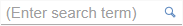 The selection dialog can normally be used wherever the search field shown here is displayed (see, for example, reference selection input element, internal links in the rich text editor, etc.).
Initial compatible elements (elements which are compatible with the corresponding input element and/or the template developer's configuration) are displayed as soon as you click in the search field. Most of the elements displayed will have been created or edited recently.
The full name or part of the name of the required reference can also be entered in the search field. This automatically reduces the list of elements to the possible results.
The number of results which are displayed is limited by the system.
Clicking on the magnifying glass opens the selection dialog where the search can be limited to the storage location, editing time frame and current user.
Selection dialog

The selection dialog itself is laid out so that all elements that are available for selection are listed on the right-hand side. Elements recently created or edited by the current editor usually appear at the top of this list.
The number of results which are displayed is limited by the system.
For more information about how results are displayed, see also the introduction to the section about the report area.
Make selection: Click once to select the desired element. The selection dialog closes again.
Limit elements: Different options are available in the left area of the dialog for limiting the number of elements available for selection:

By default, the selection dialog always opens with the results displayed in list format. However, it is also possible to limit the permissible elements of a reference selection to images. In this case, the selection dialog opens automatically with a preview.
Search request
Names or parts of names for the element being searched for can be entered in this field. Terms that have been entered in the edit window's search field are used here as well.
The search functions the same way as the search in the report area.
The search is restarted by clicking on the magnifying glass.
 Click this icon to display the search hits in list format.
 Click this icon to display the search hits in preview format.
Search in

The specified element can be selected via the folder and store structure of a project here.
In the case of datasets, a dataset type can be selected.
 Click this icon to display the available folders.
 Click this icon to display all of the folders below the current level. This can be used to navigate to the desired folder level.
In the area on the right, only the elements below the selected folder level are now still visible. A folder level is selected by clicking on that level.
 Click on a line with this icon to switch the focus to the next level up.
 The selected level is indicated by this icon.
Modified

The elements available for selection can be limited chronologically by using this filter function:
- No filter: All of the elements that meet the search criteria are displayed. This is the default setting.
- Modified, last week: Elements that were created or modified within the last 7 days are displayed
- Modified, last month: Elements that were created or modified within the last 30 days are displayed
By me
 If this check box is enabled, only elements that the logged in user created or edited are displayed.
Cancel
A “Cancel” button is available on the bottom left. It is used to close the element selection dialog without making a selection.