

Input elements
In ContentCreator a selection of input elements (as well known as “input components”) are available, which can be used for being able to put and manage different types of content on the website.
The designations selected below are fundamentally guided by what kind of data can be entered into the respective input element. However, the FirstSpirit designation for the input element, under which the template developer is known, is also specified for each.
The input elements can roughly be divided into the following groups based on functionality:
Functionality | Input element |
|---|---|
Entering text and tables | Single-line text |
Multi-line text | |
Rich text editor | |
Rich text editor for tables | |
Selecting internal and external references | Reference selection |
Link input | |
Catalog list | |
Link-sensitive image | |
Managing multiple sections in a list | Catalog list |
Overview of the sections of a page | |
Creating and selecting datasets | Dataset selection |
Index | |
Entering numbers and date specifications | Numbers |
Date | |
Entering or selecting values and states | Check box |
Combo box | |
Multiple Selection List | |
Radio button | |
Toggle | |
The layout and function of individual input element can vary slightly depending on the template developer's specifications:
Functions
In addition to other options, the template developer has the following configuration options available with respect to functionality:
- Limitations: The selection and entry into individual input elements can be specified by the template developer. This way, for instance, selecting/referencing images from just one specific folder or entering text up to a specific number of characters can be possible, etc. Some input elements are also used only for displaying information; values that already exist then cannot be modified.
- Mandatory input fields: Mandatory input fields are marked with a border and in color and a note such as “This field cannot be left empty” is displayed. These kinds of fields have to be filled out, otherwise it is not possible to save the content.
- Default values: The template developer can define what are known as “default values” for input elements, such as the standard text in an input element for text. This is already present when a new section, page or dataset is created with this type of input element. It can be overwritten by separate text. If the text specified by the template developer is not overwritten, it is possibly used in the preview and later on the published website. For general information please see Template development / Forms / Default values (→FirstSpirit Online Documentation), for information about restrictions and differences of this function in SiteArchitect please see Template development / ContentCreator / Restrictions (→FirstSpirit Online Documentation).
- Further functions: The template developer has many options to influence the input elements and the entered values if necessary and thus to guide the editorial care. Entries can be checked for plausibility, modified automatically or input elements can be displayed or hidden, depending on the input in other input element. Furthermore, correction notes can be shown. See page Rule violations.
Likewise, the way the input or referenced content is later output on the website depends heavily on the template developer's specifications.
Special case "Unknown input elements": During the life cycle of a project, input elements may no longer exist for various reasons. Unknown input elements are marked in ContentCreator with the following note:
There is no component registered as (...)
This misconfiguration must be corrected by a FirstSpirit template developer. For further information, see Template development / Forms (→FirstSpirit Online Documentation).
Layout
To better identify (thematically) related input elements, they can be displayed on individual tabs:
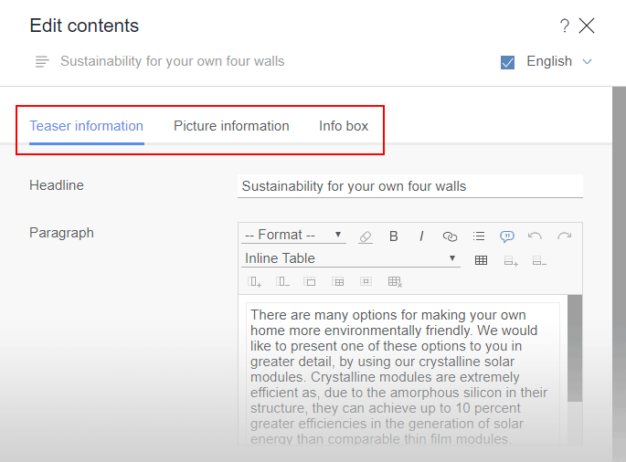
Section with groupings