

Combo box (CMS_INPUT_COMBOBOX)
Using a combo box, the user can:
- Select exactly one value from a group of values
- Leave the selection empty.
Depending on the configuration, the user can enter a separate value as well.
 |
In contrast, for instance, selecting multiple values is possible by using the check box input element. |
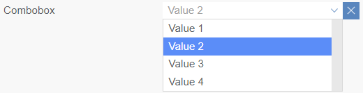
Example of a combo box:
Selection from the list can be carried by means of the mouse pointer, per arrow keys and Enter or (depending on the specific project configuration) by means of another input element of the same form.
 Remove: Clicking on this icon removes the entered value from the input element.
This input element is described in more detail under Template development / Forms / Input components / COMBOBOX (→FirstSpirit Online Documentation).