

Link-sensitive image (CMS_INPUT_IMAGEMAP)
This input element can be used to embed links at various locations in a selected background image.
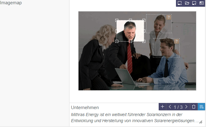
Example of a link-sensitive image (imagemap):
Start by selecting an image (icons  or
or  ).
).
A border (Icon  or per click on the selected image) on which a link can subsequently be embedded (using the field below the selected image) is created for each link-sensitive area.
 Use the adjustment handle in the bottom right-hand corner to continuously adjust the height of the selected image. This makes it easier to accurately position the link border.
 This icon in the preview shows, when the user hovers the mouse over the image and if the template developer has configured this setting accordingly, that this image is an imagemap. Click on the icon to open a window in which the imagemap can be edited.
The image, with the available areas and links, is displayed at the top of the form.
Inactive borders: Display where on the image there are borders.
Active (selected) border: If a border is selected (with the mouse pointer or browsing function), if the template developer has configured this setting accordingly, existing information about the link (e.g., link target, preview image) is displayed at the bottom. The border can be moved with the mouse and its size can be changed with the adjustment handles along the sides and in the corners.
 This icon shows that border types that are not supported (circle or polygon, which can be created with the FirstSpirit SiteArchitect) are in use. If information about the link is available, it is displayed at the bottom. The border cannot be edited (moved, its size changed) but the link can.
Click on this icon to upload a medium to the Media Management (depending on the configuration settings made by the project developer). The Upload new medium dialog opens in which the required medium can be selected. The new medium is then selected directly as a background image.
Click on this icon to select an existing image from the project. If an image has been selected upstream of this operation, it will be deleted.
The background image can also be uploaded and / or selected using drag-and-drop. The image can either be dragged onto the input form or dropped directly onto the section, e.g.,
- from the reports area
- from the file system on the workstation computer
- from another browser window / tab (if the delivering server allows cross-origin requests)
 Click on this icon to remove the image including any borders and links that might exist.
 Click on this icon to select the size (resolution) in which the background image is to be used. The selected size also affects the size in which the image is displayed in the edit window. It is for the developer to decide the actual size in which the image will ultimately be displayed on the website.
If an image has already been selected, the selected resolution is highlighted in the list.
The original resolution is used by default. If the resolution is changed subsequently, borders that have already been created might no longer be compatible and will have to be adapted manually to the new image size.
If the icon is grayed out, a resolution predefined by the template developer is being used.
If the template developer has configured this setting accordingly, existing information about the link of the active border (e.g., link target, preview image) is displayed at the bottom.
Click in this field to edit the link.
 This icon indicates that a link has not been entered for a border.
Click on this icon to generate an area in the shape of a rectangle on the background image. The size and position of the rectangle can subsequently be adapted manually.
If the template developer has configured this setting accordingly, a border (together with its link) can alternatively be generated using drag-and-drop to move elements (a page from the search, for example) to the background image.
 This icon shows how many borders there are on the current image. Use the arrow icons to move from border to border.
The borders can also be controlled directly with the mouse pointer.
 Click on this icon to remove the active border along with its current link.
 Click on this icon to open another window in which information about the link can be entered (e.g., link target; see also Input elements Link input (CMS_INPUT_LINK) or Reference selection (FS_REFERENCE)).
Alternatively, you can click in the field or double-click the border. If the template developer has configured this setting accordingly, it is also possible to use drag-and-drop to move an element (a page from the search, for example) to the frame.
This input element is described in more detail under Template development / Forms / Input components / IMAGEMAP (→FirstSpirit Online Documentation).