

Multiple selection list (CMS_INPUT_LIST)
This input field provides an option for selecting values that have been set by the project developer. The user cannot enter content directly.
Using a multiple selection list, it is possible to:
- Make more (or fewer) than one selection at the same time
- Leave the selection empty.
 |
On the other hand, selecting exactly one value, for instance, is possible using a radio button or toggle input element. |
Example of a multiple selection list:
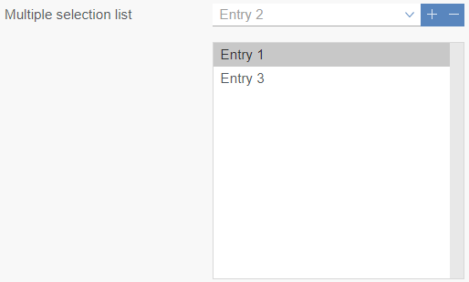
 The values / entries provided by the input field can be displayed in the selection list (at the top) using this icon.
 Add entry: Use this icon to add the entry which is marked at the moment in the selection list (at the top) to the list (at the bottom).
As an alternative, entries can, depending on the specific project configuration, also be selected by means of other input elements of the form.
 Remove entry: Use this icon to remove the entry which is marked in the list (at the bottom) at the moment.
As an alternative, entries can, depending on the specific project configuration, also be removed by means of other input elements of the form.
This input element is described in more detail under Multiple-selection list box (FirstSpirit Online Documentation) in the Template development / Forms / Input components area.