

Index lists (FS_INDEX)
This input element is used to reference lists from any data object source that has been made available. External components and modules can be integrated and the input component can be made available. This data can be selected, i.e., referenced, with FS_INDEX. Both function and appearance are highly dependent on the individual implementation of the module.
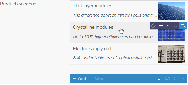
Example of a list with Datasets:
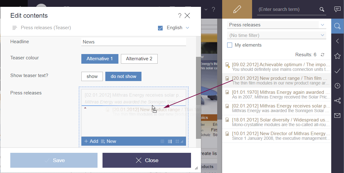
 The “Add” button opens a dialog in which an element from the included data source can be selected.
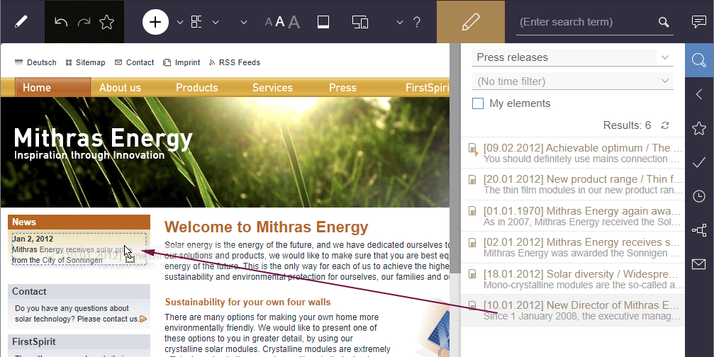
In addition, entries can be added by dragging and dropping compatible elements from the report area (Search, Bookmarks etc.) into the input element when it is opened in the dialog.
Adding a new entry (report area => editing dialog)
Existing entries within the editing dialog may also be replaced with other compatible data from reports: A colored marker  or
or  /
/  indicates whether the data would replace an existing entry if dropped or be added as a new entry.
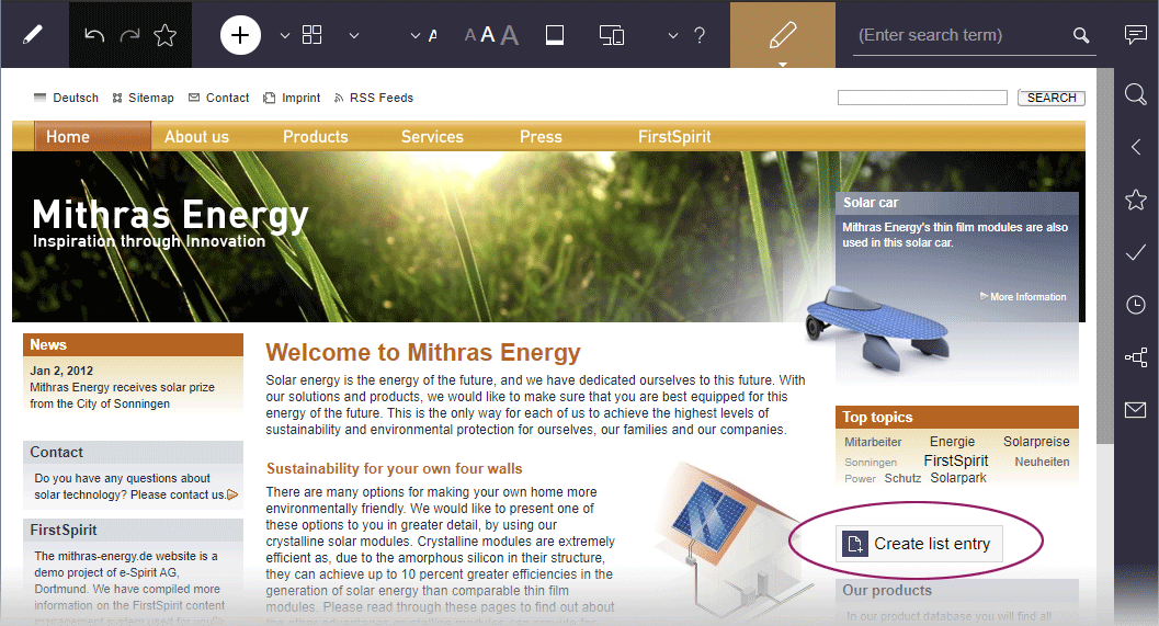
Adding a new entry (report area => preview)
Adding new entries to index components is also possible by dragging a compatible dataset from a report (e.g. Search, Bookmarks, etc.) or data from a custom report implementation into the preview area (assuming the project has been configured accordingly by the project developer). Locations where the corresponding object may be inserted are highlighted in color.
 The “New” button can be used to create a new dataset and add it to the list. A details view for editing the new dataset opens.
Creating a new dataset from the preview
New datasets can be created directly from the preview (assuming the project has been configured accordingly by the project developer) without the need to open the edit dialog for the catalog list first. For this purpose, the project developer provides a corresponding button, an icon, or a text link on the preview page itself. One click or dragging & dropping opens the edit dialog which can be used to enter and save the content of the input element.
Depending on the project configuration, images can also be dragged and dropped (e.g. from a report or from the local workstation) into the open editing window, for example to create or maintain an image gallery.
 Use these icons to switch between the display options Title, Details, Symbols and Grid.
Other functions are supported for the elements in a catalog. They can be executed using the corresponding icon:
 Move: Using this icon, an element can be moved to another position within the list.
 Remove: This icon removes the corresponding entry from the list.
 Move down: The corresponding entry is shifted one position downward.
 Move up: The corresponding entry is shifted one position upward.
 Edit: With this icon, it is possible to change the data of the corresponding entry. It opens the entry to the corresponding editing dialog, in which the data can be adapted as desired.
Access control
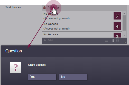
Access to the data in this input element can be protected.
If access to the data in this input form is protected, the content of entries selected previously will not be displayed initially. When clicking on “Add”, the program checks to see if access is permitted. Following confirmation, the content is displayed and new entries can be selected (by clicking on “Add”). If access is not permitted, the content remains hidden and no new entries can be selected.
This input element is described in more detail under Template development / Forms / Input components / INDEX (→FirstSpirit Online Documentation).