

Navigation
| Table of contents |
The Navigation and Page areas have the following functions:
- Navigation: Shows the structure of the site
- Page: Contains detailed information about the page that is currently selected
The width of the column can be increased or decreased individually.
The tree view can be closed again by clicking on the icon for a second time.
Language selection
The language that is currently selected is shown next to the  icon (for more information about the use of languages, see also Use of multiple languages).
The user can click here to select a different language from the list. The preview will then change to the selected language.
Depending on the setting in the Visible languages menu, less relevant languages can be accessed via the “More languages” submenu.
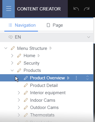
Navigation
The “Navigation” area maps the structure of the site clearly and hierarchically in a tree structure – as will be familiar from the way that operating systems organize file management. The Navigation area not only provides an overview of the structure, including state information and properties relating to the various elements, but also allows users to navigate directly to the required page. In this view, only elements for which the current user has the appropriate permissions are displayed.
The content of the selected page is displayed in the preview.
The element that is currently selected and is being displayed in the preview has a colored background in the tree.
If the preview or reports are used for navigation, the tree is expanded up to the element currently being displayed in the preview.
Simple editing options are provided in a context menu; the order of navigation items can be changed intuitively via drag-and-drop (dragger  ).
).
 |
The tree structure maps the hierarchy of the whole project. Depending on how the project has been configured by the project developer, some of the elements may not have any “readable” content or any content at all and should not be edited by editors. |
Structure / Element types
The following element types are displayed in the tree:
- Menu item (
 )
)
Every menu item in the tree corresponds to a menu item in the site navigation.
When a menu item is selected in the tree, the content of the relevant page is displayed in the preview and the selection in the tree automatically switches to this page. - Page (
 )
)
These are concrete (web)pages whose content can be shown in the preview. - Start node (
 )
)
In some cases, a menu item may comprise multiple pages. The start node indicates the page that is displayed in the preview when the user navigates to the menu level.
Menu items may also be identified as “start nodes”.
Sections are shown on the Page tab.
Visualizations
- Editing state (
 ,
, ,
,  )
)
The highlighted element has not been released, has been released in the currently selected editorial language but not in at least one other editorial language or is currently located in a workflow.
For more information, see also Element status and Workflows.
|
Differences in the element status of individual elements across different editorial languages are only possible when using the beta feature Language-Dependent Release. |
- Metadata set (
 )
)
This icon indicates elements for which metadata has been set.
For more information, see also Editing contents – Metadata. - Hidden in navigation menu (
 )
)
This menu item is not visible in the selected language.
It can be made visible again for the respective language using the context menu function Show in navigation menu. - Hidden in sitemap (
 )
)
This menu item is not visible for the selected language in the sitemap.
It can be made visible again for the respective language using the context menu function Show in sitemap. - Hidden in sitemap and navigation menu (
 )
)
Functions
Possible functions (right-click or  icon):
- Edit metadata (if configured,
 )
)
See also Editing contents – Metadata. - Rename (
 )
)
Exception: The top menu item (“Menu Structure”) cannot be renamed. - Edit link (on pages, )
Instead of a page in the respective FirstSpirit project, external addresses or pages from remote projects can also be referenced for menu items.- Internal (FirstSpirit): This is the default setting: The page referenced in the current FirstSpirit project is used and displayed when the corresponding menu item is selected.
- External address (URL): Using this option, a reference to an external address can be specified. The address must begin with http:// (e.g. http://www.crownpeak.com). This address is displayed when the corresponding menu item is selected. This page cannot be edited in the preview.
- Related Project: Using this option, a page from another FirstSpirit project can be referenced, if available. The page selected from the related project is displayed when the corresponding menu item is selected. This page cannot be edited in the preview.
- Convert menu item to page (on menu items, )
Calling this function deletes the selected menu item. This means that the associated page is no longer displayed in the navigation and is moved under the next highest menu item. - Show References (on pages, ):
Opens the References report. You can check there which elements are referenced with the selected page. - Set as default start menu (on menu items, )
If a menu item does not have a concrete page or several sub-menu items, a click on the corresponding menu item on the website will take you directly to the pages in the sub-menu defined as the “start menu”. - Set as start page (on pages, )
If there are several pages in one menu level, clicking on the corresponding menu item on the website will display the page defined as the “start page”. - Hide in navigation menu (on menu items, )
The respective menu item will no longer be displayed on the website in the selected language. - Show in navigation menu (on menu items, )
Hidden menu items will be displayed in the selected language on the website again. - Hide in sitemap (on menu items and pages, , )
The respective menu item or page will no longer be displayed in the sitemap in the selected language. - Show in sitemap (on menu items and pages, , )
The respective menu item or page will be displayed in the sitemap in the selected language again. - Edit structure variables (on menu items, )
Structure variables can be created or edited. This functionality can only be used by server or project administrators. - Convert page to menu item (on pages, )
Calling this function adds a menu item back to the navigation structure for the current page. It may need to be moved to the desired spot in the navigation. - Execute script (if configured,
 )
)
Click this icon to execute a script (project-specific function extension). - Execute workflow
Below the status of the element (e.g. “Released”), the available workflows or workflow steps are displayed. Click to select the desired workflow or workflow step (e.g. “Request release”).
Edit order:
Menu items and pages can be moved to other places in the structure by means of drag-and-drop ().
Modifications are carried out directly and usually require release for the modification to be reflected on the website.
Page
The “Page” area maps the elements of the page currently displayed in the preview hierarchically.
Provided the project has been configured accordingly, clicking on an element highlights the relevant area in the preview with a colored frame.
The element that is currently selected and is being displayed in the preview has a colored background in the tree.
And vice versa: When the user moves the mouse over editable areas in the preview, the corresponding element of the page structure is highlighted. If the user clicks the mouse, the background changes color.
Editing options for the page elements are provided in a context menu; the order of sections can also be changed via drag-and-drop (dragger ).
Structure / Element types
The structure of the page is displayed below the language selection. The following element types are possible:
- Page (
 )
)
This is the page that is currently being displayed in the preview. - Content area (
 )
)
A page may have one or more content areas depending on the project configuration. Sections can only be created in these content areas. The content areas control the assignment of the sections to individual areas of the HTML page, e.g., to a main area, teaser boxes on the right-hand side, etc. - Section (
 )
)
Each page generally contains one or more sections. This is where the content of the website is entered and managed. There may be one or more section types depending on the project configuration (basing on so-called “Section templates”). They usually differ with regard to the input elements available in each case. - Section reference (
 )
)
This type of element is a reference for another section. Changes made to this kind of section reference have an effect on other pages or in other sections.
See also page Sections. - Data section (
 )
)
This element type is a special type of section which integrates datasets from a data source in a page. “Data sections” can only be created in FirstSpirit SiteArchitect. Datasets on a page like this can, however, be edited via ContentCreator if the project has been configured accordingly.
Visualizations
- Editing state (, )
The highlighted element has not been released or is currently located in a workflow.
For all elements below a page (sections, content areas, etc.), the same state applies as for the page itself.
For technical reasons, this state may differ from the one displayed for the page in the “Navigation” area (see above). Whether or not changes to a page are made public generally depends on the element status of the relevant page.
For more information, see also Element status and Workflows. - Metadata set ()
This icon indicates elements for which metadata has been set.
For more information, see also Editing contents – Metadata. - Hidden section (
 )
)
This icon indicates sections that are hidden and are therefore not displayed in the preview. If the page is deployed, this section will not be included.
See also Displaying or hiding a section and the Element state page.
Functions
Possible functions (right-click or icon):
- Rename ()
Use this function to rename the section (display name). - Edit element (
 )
)
This icon opens an edit window with all of the input elements for the selected element. - Delete (
 )
)
This icon deletes the selected section. - Use as master copy (
 )
)
This icon can be used to create a master copy of the selected section. A section identified as the master copy can be used when creating new sections.
See also Creating and editing sections. - No longer use as master (
 )
)
This icon can be used for undo using this section as master copy. - Move
This function moves the selected section one position up or down. - New section (
 )
)
This icon inserts a new section (or section reference) after the selected section on the current page.
See also Creating and editing sections. - Edit metadata (if configured, )
See also Editing contents – Metadata. - Show References (
 ):
):
Opens the References report. You can check there which elements are referenced with the selected one. - Execute script (if configured, )
Click this icon to execute a script (project-specific function extension).
Which functions are available depends on the element in question.
Media
This area contains a list of all media used on the page.
Clicking on a medium highlights the corresponding area in the preview.
And vice versa: Clicking on an editable area in the preview highlights the media used there.
Functions for media:
- Edit a medium
- Download
- Edit metadata
Datasets
This area contains a list of all datasets used on the page.
Clicking on a dataset highlights the corresponding area in the preview.
Depending on the project configuration, datasets can also be edited here.