

Element status
The current status of elements can be checked at this spot on the menu bar and functions that depend on the status can be carried out.
To which element does the status apply?
- If you are in the Preview (i.e. on a page), the displayed status relates to this page in the selected editorial language.
Additional views of the page (e.g., a previous version) can be accessed via the corresponding buttons (3).
The status of the page in any currently not displayed editorial language is visible via the globe icon. If a brown dot appears in the icon, the current page has not been released in at least one other editorial language. If a red dot appears in the icon, the current page is in a workflow.
 |
A workflow is always executed for an element in all languages. However, the status "In workflow" is displayed individually for each language. It is not possible to initiate multiple workflows for an element, such as a release for DE and then a release for EN. |
|
Differences in the element status of individual elements across different editorial languages are only possible when using the feature Language-Dependent Release. |
- If you are in the Media management or the Data source view, the displayed status refers to the folder selected in the navigation bar if no individual element has been selected.
If an individual element within the folder is selected (media, dataset, or subfolders), the status refers to the selected element.

In the media management and the data source view, you can select multiple items by clicking on them and start workflows on them. A bent edge indicates that a selection has been made and the status display concerns the selected folder and at least one selected item in it.
If several of the selected elements are in the same workflow step, the workflow is switched for them simultaneously by pressing the corresponding button.
Note: Switching a workflow for many elements at the same time can take some time. For this reason, a corresponding note is displayed for 20 elements or more. For many elements, it is recommended to start (and advance) a workflow on the parent folder, if a suitable workflow is available.
1. Status
The status display includes in addition to
- the characteristic status icon and the status color referring to the currently selected editorial language
- information about the element (name, type icon, etc.) and
- the last change (what was changed last, when and by whom?)
There can be the following states:
Released
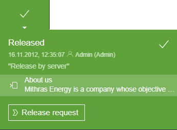
This status means that the currently visible element is released in the currently selected editorial language.
For an explanation of releases, also see page The standard “Release” workflow.
When the current element in the currently selected editorial language was last released and who released it is displayed here.
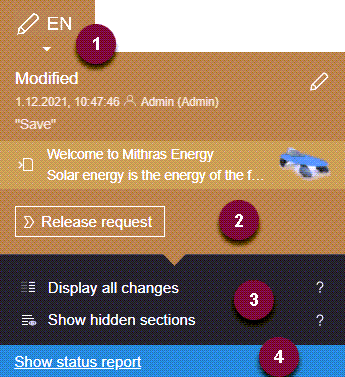
Modified

This status means that the element has been modified and has not been released in the currently selected editorial language. In order for the modifications to be published, it requires release.
When the last change was made to the current element in the currently selected editorial language and which editor made the change is displayed here.
In workflow
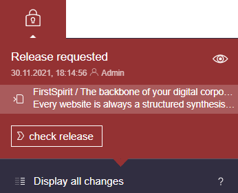
This status means that the element in the currently selected editorial language is in a workflow. In other words, a workflow has already been started. The  icon means that the element in this status is write-protected and cannot be edited; only the next workflow action can be performed.
When the last workflow action was performed and who performed the action is shown here.
2. Workflow actions
In general, workflows can be started or switched on using the respective buttons.
For an explanation of workflows, see also the Tasks page.
Different buttons are available depending on the element and status.
Note
If a parent element is in a workflow and is write-protected, no workflow can be started or switched on for a child element either.
A respective message is displayed, for example:
The changes were saved, but the workflow could not be started. Object cannot be edited.
or
The object is marked as “read only” in the workflow..
In this case, the parent element must be switched on so that the child can be switched on in the workflow, too.
3. Supplementary views and functions
For pages (depending on the status) further views and actions can be called.
 Click on this icon to close the respective view again.
Validation issues
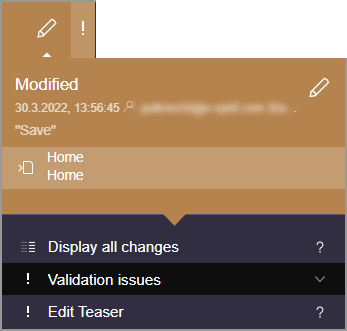
If there is information about how to fill out forms on the page (e.g. “Rule violations”), this is indicated by an exclamation mark on the status icon in the menu bar..
In the fly-out menu, below “Validation issues”, the affected forms are listed.
Click on an entry (here: “Edit Teaser...”) to open the corresponding form directly, where the user can correct the entry.
See also page Rule violations.
Show hidden sections
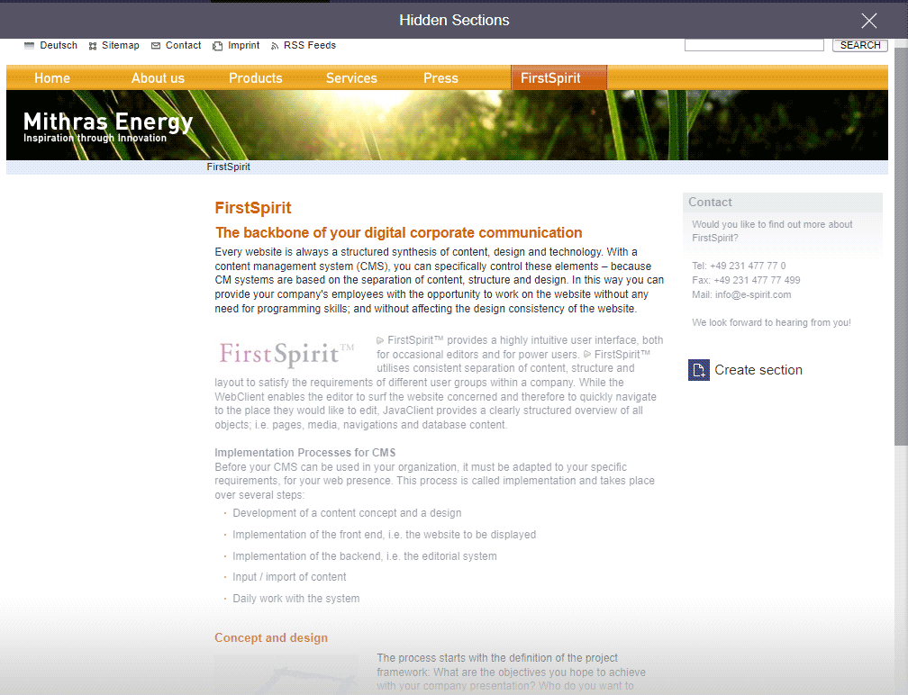
Sections of a page can be hidden (see page Editing window). Using this function, the hidden sections will be displayed in the preview. They are displayed softened.
The mode changes to “Hidden Sections”.
Display all changes / Comparison View
Selecting this option will visually highlight all content where changes have been made since the last release or since the selected release status.
The mode changes to “Comparison View”:
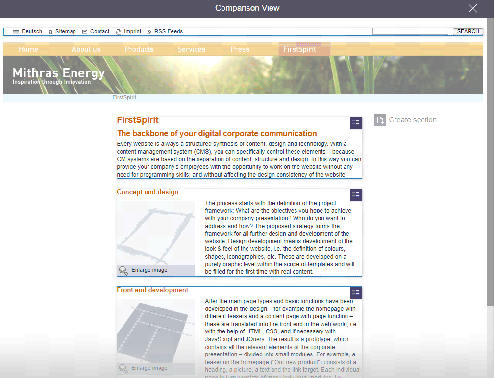
In the Comparison view, editorial changes to the current preview page are compared with the last released state here and the changes are visualized (“Which differences are there relative to the released page?”). The modified areas are highlighted in the preview. Also refer to page Project history.
Restore section

If sections have been deleted (for example by the “Delete” icon) on the current page, they can be added back to the page using the respective “Restore section” entry in the “Comparison View”.
Historic version / Release State
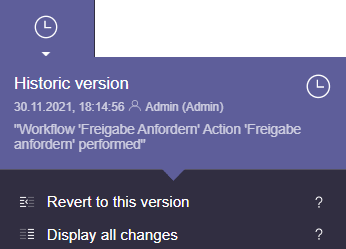
Using the History previous versions of a page can be called.
The mode changes to
- “Historic version”: This is an unreleased state of the page.
- “Release State”: This is a released state of the page.
Revert to this version
The displayed version of the current page can be restored by selecting this option. This means that all changes made after the displayed version are lost.
Deleted pages can be restored using this option, too.
Special visualizations
Page-related status information that is especially important for the editorial process may now be added and displayed prominently in the user interface (by the project developer).
For example, an entry can be added to the status menu if the current page is in a workflow. Additionally, a prominent “!” icon will be displayed underneath the page status display if the user has been explicitly set as an editor in the workflow. Title, text, icon, color and the action which is related to entry are defined by the project developer.
For further information, see Plug-In Development / ContentCreator Extensions / Interactive Features / Page-Based Notifications (→FirstSpirit Online Documentation).
4. Pinning the status display
With a click on the status icon the status display can be fixed:
When going to other elements, the status display remains open so that the status of any desired element can be checked. Alternatively, the “Show status report” link can be used.
The status display can be closed again by
- another click on the status icon or
- opening another report