

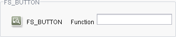
FS_BUTTON
| Contents |
| for example |
| to the methods: Map |
FS_BUTTON
The FS_BUTTON input component provides the editor with an icon, button or link that is linked to a FirstSpirit script or a class, which a FirstSpirit module, for instance, provides on the server. If the editor clicks on this control element or uses a mouse to drag and drop objects onto it, the referenced script or class is executed. This makes it possible to use the FS_BUTTON to create an icon or button that executes an individually implementable function.
The input component can work with other input components. This makes it possible, for instance, to use input by the editor within the script.
For information about how to use FS_BUTTON in ContentCreator please see also page Functions in the preview.
Mandatory
Optional parameters
Optional parameters
Optional parameters
Optional parameters
Optional parameters
Optional parameters
Optional parameters
Optional parameters
Optional parameters
Optional parameters
Optional parameters
Mandatory
Mandatory
Mandatory
Mandatory
Optional parameters
Optional parameters
Mandatory
Parameter
The parameters of the FS_BUTTON input component are given in the following table.
name
The attribute "name" is the variable name of an input component with which the the result object of the input component can be used in the templates - with the help of $CMS_VALUE()$ - or the content can be output.
| Parameter | Mandatory | Since | Type | Default value |
|---|---|---|---|---|
| name* | Yes | 3.1 | Designator | None |
alwaysEnabled
By default, input components can only be edited in FirstSpirit SiteArchitect if the section, the page or the dataset which contains the input component is in Edit mode.
On the other hand, FS_BUTTON can be configured so that the control element (see also icon and style parameters) is also active if the section, page or dataset concerned is in View mode. I.e., the referenced script or module can be run, regardless of whether the input component is in Edit or View mode.
However, this only applies to onClick mode, i.e. if the control element is clicked. If an object is dragged onto the control element (onDrop), the input component must be set in Edit mode.
The alwaysEnabled parameter is used as follows: If alwaysEnabled="YES", the input component is also active in View mode. If alwaysEnabled="NO", it does not become active until it is set in Edit mode. If the parameter is not given, the input component does not become active until set in Edit mode (alwaysEnabled="NO").
| Parameter | Mandatory | Since | Type | Default value |
|---|---|---|---|---|
| alwaysEnabled | No | 4.2.426 | YesNo | NO |
convertEntities
The "convertEntities" attribute is used to convert special characters entered in the input component for output in HTML characters.
There are three forms:
- convertEntities="NONE" (standard)
- convertEntities="STANDARD"
- convertEntities="QUOTE"
With the NONE form, no conversion rules whatsoever are applied.
If STANDARD is given the conversion rules in the "convert" area of the selected conversion rule of the template set are applied.
The form QUOTE explicitly includes STANDARD too. However, the "quote" area of the conversion rule is also applied.
| Parameter | Mandatory | Since | Type | Default value |
|---|---|---|---|---|
| convertEntities | No | 2.0 | ConvertEntity | NONE |
hFill
An input component is always displayed with a pre-defined width.
However, if the input component is to use the full available display width the parameter hFill must be given with the value YES .
| Parameter | Mandatory | Since | Type | Default value |
|---|---|---|---|---|
| hFill | No | 2.0 | YesNo | NO |
hidden
With the "hidden" parameter an input component can be hidden from the editor.
If hidden="YES" the input component is not visible for the editor, if hidden="NO" it is visible.
The default value for hidden is NO.
| Parameter | Mandatory | Since | Type | Default value |
|---|---|---|---|---|
| hidden | No | 4.0.44 | YesNo | NO |
icon
This parameter is used to assign the input component to an icon. When the editor clicks or or drags an object to it with the mouse pointer, the referenced script or the referenced class is executed.
Its value should be set to either question or info in order for the predefined symbols to be displayed. For
icon="question"
the  symbol is used;
for
icon="info"
the  symbol is used.
The FsResource.FsIcon class in the de.espirit.firstspirit.common package of the FirstSpirit Access API provides additional icons. For example, for
icon="fs:new"
the  symbol is used; for
icon="fs:edit"
the  symbol is used.
Images from the Media Store can also be used. In this case, media:, must be entered as the parameter value, followed by the unique identifier of the required image. The original resolution of the image is used.
The following syntax is used for images from the Media Store:
icon="media:icon_startSearch"
For use in ContentCreator, the URL for the medium (from the Media Store) is not mapped to the preview URL but to the optional URL parameter from fs-server.conf. The URL for the start page of the FirstSpirit Server must be mapped to the preview URL.
If the icon parameter is not specified, depending on the definition of the style parameter, a link (style="LINK"), a button, (style="BUTTON") or a FirstSpirit icon (background only, style="FIRSTSPIRIT") is displayed.
| Parameter | Mandatory | Since | Type | Default value |
|---|---|---|---|---|
| icon | No | 4.2.426 | String | None |
noBreak
The noBreak parameter can be used to suppress automatic line break after an input component.
The noBreak parameter must be given with value "YES" (noBreak="YES") to suppress the automatic line break.
| Parameter | Mandatory | Since | Type | Default value |
|---|---|---|---|---|
| noBreak | No | 2.0 | YesNo | NO |
onClick
This parameter is used to reference a script (from the Template Store) or a class that is to be executed when the control element is clicked (also refer to the icon and style parameters).
 |
If a class is referenced, it must implement the de.espirit.firstspirit.access.script.Executable interface! |
When mousing over the control element, the mouse pointer changes depending on the value selected for style and when clicked, the control element appears to be depressed.
As a value, the parameter expects the key term
- script: in the case of a script, followed by the unique reference name of the desired script from the Template Store, e.g.
onClick="script:do_search" - class: in the case of a class, followed by a fully qualified class name, including package name, e.g.
onClick="class:..."
FirstSpirit offers several classes for FS_BUTTON applications in the ContentCreator preview (i.e. integration of the button via the fsbutton(...) function into an HTML template set). These classes can be used to trigger ContentCreator-specific functions from the preview, such as adding a section or editing the menu structure of the project. These classes are described on page Functions in the preview.
|
If this parameter is no set, the onDrop parameter needs to be set. |
The following variable names, which can be used to access FS_BUTTON data, can be used within the script context:
- context:
Accesses the script context. The de.espirit.firstspirit.access.ClientScriptContext (Access API) interface methods can be executed based on the returned value. - properties:
Accesses values (Map) set using a script or executable.
The values are preserved between different calls of an FS_BUTTON from the same form, making data persistent between multiple actions on the same button instance. The properties variable is only available in forms; data persistence is not supported in preview modes. The persistence is thrown when the form is updated or SiteArchitect is restarted.
The java.util.Map<String, String> interface methods can be executed in order to access data stored in properties. - language:
Accesses the project language (Language tab) in which the input component was clicked. The de.espirit.firstspirit.access.Language interface methods can be executed based on the returned value. - element:
Accesses the tree node information contained in the input component, e.g. section, page or dataset. Using the #field system object, information about individual input components can be accessed (see also the PARAMS / PARAM tags).
The de.espirit.firstspirit.access.store.IDProvider interface methods can be executed based on the returned values. If the input component is in a table template, then it is specifically the de.espirit.firstspirit.access.store.contentstore.Dataset interface methods that can be executed. - drop:
Checks if the script was called when dragging objects with the mouse to the (true) input component or when clicking on the (false) input component.
|
If a Java class is used for an FS_BUTTON action, these variables can be accessed using the Map<String, Object> object context within the execute() methods; the specified variable names are then passed as context.get() method keys. |
| Parameter | Mandatory | Since | Type | Default value |
|---|---|---|---|---|
| onClick | No | 4.2.426 | GomButtonScriptReference | None |
onDrop
This parameter is used to reference a script (from the Template Store) or a class that is to be executed when an object is dragged and then dropped onto the control element ("drop"; also refer to the icon and style parameters).
A colored frame is applied to FS_BUTTON instances in the ContentCreator preview (just like other elements, see Chapter Content Highlighting and EasyEdit) if the onDrop parameter has been defined and the user selects an element with the mouse in ContentCreator and then hovers over the FS_BUTTON with the button still pressed. See also FS_BUTTON handler classes.
|
If a class is referenced, it must implement the de.espirit.firstspirit.access.script.Executable interface! |
As a value, the parameter expects the key term
- script: in the case of a script, followed by the unique reference name of the desired script from the Template Store, e.g.
onDrop="script:do_search" - class: in the case of a class, followed by a fully qualified class name, including package name, e.g.
onDrop="class:..."
|
If this parameter is no set, the onClick parameter needs to be set. |
The following variable names, which can be used to access FS_BUTTON data, can be used within the script context:
- context:
Accesses the script context. The de.espirit.firstspirit.access.ClientScriptContext (Access API) interface methods can be executed based on the returned value. - properties:
Accesses values (Map) set using a script or executable.
The values are preserved between different calls of an FS_BUTTON from the same form, making data persistent between multiple actions on the same button instance. The properties variable is only available in forms; data persistence is not supported in preview modes. The persistence is thrown when the form is updated or SiteArchitect is restarted.
The java.util.Map<String, String> interface methods can be executed in order to access data stored in properties. - language:
Accesses the project language (Language tab) in which the objects were dropped onto the input component. The de.espirit.firstspirit.access.Language interface methods can be executed based on the returned value. - element:
Accesses the tree node information contained in the input component, e.g. section, page or dataset. Using the #field system object, information about individual input components can be accessed (see also the PARAMS / PARAM tags).
The de.espirit.firstspirit.access.store.IDProvider interface methods can be executed based on the returned values; the input component is in a table template, specifically the de.espirit.firstspirit.access.store.contentstore.Dataset interface methods. - drop:
Checks if the script was called when dragging objects with the mouse to the (true) input component or when clicking on the (false) input component. - dropdata:
Accesses the data dropped onto the input component using the mouse. The de.espirit.firstspirit.ui.gadgets.aspects.transfer.CommodityContainer (Developer API) interface methods can be executed based on the returned value.
|
If a Java class is used for an FS_BUTTON action, these variables can be accessed using the Map<String, Object> object context within the execute() methods; the specified variable names are then passed as context.get() method keys. |
| Parameter | Mandatory | Since | Type | Default value |
|---|---|---|---|---|
| onDrop | No | 4.2.426 | GomButtonScriptReference | None |
preset
Using the preset attribute the handling of default values in an input component can defined (see also chapter Default values). If preset="default" is set, the fall-back value defined in the form is used. If this value in the form is changed later on, these changes will be affect all usages of this default value in the input components maintained by the editor, as long as a value will be set manually in the input component. This is the default setting. If preset="copy" is set, the value entered by the editor is copied directly into the input component. Subsequent changes to the default value in the form do not have any effect on the usages of this default value in the input components maintained by the editor.
| Parameter | Mandatory | Since | Type | Default value |
|---|---|---|---|---|
| preset | No | 4.0 | Preset | DEFAULT |
style
FS_BUTTON can be displayed in different variants. These are controlled via the style parameter:
- Button
With style="BUTTON", the input component is displayed as a button. The text defined via LANGINFOS is displayed on the button, e.g.
- Link
With style="LINK", the input component is displayed as a link. The text defined via LANGINFOS is used for this, e.g.
If the mouse cursor is held over this link (mouseover), the text and underlining become a lighter color. - FirstSpirit
With style="FIRSTSPIRIT", it is possible to equip the input component with an icon, whose design is based on the style of the usual FirstSpirit icons. With the "FIRSTSPIRIT" value, the input component is assigned an icon with the usual SiteArchitect size and background color as well as the typical shading. Depending on the user's own requirements, it can also be assigned a symbol, which must be referenced via the icon parameter. The individual symbol used for the icon should ideally be an image file with light color, in PNG or GIF format with transparent background and dimensions 19px x 18px. The text defined via LANGINFOS is displayed to the right of the icon, e.g.
If the mouse cursor is held over the icon and/or text (mouseover), a frame is displayed around these elements.
If the parameter is not given, by default the input component is displayed as the "button" variant.
| Parameter | Mandatory | Since | Type | Default value |
|---|---|---|---|---|
| style | No | 4.2.426 | ButtonStyle | button |
useLanguages
The useLanguages parameter can be used to specify whether or not an input component is to store different or deviating values for different languages (multi-lingual maintenance).
If the parameter is not given, deviating values are stored for the different languages as a default.
If NO (...useLanguages="NO") is specified, one value is stored for all languages.
 useLanguages="YES" will potentially no longer be evaluated in FirstSpirit version 5.2R5 and higher. See also parameter forbidPolyglotDataHierarchy (FS_CATALOG).
| Parameter | Mandatory | Since | Type | Default value |
|---|---|---|---|---|
| useLanguages | No | 2.0 | YesNo | YES |
DROPTYPES
If the "onDrop" variant of the input component is used (see onDrop parameter), the DROPTYPES tag must be used to define the object types which may be dropped onto the input component with the mouse cursor ("Drop"). A TYPE or MIME tag must be given for each allowed type.
MIME
The MIME tag can be used to define custom MIME types which may be dragged and dropped onto the input component using the mouse cursor. A tag must be given for each type.
| Parameter | Mandatory | Since | Type | Default value |
|---|---|---|---|---|
| classname* | Yes | 4.2.426 | String | None |
| type* | Yes | 4.2.426 | String | None |
classname
This parameter must be used to provide a class via which the MIME type can be transferred, e.g.
classname="java.io.InputStream"
| Parameter | Mandatory | Since | Type | Default value |
|---|---|---|---|---|
| classname* | Yes | 4.2.426 | String | None |
type
This parameter must be used to define a MIME type which is to be transferable, e.g.
type="application/video"
| Parameter | Mandatory | Since | Type | Default value |
|---|---|---|---|---|
| type* | Yes | 4.2.426 | String | None |
TYPE
The TYPE tag can be used to define specified object types, which may be dragged and dropped onto the input component using the mouse cursor. A tag must be given for each type.
| Parameter | Mandatory | Since | Type | Default value |
|---|---|---|---|---|
| value* | Yes | 4.2.426 | DropType | None |
value
This parameter can be used to provide predefined object types which may be dragged and dropped onto the input component using the mouse cursor.
The following values and types can be used for this:
- TEXT_HTML (HTML text)
- TEXT_PLAIN (Plain Text)
- EXTERNAL (external files)
FirstSpirit objects
- NODE (FirstSpirit node)
- PAGEFOLDER (Page Store: folder)
- PAGE (Page Store: pages)
- BODY (Page Store: content areas)
- SECTION (Page Store: sections)
- SITESTOREFOLDER (Site Store: menu levels)
- PAGEREF (Site Store: page references)
- DOCGROUP (Site Store: document groups)
- MEDIAFOLDER (Media Store: folder)
- PICTURE (Media Store: images)
- FILE (Media Store: files)
- DATASET (Content Store: data sets)
 MEDIA (Media Store: Media;
is replaced with <TYPE value="picture"/> and <TYPE value="file"/> when the template is saved)
Example:
<DROPTYPES>
 <MIME type="application/video" classname="java.io.InputStream"/>
 <TYPE value="text_html"/>
 <TYPE value="text_plain"/>
 <TYPE value="external"/>
 <TYPE value="picture"/>
 <TYPE value="file"/>
</DROPTYPES>
| Parameter | Mandatory | Since | Type | Default value |
|---|---|---|---|---|
| value* | Yes | 4.2.426 | DropType | None |
LANGINFOS
Using the tag LANGINFOS language-dependent information can be defined for each input component, e.g. which title is to be used for the input component in the different project languages (parameter label), which tooltip is to be displayed (parameter description) etc. For reasons of clarity, definitions which are identical in multiple languages will be merged. For example,
<LANGINFOS>
 <LANGINFO lang="*" label="Datum"/>
 <LANGINFO lang="DE" label="Datum"/>
 <LANGINFO lang="EN" label="Datum"/>
</LANGINFOS>
will be merged to
 <LANGINFOS>
 <LANGINFO lang="*" label="Datum"/>
</LANGINFOS>
after saving.
 Up to and including FirstSpirit version 4.2R2 language definitions will be deleted only in the case if the values are identical in all languages (as in example above). Furthermore, only the parameters lang, description and label are taken into account when merging.
 Since FirstSpirit version 4.2R4 all parameters are taken into account (e.g. format and length). Furthermore, language definitions are also merged within LANGINFOS tags, if they are identical in at least two languages. For example,
<LANGINFOS>
 <LANGINFO lang="*" label="Date" format="dd.MM.yy"/>
 <LANGINFO lang="DE" label="Date" format="dd.MM.yy"/>
 <LANGINFO lang="EN" label="Date" format="MM/dd/yy"/>
</LANGINFOS>
will become
 <LANGINFOS>
 <LANGINFO lang="*" label="Date" format="dd.MM.yy"/>
 <LANGINFO lang="EN" label="Date" format="MM/dd/yy"/>
</LANGINFOS>
after saving.
The definition for the fallback value (*) will not be deleted in any case. If there are two or more language definitions with identical values the first one will be maintained, the other will be deleted.
IMPORTANT: Up to and including FirstSpirit version 4.2R2 at least one definition for the fallback labelling ("*") must be given:
<LANGINFOS>
 <LANGINFO lang="*" label="TEXT"/>
</LANGINFOS>
From FirstSpirit version 4.2R4 the fallback definition can be omitted. In this case, the language which is defined first will be used automatically as fallback value. For example,
<LANGINFOS>
 <LANGINFO lang="EN" label="Date"/>
 <LANGINFO lang="DE" label="Datum"/>
</LANGINFOS>
will become
 <LANGINFOS>
 <LANGINFO lang="*" label="Date"/>
 <LANGINFO lang="DE" label="Datum"/>
</LANGINFOS>
after saving.
LANGINFO
The LANGINFO tag is used to give values or attributes for a language as well for use as fallback values.
In order to state values or attributes for a language it is necessary to give the abbreviation of the project language in the lang parameter:
...
<LANGINFO lang="DE".../>
...
Fallback values are given with the special language abbreviation * ("for all languages"):
...
<LANGINFO lang="*".../>
...
The lang parameter is a mandatory parameter.
| Parameter | Mandatory | Since | Type | Default value |
|---|---|---|---|---|
| lang* | Yes | 3.1 | LanguageAbbreviation | None |
| description | No | 3.1 | String | None |
| label | No | 3.1 | String | None |
lang
The lang parameter is used to give the language abbreviation which is entered in the server properties see Language templates (→Documentation for Administrators)) to specify for which project languages the definitions are to apply, e.g. DE for German, EN for English, FR for French etc. The following characters can be used as often as required: -, _, 0-9 and A-Z. Lower case letters are transformed automatically into upper case letters after having saved the template. In addition * can be used for fallback values.
| Parameter | Mandatory | Since | Type | Default value |
|---|---|---|---|---|
| lang* | Yes | 3.1 | LanguageAbbreviation | None |
description
The description parameter can be used to specify a description of how the input component is to be used and filled by the editor. The text defined here is displayed as a tooltip on mouse-over at the relevant input component.
The text should serve as a guide for the editor and be as short as possible, understandable and relevant. It should match the label (label parameter) and complement it appropriately.
Make sure to use terminology that the editor knows and expects.
Example:
...description="Please enter the text for the headline here (H1)."...
Tip: If you would like to know how to better support and guide editors when filling input components, take a look at the chapter on Rules and other parameters and functions of forms.
| Parameter | Mandatory | Since | Type | Default value |
|---|---|---|---|---|
| description | No | 3.1 | String | None |
label
Use the label parameter to define the label of the input component.
Choose a label that is as short and meaningful as possible.
In combination with a relevant description (description parameter), you can help the editor to use the input component correctly and successfully.
Example:
... label="Headline (H1)" ...
| Parameter | Mandatory | Since | Type | Default value |
|---|---|---|---|---|
| label | No | 3.1 | String | None |
PARAMS
The PARAMS / PARAM tags can be used to transfer script/module values referenced via onClick and / or onDrop.
The #field system object can be used to access values in other input components of the current form. In this context, the de.espirit.firstspirit.forms.FormField instance is available.
Beanshell scripts and Java classes which are used as button actions via the attributes onClick and onDrop of the FS_BUTTON tag, can access the parameters which are specified within this block as follows:
- Beanshell scripts
Each parameter is made available as a variable. The name of a parameter which is specified by the name attribute of the PARAM tag is used as variable name. - Java classes
Each parameter is stored within the Map<String, Object> object which is made available as parameter of the execute() methods of the interface Executable. The name of a parameter which is specified by the name attribute of the PARAM tag is used as key.
|
If FS_BUTTON is used in previews (calling the funktion fsbutton() in a template set) parameters of the form definition get higher priority. If parameters with the same name are used for a FS_BUTTON instance for the form definition (using the PARAM tag) as well as within a template set (using the fsbutton() function), the value of the parameter deriving form the form definition is always made available in scripts and executables. |
PARAM
Within PARAMS, a PARAM tag with a name parameter is required for each value to be transferred to the referenced script/module.
| Parameter | Mandatory | Since | Type | Default value |
|---|---|---|---|---|
| name* | Yes | 4.2.404 | String | None |
name
The name parameter is used to define the name of the parameter to be transferred to the referenced script / module.
| Parameter | Mandatory | Since | Type | Default value |
|---|---|---|---|---|
| name* | Yes | 4.2.404 | String | None |
TEXT
The value which is to be transferred to the referenced script / module is defined here.
The system object #field can be used to access input components of the same form. This is done by attaching the variable name of the input component concerned, separated by a dot, e.g.
<PARAM name="targeturl">#field.st_text</PARAM>
where targeturl is the parameter name which can be used in the script / module and st_text is the variable name of the input component whose value is to be used.
Example:
<PARAMS>
 <PARAM name="targeturl">#field.st_url</PARAM>
 <PARAM name="wikisearch">#field.st_wikisearch</PARAM>
</PARAMS>


Example
An FS_BUTTON input component example:
<FS_BUTTON
       name="IDENTIFIER"
       icon="media:IDENTIFIER"
       style="FIRSTSPIRIT"
       onClick="script:IDENTIFIER"
       onDrop="script:IDENTIFIER"
       noBreak="NO"
       useLanguages="NO"
       hFill="YES">
  <LANGINFOS>
    <LANGINFO lang="*" label="TEXT_FALLBACK" description="TEXT_FALLBACK"/>
    <LANGINFO lang="DE" label="TEXT_DE" description="TEXT_DE"/>
    <LANGINFO lang="EN" label="TEXT_EN" description="TEXT_EN"/>
  </LANGINFOS>
  <DROPTYPES>
    <MIME classname="java.io.InputStream" type="application/video">
    <TYPE value="TEXT_PLAIN"/>
    <TYPE value="FILE"/>
  </DROPTYPES>
  <PARAMS>
    <PARAM name="IDENTIFIER">#field.IDENTIFIER</PARAM>
  </PARAMS>
</FS_BUTTON>
In this example an FS_BUTTON button, which is identified using the FirstSpirit button style, is defined and the script specified in onClick or onDrop is called using the click and drop actions.
The information in the <DROPTYPES/> block refers to drag-and-drop actions in which content is dropped onto the button. Here the predefined types "TEXT_PLAIN" (unformatted text) and "FILE" (data elements from the Media Store) as well as the "application/video" MIME type are accepted. In the case of the "application/video" MIME type, a java.io.InputStream type object is explicitly specified for use in order to make the binary data available in the onDrop script.
A parameter that can be called within the scripts by using the name string ("IDENTIFIER" in this case) is defined in the <PARAMS/> block. The value of the parameter in this case is the FormField object of an input component, which is accessed via the #field system object.