

CMS_INPUT_TOGGLE
| Contents |
| for example |
| to the methods: Boolean |
CMS_INPUT_TOGGLE
This input component can be used to toggle between two specified values (e.g. on/off, right/left) or to activate/deactivate a checkbox.
The input component returns in the activated state the value true and false when it is deactivated. The initial state (no option has been selected yet) returns the value null. This should be taken into account when defining rules (Dynamic forms), especially when using the property VISIBLE.
For information about transfer types which are supported for drag-and-drop please see also page Drag-and-drop.
Mandatory
Optional parameters
Optional parameters
Optional parameters
Optional parameters
Optional parameters
Optional parameters
Optional parameters
Optional parameters
Optional parameters
Optional parameters
Optional parameters
Mandatory
Optional parameters
Optional parameters
Mandatory
Optional parameters
Optional parameters
Mandatory
Optional parameters
Optional parameters
Parameter
The following table gives the parameters of the TOGGLE input component.
name
The attribute "name" is the variable name of an input component with which the the result object of the input component can be used in the templates - with the help of $CMS_VALUE()$ - or the content can be output.
| Parameter | Mandatory | Since | Type | Default value |
|---|---|---|---|---|
| name* | Yes | 3.1 | Designator | None |
allowEmpty
The "allowEmpty" parameter is used to specify whether a value has to be entered for an input value or not.
If allowEmpty="YES" input is not mandatory; however, it is if allowEmpty="NO".
Input components with allowEmpty="NO" are also called mandatory input components.
The default value for allowEmpty is YES.
| Parameter | Mandatory | Since | Type | Default value |
|---|---|---|---|---|
| allowEmpty | No | 3.0 | YesNo | YES |
convertEntities
The "convertEntities" attribute is used to convert special characters entered in the input component for output in HTML characters.
There are three forms:
- convertEntities="NONE" (standard)
- convertEntities="STANDARD"
- convertEntities="QUOTE"
With the NONE form, no conversion rules whatsoever are applied.
If STANDARD is given the conversion rules in the "convert" area of the selected conversion rule of the template set are applied.
The form QUOTE explicitly includes STANDARD too. However, the "quote" area of the conversion rule is also applied.
| Parameter | Mandatory | Since | Type | Default value |
|---|---|---|---|---|
| convertEntities | No | 2.0 | ConvertEntity | NONE |
hFill
An input component is always displayed with a pre-defined width.
However, if the input component is to use the full available display width the parameter hFill must be given with the value YES .
| Parameter | Mandatory | Since | Type | Default value |
|---|---|---|---|---|
| hFill | No | 2.0 | YesNo | NO |
hidden
With the "hidden" parameter an input component can be hidden from the editor.
If hidden="YES" the input component is not visible for the editor, if hidden="NO" it is visible.
The default value for hidden is NO.
| Parameter | Mandatory | Since | Type | Default value |
|---|---|---|---|---|
| hidden | No | 4.0.44 | YesNo | NO |
hideLabel
hideLabel should only be used with type="radio". If hideLabel="yes" is set the labelling which is defined via the parameter label will be hidden. By default, the labelling is shown (hideLabel="no").
| Parameter | Mandatory | Since | Type | Default value |
|---|---|---|---|---|
| hideLabel | No | 4.0 | YesNo | NO |
noBreak
The noBreak parameter can be used to suppress automatic line break after an input component.
The noBreak parameter must be given with value "YES" (noBreak="YES") to suppress the automatic line break.
| Parameter | Mandatory | Since | Type | Default value |
|---|---|---|---|---|
| noBreak | No | 2.0 | YesNo | NO |
preset
Using the preset attribute the handling of default values in an input component can defined (see also chapter Default values). If preset="default" is set, the fall-back value defined in the form is used. If this value in the form is changed later on, these changes will be affect all usages of this default value in the input components maintained by the editor, as long as a value will be set manually in the input component. This is the default setting. If preset="copy" is set, the value entered by the editor is copied directly into the input component. Subsequent changes to the default value in the form do not have any effect on the usages of this default value in the input components maintained by the editor.
| Parameter | Mandatory | Since | Type | Default value |
|---|---|---|---|---|
| preset | No | 4.0 | Preset | DEFAULT |
searchRelevancy
This parameter can be used for determining the weighting of content of this input component in search results (SiteArchitect: Global search (→Documentation FirstSpirit SiteArchitect), search in data sources | ContentCreator: search in report area). For example, using this parameter, template developers may specify that elements that contain a search term in a headline input component should be displayed more prominently in search results than elements that only contain the search term in a body text input component. Additionally, contents of individual input components may be configured so that they be ignored during indexing for search, which may increase indexing performance.
Input components may be configured with the following values to specify their contents' weight in search indexing:
- none: The contents of an input component that is configured with this search relevancy value will not be indexed. Pages, sections, and datasets which contain contents in input components configured with this search relevancy value will not appear in search results if the search term only appears in these input components. Searching for contents of such input components using drag-and-drop will yield no results ("The field is not eligible for search, as it is marked non-relevant for searching."). Such fields are also marked accordingly in "Simple Search" in data sources ("Not eligible for searching.").
- default: The input component's content receives default weight in the search index (default setting).
- high: The contents of an input component that is configured with this search relevancy value will be displayed more prominently in search results (exception: search for datasets). This means that if a search term appears in both an element with an input component configured with high search relevancy and an element with an input component configured with default search relevancy, the element which contains the search term in a high-relevancy input component will be shown in a higher position in search results.
If the parameter is not specified for an input component, the component's contents will be indexed with a default weight (searchRelevancy="default").
Note: Header fields of snippets (tab Snippet in templates, "Label" field) are also indexed. If an input component is configured with a weighting none (searchRelevancy="none") but its value is included in the template's snippet header field, searching for the input component's value will cause the associated element to appear in search results
Changing the weighting setting of an input component in a template does not immediately affect existing elements based upon that template, and search results will continue to reflect the old weighting until elements based upon that template are modified (at which time they will be reindexed in the background). Alternatively, the entire project or parts of it may be reindexed via a schedule task or the FirstSpirit APIs, which does not require elements to be changed (see FirstSpirit Manual for Administrators, Chapter "Rebuild search index (→Documentation for Administrators)"). However, reindexing large numbers of elements is memory and CPU-intensive and should only be performed during a planned maintenance period!
For further information, see
- interface GomSearchRelevancy (package de.espirit.firstspirit.access.store.templatestore.gom, FirstSpirit Access API)
- interface SearchService (package de.espirit.firstspirit.access.search, FirstSpirit Access API)
- interface QueryAgent (package de.espirit.firstspirit.agency, FirstSpirit Access API)
| Parameter | Mandatory | Since | Type | Default value |
|---|---|---|---|---|
| searchRelevancy | No | 5.2.305 | Relevancy | DEFAULT |
singleLine
The singleLine parameter can be used to specify whether an input component is to be displayed in one row (without frame) or not.
If the parameter is not given the input component is displayed in one row - without a frame.
If NO (...singleLine="NO"...) is specified the input component is displayed over two rows with a frame.
To ensure uniform layout of the input components it is advisable to enter the following for the input components which support this attribute (e.g. COMBOBOX, NUMBER, TEXT and TOGGLE) singleLine="NO".
| Parameter | Mandatory | Since | Type | Default value |
|---|---|---|---|---|
| singleLine | No | 4.0 | YesNo | YES |
type
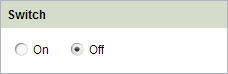
CMS_INPUT_TOGGLE can be displayed in two variants. This can be configured by the parameter type:
- Checkbox: Using type="CHECKBOX" the input component will be displayed with one square which can be checked (cf. also figure for CMS_INPUT_CHECKBOX).
- Radiobutton: Using type="RADIO" the input component will be displayed with two buttons for choosing between exactly two states (cf. also figure for CMS_INPUT_RADIOBUTTON).
If type is not set, CMS_INPUT_TOGGLE will be displayed by default as Checkbox.
| Parameter | Mandatory | Since | Type | Default value |
|---|---|---|---|---|
| type | No | 4.0 | ToggleType | CHECKBOX |
useLanguages
The useLanguages parameter can be used to specify whether or not an input component is to store different or deviating values for different languages (multi-lingual maintenance).
If the parameter is not given, deviating values are stored for the different languages as a default.
If NO (...useLanguages="NO") is specified, one value is stored for all languages.
 useLanguages="YES" will potentially no longer be evaluated in FirstSpirit version 5.2R5 and higher. See also parameter forbidPolyglotDataHierarchy (FS_CATALOG).
| Parameter | Mandatory | Since | Type | Default value |
|---|---|---|---|---|
| useLanguages | No | 2.0 | YesNo | YES |
LANGINFOS
Using the tag LANGINFOS language-dependent information can be defined for each input component, e.g. which title is to be used for the input component in the different project languages (parameter label), which tooltip is to be displayed (parameter description) etc. For reasons of clarity, definitions which are identical in multiple languages will be merged. For example,
<LANGINFOS>
 <LANGINFO lang="*" label="Datum"/>
 <LANGINFO lang="DE" label="Datum"/>
 <LANGINFO lang="EN" label="Datum"/>
</LANGINFOS>
will be merged to
 <LANGINFOS>
 <LANGINFO lang="*" label="Datum"/>
</LANGINFOS>
after saving.
 Up to and including FirstSpirit version 4.2R2 language definitions will be deleted only in the case if the values are identical in all languages (as in example above). Furthermore, only the parameters lang, description and label are taken into account when merging.
 Since FirstSpirit version 4.2R4 all parameters are taken into account (e.g. format and length). Furthermore, language definitions are also merged within LANGINFOS tags, if they are identical in at least two languages. For example,
<LANGINFOS>
 <LANGINFO lang="*" label="Date" format="dd.MM.yy"/>
 <LANGINFO lang="DE" label="Date" format="dd.MM.yy"/>
 <LANGINFO lang="EN" label="Date" format="MM/dd/yy"/>
</LANGINFOS>
will become
 <LANGINFOS>
 <LANGINFO lang="*" label="Date" format="dd.MM.yy"/>
 <LANGINFO lang="EN" label="Date" format="MM/dd/yy"/>
</LANGINFOS>
after saving.
The definition for the fallback value (*) will not be deleted in any case. If there are two or more language definitions with identical values the first one will be maintained, the other will be deleted.
IMPORTANT: Up to and including FirstSpirit version 4.2R2 at least one definition for the fallback labelling ("*") must be given:
<LANGINFOS>
 <LANGINFO lang="*" label="TEXT"/>
</LANGINFOS>
From FirstSpirit version 4.2R4 the fallback definition can be omitted. In this case, the language which is defined first will be used automatically as fallback value. For example,
<LANGINFOS>
 <LANGINFO lang="EN" label="Date"/>
 <LANGINFO lang="DE" label="Datum"/>
</LANGINFOS>
will become
 <LANGINFOS>
 <LANGINFO lang="*" label="Date"/>
 <LANGINFO lang="DE" label="Datum"/>
</LANGINFOS>
after saving.
LANGINFO
The LANGINFO tag is used to give values or attributes for a language as well for use as fallback values.
In order to state values or attributes for a language it is necessary to give the abbreviation of the project language in the lang parameter:
...
<LANGINFO lang="DE".../>
...
Fallback values are given with the special language abbreviation * ("for all languages"):
...
<LANGINFO lang="*".../>
...
The lang parameter is a mandatory parameter.
| Parameter | Mandatory | Since | Type | Default value |
|---|---|---|---|---|
| lang* | Yes | 3.1 | LanguageAbbreviation | None |
| description | No | 3.1 | String | None |
| label | No | 3.1 | String | None |
lang
The lang parameter is used to give the language abbreviation which is entered in the server properties see Language templates (→Documentation for Administrators)) to specify for which project languages the definitions are to apply, e.g. DE for German, EN for English, FR for French etc. The following characters can be used as often as required: -, _, 0-9 and A-Z. Lower case letters are transformed automatically into upper case letters after having saved the template. In addition * can be used for fallback values.
| Parameter | Mandatory | Since | Type | Default value |
|---|---|---|---|---|
| lang* | Yes | 3.1 | LanguageAbbreviation | None |
description
The description parameter can be used to specify a description of how the input component is to be used and filled by the editor. The text defined here is displayed as a tooltip on mouse-over at the relevant input component.
The text should serve as a guide for the editor and be as short as possible, understandable and relevant. It should match the label (label parameter) and complement it appropriately.
Make sure to use terminology that the editor knows and expects.
Example:
...description="Please enter the text for the headline here (H1)."...
Tip: If you would like to know how to better support and guide editors when filling input components, take a look at the chapter on Rules and other parameters and functions of forms.
| Parameter | Mandatory | Since | Type | Default value |
|---|---|---|---|---|
| description | No | 3.1 | String | None |
label
Use the label parameter to define the label of the input component.
Choose a label that is as short and meaningful as possible.
In combination with a relevant description (description parameter), you can help the editor to use the input component correctly and successfully.
Example:
... label="Headline (H1)" ...
| Parameter | Mandatory | Since | Type | Default value |
|---|---|---|---|---|
| label | No | 3.1 | String | None |
OFF
The OFF tag can be used to give language-dependent details for the state off or deactivated .
This input is useful if the type attribute has been given the value RADIO .
LANGINFO
The LANGINFO tag is used to give values or attributes for a language as well for use as fallback values.
In order to state values or attributes for a language it is necessary to give the abbreviation of the project language in the lang parameter:
...
<LANGINFO lang="DE".../>
...
Fallback values are given with the special language abbreviation * ("for all languages"):
...
<LANGINFO lang="*".../>
...
The lang parameter is a mandatory parameter.
| Parameter | Mandatory | Since | Type | Default value |
|---|---|---|---|---|
| lang* | Yes | 3.1 | LanguageAbbreviation | None |
| description | No | 3.1 | String | None |
| label | No | 3.1 | String | None |
lang
The lang parameter is used to give the language abbreviation which is entered in the server properties see Language templates (→Documentation for Administrators)) to specify for which project languages the definitions are to apply, e.g. DE for German, EN for English, FR for French etc. The following characters can be used as often as required: -, _, 0-9 and A-Z. Lower case letters are transformed automatically into upper case letters after having saved the template. In addition * can be used for fallback values.
| Parameter | Mandatory | Since | Type | Default value |
|---|---|---|---|---|
| lang* | Yes | 3.1 | LanguageAbbreviation | None |
description
The description parameter can be used to specify a description of how the input component is to be used and filled by the editor. The text defined here is displayed as a tooltip on mouse-over at the relevant input component.
The text should serve as a guide for the editor and be as short as possible, understandable and relevant. It should match the label (label parameter) and complement it appropriately.
Make sure to use terminology that the editor knows and expects.
Example:
...description="Please enter the text for the headline here (H1)."...
Tip: If you would like to know how to better support and guide editors when filling input components, take a look at the chapter on Rules and other parameters and functions of forms.
| Parameter | Mandatory | Since | Type | Default value |
|---|---|---|---|---|
| description | No | 3.1 | String | None |
label
Use the label parameter to define the label of the input component.
Choose a label that is as short and meaningful as possible.
In combination with a relevant description (description parameter), you can help the editor to use the input component correctly and successfully.
Example:
... label="Headline (H1)" ...
| Parameter | Mandatory | Since | Type | Default value |
|---|---|---|---|---|
| label | No | 3.1 | String | None |
ON
The ON tag can be used to give language-dependent details for the state on or activated .
This input is useful if the type attribute has been given the value RADIO .
LANGINFO
The LANGINFO tag is used to give values or attributes for a language as well for use as fallback values.
In order to state values or attributes for a language it is necessary to give the abbreviation of the project language in the lang parameter:
...
<LANGINFO lang="DE".../>
...
Fallback values are given with the special language abbreviation * ("for all languages"):
...
<LANGINFO lang="*".../>
...
The lang parameter is a mandatory parameter.
| Parameter | Mandatory | Since | Type | Default value |
|---|---|---|---|---|
| lang* | Yes | 3.1 | LanguageAbbreviation | None |
| description | No | 3.1 | String | None |
| label | No | 3.1 | String | None |
lang
The lang parameter is used to give the language abbreviation which is entered in the server properties see Language templates (→Documentation for Administrators)) to specify for which project languages the definitions are to apply, e.g. DE for German, EN for English, FR for French etc. The following characters can be used as often as required: -, _, 0-9 and A-Z. Lower case letters are transformed automatically into upper case letters after having saved the template. In addition * can be used for fallback values.
| Parameter | Mandatory | Since | Type | Default value |
|---|---|---|---|---|
| lang* | Yes | 3.1 | LanguageAbbreviation | None |
description
The description parameter can be used to specify a description of how the input component is to be used and filled by the editor. The text defined here is displayed as a tooltip on mouse-over at the relevant input component.
The text should serve as a guide for the editor and be as short as possible, understandable and relevant. It should match the label (label parameter) and complement it appropriately.
Make sure to use terminology that the editor knows and expects.
Example:
...description="Please enter the text for the headline here (H1)."...
Tip: If you would like to know how to better support and guide editors when filling input components, take a look at the chapter on Rules and other parameters and functions of forms.
| Parameter | Mandatory | Since | Type | Default value |
|---|---|---|---|---|
| description | No | 3.1 | String | None |
label
Use the label parameter to define the label of the input component.
Choose a label that is as short and meaningful as possible.
In combination with a relevant description (description parameter), you can help the editor to use the input component correctly and successfully.
Example:
... label="Headline (H1)" ...
| Parameter | Mandatory | Since | Type | Default value |
|---|---|---|---|---|
| label | No | 3.1 | String | None |


Example
An example of the input component TOGGLE:
<CMS_INPUT_TOGGLE name="IDENTIFIER">
  <LANGINFOS>
    <LANGINFO lang="*" label="TEXT_FALLBACK" description="TEXT_FALLBACK"/>
    <LANGINFO lang="DE" label="TEXT_DE" description="TEXT_DE"/>
    <LANGINFO lang="EN" label="TEXT_EN" description="TEXT_EN"/>
  </LANGINFOS>
  <OFF>
    <LANGINFO lang="*" label="TEXT_FALLBACK"/>
    <LANGINFO lang="DE" label="TEXT_DE"/>
    <LANGINFO lang="EN" label="TEXT_EN"/>
  </OFF>
  <ON>
    <LANGINFO lang="*" label="TEXT_FALLBACK"/>
    <LANGINFO lang="DE" label="TEXT_DE"/>
    <LANGINFO lang="EN" label="TEXT_EN"/>
  </ON>
</CMS_INPUT_TOGGLE>