

CMS_INPUT_IMAGEMAP
| Contents |
| for example |
| to the methods: MappingMedium |
CMS_INPUT_IMAGEMAP
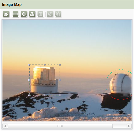
This input component can be used to anchor links in various positions of a selected background picture. A frame object or shape (SiteArchitect: rectangle, circle or polygon, ContentCreator: only rectangle) is first generated for each link, the size and position of the shape can then be individually adjusted. The link can then be anchored on this frame object (also called “hot-spot” (“link-sensitive area”), “active area” or “live area”).
For information about transfer types which are supported for drag-and-drop please see also page Drag-and-drop.
Frame objects and links can also be defined using the API. See also page Data type "Area".
Mandatory
Optional parameters
Optional parameters
Optional parameters
Optional parameters
Optional parameters
Optional parameters
Optional parameters
Optional parameters
Optional parameters
Mandatory
Optional parameters
Optional parameters
Mandatory
Mandatory
Mandatory
Mandatory
Optional parameters
Optional parameters
Mandatory
Mandatory
Optional parameters
Optional parameters
Mandatory
Parameter
The following table gives the parameters of the IMAGEMAP input component.
name
The attribute "name" is the variable name of an input component with which the the result object of the input component can be used in the templates - with the help of $CMS_VALUE()$ - or the content can be output.
| Parameter | Mandatory | Since | Type | Default value |
|---|---|---|---|---|
| name* | Yes | 3.1 | Designator | None |
allowEmpty
The "allowEmpty" parameter is used to specify whether a value has to be entered for an input value or not.
If allowEmpty="YES" input is not mandatory; however, it is if allowEmpty="NO".
Input components with allowEmpty="NO" are also called mandatory input components.
The default value for allowEmpty is YES.
| Parameter | Mandatory | Since | Type | Default value |
|---|---|---|---|---|
| allowEmpty | No | 3.0 | YesNo | YES |
hFill
An input component is always displayed with a pre-defined width.
However, if the input component is to use the full available display width the parameter hFill must be given with the value YES .
| Parameter | Mandatory | Since | Type | Default value |
|---|---|---|---|---|
| hFill | No | 2.0 | YesNo | NO |
hidden
With the "hidden" parameter an input component can be hidden from the editor.
If hidden="YES" the input component is not visible for the editor, if hidden="NO" it is visible.
The default value for hidden is NO.
| Parameter | Mandatory | Since | Type | Default value |
|---|---|---|---|---|
| hidden | No | 4.0.44 | YesNo | NO |
preset
Using the preset attribute the handling of default values in an input component can defined (see also chapter Default values). If preset="default" is set, the fall-back value defined in the form is used. If this value in the form is changed later on, these changes will be affect all usages of this default value in the input components maintained by the editor, as long as a value will be set manually in the input component. This is the default setting. If preset="copy" is set, the value entered by the editor is copied directly into the input component. Subsequent changes to the default value in the form do not have any effect on the usages of this default value in the input components maintained by the editor.
| Parameter | Mandatory | Since | Type | Default value |
|---|---|---|---|---|
| preset | No | 4.0 | Preset | DEFAULT |
resolution
By default, editors can select a resolution to be used to output the background image in SiteArchitect and in ContentCreator. The .getResolution() (in Bean syntax: .resolution) can be used to take the resolution selected by the editor into account in the output, for example:
<img src="$CMS_REF(imagemap, resolution:imagemap.resolution)$" ...>
where imagemap is the identifier in the imagemap.
In this case, the editor is responsible for the size of the image in the output.
The resolution is used to predefine a resolution for CMS_INPUT_IMAGEMAP to be used for the selected background image.
This is of benefit if the output of the image resolution is being predefined by the template developer and cannot be changed, for example, with:
<img src="$CMS_REF(imagemap, resolution:"Teaser")$" ...>
(see also $CMS_REF(...)$, resolution) parameter,
since otherwise the border positions and sizes defined by the editor might not be compatible with the resolution output.
| Parameter | Mandatory | Since | Type | Default value |
|---|---|---|---|---|
| resolution | No | 5.1 | String | None |
searchRelevancy
This parameter can be used for determining the weighting of content of this input component in search results (SiteArchitect: Global Search (Global search (→Documentation FirstSpirit SiteArchitect)), search in data sources (Search (→Documentation FirstSpirit SiteArchitect)) | ContentCreator: search in report area). For example, using this parameter, template developers may specify that elements that contain a search term in a headline input component should be displayed more prominently in search results than elements that only contain the search term in a body text input component. Additionally, contents of individual input components may be configured so that they be ignored during indexing for search, which may increase indexing performance.
Input components may be configured with the following values to specify their contents' weight in search indexing:
- none: The contents of an input component that is configured with this search relevancy value will not be indexed. Pages, sections, and datasets which contain contents in input components configured with this search relevancy value will not appear in search results if the search term only appears in these input components. Searching for contents of such input components using drag-and-drop will yield no results ("The field is not eligible for search, as it is marked non-relevant for searching."). Such fields are also marked accordingly in "Simple Search" in data sources ("Not eligible for searching.").
- default: The input component's content receives default weight in the search index (default setting).
- high: The contents of an input component that is configured with this search relevancy value will be displayed more prominently in search results (exception: search for datasets). This means that if a search term appears in both an element with an input component configured with high search relevancy and an element with an input component configured with default search relevancy, the element which contains the search term in a high-relevancy input component will be shown in a higher position in search results.
If the parameter is not specified for an input component, the component's contents will be indexed with a default weight (searchRelevancy="default").
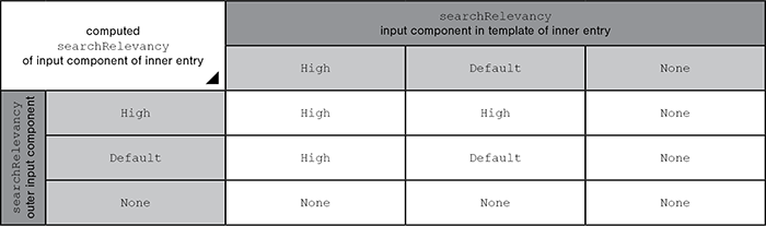
Hierarchy of evaluation:
- If searchRelevancy="none" is set for for this input component ("outer input component"),
- input components of inner entries will not be indexed regardless of the searchRelevancy setting of input components in the templates used for inner entries.
- If searchRelevancy="default" is set for for this input component ("outer input component"),
- input components in inner entries, with searchRelevancy="none" will not be indexed,
- input components in inner entries, with searchRelevancy="default" will be indexed with normal weight,
- input components in inner entries, with searchRelevancy="high" will be indexed with higher weight.
- If searchRelevancy="high" is set for for this input component ("outer input component"),
- input components in inner entries, with searchRelevancy="none" will not be indexed,
- input components in inner entries, with searchRelevancy="default" or searchRelevancy="high" will be indexed with higher weight.
Note: Header fields of snippets (tab Snippet in templates, "Label" field) are also indexed. If an input component is configured with a weighting none (searchRelevancy="none") but its value is included in the template's snippet header field, searching for the input component's value will cause the associated element to appear in search results
For further information, see
- page Search and indexing
- interface GomSearchRelevancy (package de.espirit.firstspirit.access.store.templatestore.gom, FirstSpirit Access API)
- interface SearchService (package de.espirit.firstspirit.access.search, FirstSpirit Access API)
- interface QueryAgent (package de.espirit.firstspirit.agency, FirstSpirit Access API)
| Parameter | Mandatory | Since | Type | Default value |
|---|---|---|---|---|
| searchRelevancy | No | 5.2.305 | Relevancy | DEFAULT |
simpleMode
The simpleMode parameter is used to customize the input component for simultaneous use in SiteArchitect and ContentCreator.
To make this possible, set the value of simpleMode to YES:
... simpleMode="YES" ...
When an input component configured in this way is used in SiteArchitect, no circular or polygonal border objects can be created in SiteArchitect (the corresponding icons are hidden).
By default (without setting simpleMode) or if simpleMode="NO", all border shapes are available.
ContentCreator is designed to support the creation of rectangular border objects only. Other border shapes (created with SiteArchitect, for example) are displayed rectangular with the following icon:  . The border cannot be edited (moved, changed in size) but the link (link target, link text, etc.) can.
| Parameter | Mandatory | Since | Type | Default value |
|---|---|---|---|---|
| simpleMode | No | 5.1 | YesNo | NO |
upload
The upload parameter can be used by the template developer to enable the editor to upload a medium via the input component.
The editor can either enter the picture in the media store dialog-controlled using the relevant button or directly add it to the input component using drag & drop.
The function is deactivated as a default; it is activated by specifying the parameter with the value YES (...upload="YES"...) .
In FirstSpirit ContentCreator media can only be uploaded into those folders (and subfolders) for which a selection is permitted.
| Parameter | Mandatory | Since | Type | Default value |
|---|---|---|---|---|
| upload | No | 5.2.2105 | YesNo | None |
useLanguages
The useLanguages parameter can be used to specify whether or not an input component is to store different or deviating values for different languages (multi-lingual maintenance).
If the parameter is not given, deviating values are stored for the different languages as a default.
If NO (...useLanguages="NO") is specified, one value is stored for all languages.
 useLanguages="YES" will potentially no longer be evaluated in FirstSpirit version 5.2R5 and higher. See also parameter forbidPolyglotDataHierarchy (FS_CATALOG).
| Parameter | Mandatory | Since | Type | Default value |
|---|---|---|---|---|
| useLanguages | No | 2.0 | YesNo | YES |
LANGINFOS
Using the tag LANGINFOS language-dependent information can be defined for each input component, e.g. which title is to be used for the input component in the different project languages (parameter label), which tooltip is to be displayed (parameter description) etc. For reasons of clarity, definitions which are identical in multiple languages will be merged. For example,
<LANGINFOS>
 <LANGINFO lang="*" label="Datum"/>
 <LANGINFO lang="DE" label="Datum"/>
 <LANGINFO lang="EN" label="Datum"/>
</LANGINFOS>
will be merged to
 <LANGINFOS>
 <LANGINFO lang="*" label="Datum"/>
</LANGINFOS>
after saving.
 Up to and including FirstSpirit version 4.2R2 language definitions will be deleted only in the case if the values are identical in all languages (as in example above). Furthermore, only the parameters lang, description and label are taken into account when merging.
 Since FirstSpirit version 4.2R4 all parameters are taken into account (e.g. format and length). Furthermore, language definitions are also merged within LANGINFOS tags, if they are identical in at least two languages. For example,
<LANGINFOS>
 <LANGINFO lang="*" label="Date" format="dd.MM.yy"/>
 <LANGINFO lang="DE" label="Date" format="dd.MM.yy"/>
 <LANGINFO lang="EN" label="Date" format="MM/dd/yy"/>
</LANGINFOS>
will become
 <LANGINFOS>
 <LANGINFO lang="*" label="Date" format="dd.MM.yy"/>
 <LANGINFO lang="EN" label="Date" format="MM/dd/yy"/>
</LANGINFOS>
after saving.
The definition for the fallback value (*) will not be deleted in any case. If there are two or more language definitions with identical values the first one will be maintained, the other will be deleted.
IMPORTANT: Up to and including FirstSpirit version 4.2R2 at least one definition for the fallback labelling ("*") must be given:
<LANGINFOS>
 <LANGINFO lang="*" label="TEXT"/>
</LANGINFOS>
From FirstSpirit version 4.2R4 the fallback definition can be omitted. In this case, the language which is defined first will be used automatically as fallback value. For example,
<LANGINFOS>
 <LANGINFO lang="EN" label="Date"/>
 <LANGINFO lang="DE" label="Datum"/>
</LANGINFOS>
will become
 <LANGINFOS>
 <LANGINFO lang="*" label="Date"/>
 <LANGINFO lang="DE" label="Datum"/>
</LANGINFOS>
after saving.
LANGINFO
The LANGINFO tag is used to give values or attributes for a language as well for use as fallback values.
In order to state values or attributes for a language it is necessary to give the abbreviation of the project language in the lang parameter:
...
<LANGINFO lang="DE".../>
...
Fallback values are given with the special language abbreviation * ("for all languages"):
...
<LANGINFO lang="*".../>
...
The lang parameter is a mandatory parameter.
| Parameter | Mandatory | Since | Type | Default value |
|---|---|---|---|---|
| lang* | Yes | 3.1 | LanguageAbbreviation | None |
| description | No | 3.1 | String | None |
| label | No | 3.1 | String | None |
lang
The lang parameter is used to give the language abbreviation which is entered in the server properties see Language templates (→Documentation for Administrators)) to specify for which project languages the definitions are to apply, e.g. DE for German, EN for English, FR for French etc. The following characters can be used as often as required: -, _, 0-9 and A-Z. Lower case letters are transformed automatically into upper case letters after having saved the template. In addition * can be used for fallback values.
| Parameter | Mandatory | Since | Type | Default value |
|---|---|---|---|---|
| lang* | Yes | 3.1 | LanguageAbbreviation | None |
description
The description parameter can be used to specify a description of how the input component is to be used and filled by the editor. The text defined here is displayed as a tooltip on mouse-over at the relevant input component.
The text should serve as a guide for the editor and be as short as possible, understandable and relevant. It should match the label (label parameter) and complement it appropriately.
Make sure to use terminology that the editor knows and expects.
Example:
...description="Please enter the text for the headline here (H1)."...
Tip: If you would like to know how to better support and guide editors when filling input components, take a look at the chapter on Rules and other parameters and functions of forms.
| Parameter | Mandatory | Since | Type | Default value |
|---|---|---|---|---|
| description | No | 3.1 | String | None |
label
Use the label parameter to define the label of the input component.
Choose a label that is as short and meaningful as possible.
In combination with a relevant description (description parameter), you can help the editor to use the input component correctly and successfully.
Example:
... label="Headline (H1)" ...
| Parameter | Mandatory | Since | Type | Default value |
|---|---|---|---|---|
| label | No | 3.1 | String | None |
LINKEDITORS
The LINKEDITORS tag can be used to specify the quantity of link templates usable in the input component.
The LINKEDITOR tag can be given in this tag. A usable link template corresponds to a LINKEDITOR tag.
If LINKEDITORS is not specified, all link templates existing in the project can be used by default.
If no link templates should be used, a LINKEDITOR definition with an empty name attribute must be specified. The corresponding icon for inserting a link is then hidden.
LINKEDITOR
A LINKEDITOR tag is used to precisely define a link template within the LINKEDITORS tag, which is to be available for use in the input component.
The tag has the mandatory parameter name, which must contain the reference name of the link template.
| Parameter | Mandatory | Since | Type | Default value |
|---|---|---|---|---|
| name* | Yes | 3.0 | String | None |
name
The name parameter in the LINKEDITOR tag is used to given the reference name of the link template which is to be available for selection in the input component.
If no link template should be used, a LINKEDITOR definition with an empty name attribute must be specified, for example
...
<LINKEDITORS>
 <LINKEDITOR name="" />
</LINKEDITORS>
...
| Parameter | Mandatory | Since | Type | Default value |
|---|---|---|---|---|
| name* | Yes | 3.0 | String | None |
PROJECTS
The tag PROJECTS can be used to define the projects (local and/or remote) from which references are allowed to be selected.
Remote projects are specified usind the tag REMOTE, using the tag CATEGORY one or more remote category/categories can be defined (for more information about remote categories please see Remote projects (→Documentation for Administrators)). The actual project is specified by the tag LOCAL. Any number of projects can be defined here.
Moreover, for each project the tags SOURCES and FOLDER can be given. They define from which folders a reference is allowed to be selected.
In SiteArchitect, the sorting of the project definitions has an impact on the order of projects in the selection and in the upload dialogue (the local project is excepted from this sorting).
 |
For restrictions of using remote media in ContentCreator please see page Restrictions. |
CATEGORY
Using CATEGORY one or more remote categorie/s can be defined. For each category one CATEGORY tag must be given.
If a remote category contains already defined remote projects these projects from the category will be ignored.
Moreover, for each project the tags SOURCES and FOLDER can be given. They define from which folders a reference is allowed to be selected. All folders from the projects of the given remote category defined via CATEGORY are taken into account, which have the name defined by name attribute in the FOLDER tag. I.e. if the folder name specified by the name attribute exists only in one project of the remote category, only this folder will be shown in the selection dialogue. If the folder name exists in several projects, the folders of all concerned projects are shown in the selection dialogue.
|
A valid licence for the Remote media access is required to be able to use the CATEGORY tag. |
| Parameter | Mandatory | Since | Type | Default value |
|---|---|---|---|---|
| name* | Yes | 4.2 | String | None |
name
A valid name of a remote category must be given for the name parameter.
|
If two or more REMOTE or CATEGORY tags with the same name are given, only the first definition will be taken into account. |
| Parameter | Mandatory | Since | Type | Default value |
|---|---|---|---|---|
| name* | Yes | 4.2 | String | None |
SOURCES
The SOURCES tag can be used to limit the selection or display to defined folders (including sub-folders).
SOURCES is a positive list, i.e. only the given folders are allowed.
To allow a folder, a FOLDER tag must be specified for each.
FOLDER
The FOLDER tag is used to specify a folder which is to be taken into account.
When specifying a FOLDER the name parameter must be given with a valid folder name as well as the store parameter with a valid name of the respective store.
| Parameter | Mandatory | Since | Type | Default value |
|---|---|---|---|---|
| name* | Yes | 4.2 | String | None |
| store* | Yes | 4.2 | String | None |
name
A valid folder name must be given for the name parameter. To allow the complete store the value root is to be given:
<FOLDER name="root">
| Parameter | Mandatory | Since | Type | Default value |
|---|---|---|---|---|
| name* | Yes | 4.2 | String | None |
store
The name of the store must be specified by the parameter store. In this case only the Media Store can be used:
...store="mediastore"...
| Parameter | Mandatory | Since | Type | Default value |
|---|---|---|---|---|
| store* | Yes | 4.2 | String | None |
LOCAL
This tag can be used for specifying the local project if the Tag PROJECTS is given.
| Parameter | Mandatory | Since | Type | Default value |
|---|---|---|---|---|
| name | No | 4.2 | String | None |
| uploadFolder | No | 4.2 | String | None |
name
The parameter name must be used for defining the name of the local project. By default, a . (dot) must be used for this:
<LOCAL name=".">
| Parameter | Mandatory | Since | Type | Default value |
|---|---|---|---|---|
| name | No | 4.2 | String | None |
uploadFolder
If the uploadFolder parameter is given with a valid folder name from the media store the picture entered by the editor via the input component is created or uploaded directly into the given folder.
If the parameter is not given or if the folder name is not valid the editor must manually select the destination folder from the media store before selecting the medium.
|
The parameter is only used if the upload parameter has been additionally specified with the value YES . |
| Parameter | Mandatory | Since | Type | Default value |
|---|---|---|---|---|
| uploadFolder | No | 4.2 | String | None |
SOURCES
The SOURCES tag can be used to limit the selection or display to defined folders (including sub-folders).
SOURCES is a positive list, i.e. only the given folders are allowed.
To allow a folder, a FOLDER tag must be specified for each.
FOLDER
The FOLDER tag is used to specify a folder which is to be taken into account.
When specifying a FOLDER the name parameter must be given with a valid folder name of the Media Store.
| Parameter | Mandatory | Since | Type | Default value |
|---|---|---|---|---|
| name* | Yes | 4.2 | String | None |
name
A valid folder name must be given for the name parameter. To allow the complete store the value root is to be given:
<FOLDER name="root">
| Parameter | Mandatory | Since | Type | Default value |
|---|---|---|---|---|
| name* | Yes | 4.2 | String | None |
REMOTE
Using this tag one or more remote projects can be defined which is/are to be taken into account. For each remote project one REMOTE tag must be given.
|
A valid licence for the Remote media access is required to be able to use the REMOTE tag. |
| Parameter | Mandatory | Since | Type | Default value |
|---|---|---|---|---|
| name* | Yes | 4.2 | String | None |
| autoReleaseAfterUpload | No | 4.2 | YesNo | None |
| uploadFolder | No | 4.2 | String | None |
name
Using the parameter name the symbolic name of the remote project is specified.
| Parameter | Mandatory | Since | Type | Default value |
|---|---|---|---|---|
| name* | Yes | 4.2 | String | None |
autoReleaseAfterUpload
The parameter autoReleaseAfterUpload is used for defining if media which are uploaded by this input component into the respective remote project are released directly (auto release).
If the remote project, in which a medium is to be uploaded, does not use automatic release (i.e. objects must always be released manually), this medium must be released (via workflow) by default. Using autoReleaseAfterUpload="YES" you can define that media, which are uploaded by this input component, will be released directly. If autoReleaseAfterUpload="NO" is given auto release will be disabled. The advantage is that when uploading a medium via the target project into the remote project, the editor does not need to switch to the remote project for requesting / performing a release.
This parameter is only taken into account if the upload is enabled for this input component via upload="YES".
|
Auto release can only be used if the user has got the necessary rights. If the user has no release rights in the project into which the object is to be uploaded, the object will be uploaded anyway, but not released. |
| Parameter | Mandatory | Since | Type | Default value |
|---|---|---|---|---|
| autoReleaseAfterUpload | No | 4.2 | YesNo | None |
uploadFolder
If the uploadFolder parameter is given with a valid folder name from the media store the picture entered by the editor via the input component is created or uploaded directly into the given folder.
If the parameter is not given or if the folder name is not valid the editor must manually select the destination folder from the media store before selecting the medium.
|
The parameter is only used if the upload parameter has been additionally specified with the value YES . |
| Parameter | Mandatory | Since | Type | Default value |
|---|---|---|---|---|
| uploadFolder | No | 4.2 | String | None |
SOURCES
The SOURCES tag can be used to limit the selection or display to defined folders (including sub-folders).
SOURCES is a positive list, i.e. only the given folders are allowed.
To allow a folder, a FOLDER tag must be specified for each.
FOLDER
The FOLDER tag is used to specify a folder which is to be taken into account.
When specifying a FOLDER the name parameter must be given with a valid folder name of the Media Store.
| Parameter | Mandatory | Since | Type | Default value |
|---|---|---|---|---|
| name* | Yes | 4.2 | String | None |
name
A valid folder name must be given for the name parameter. To allow the complete store the value root is to be given:
<FOLDER name="root">
| Parameter | Mandatory | Since | Type | Default value |
|---|---|---|---|---|
| name* | Yes | 4.2 | String | None |


Example
An example of the input component IMAGEMAP:
<CMS_INPUT_IMAGEMAP useLanguages="NO" hFill="YES" name="IDENTIFIER">
  <LANGINFOS>
    <LANGINFO lang="*" label="TEXT_FALLBACK" description="TEXT_FALLBACK"/>
    <LANGINFO lang="DE" label="TEXT_DE" description="TEXT_DE"/>
    <LANGINFO lang="EN" label="TEXT_EN" description="TEXT_EN"/>
  </LANGINFOS>
</CMS_INPUT_IMAGEMAP>
Example of use in template syntax
The values entered by an editor in the CMS_INPUT_IMAGEMAP input component in the Page Store can be subsequently output in different ways.
Definition in HTML of an Imagemap
A link-sensitive graphic (“image map”) is usually output with the help of the HTML tags img, area and map. For example, the source text of an image map looks like this:
<img src="..." alt="Alternative_text_picture" usemap="#MAPNAME">
<map name="MAPNAME">
    <area shape="rect" coords="11,10,59,29"
             href="http://www.google.com/" alt="Alternative_text_link" title="Titletext_link">
</map>
A picture is displayed in the first line via the img tag.
The map tag can be used to make parts of the image area link-sensitive (i.e. clickable “hot-spots” or active areas, user clicks on hot-spots to open link). The name attribute defines the name of the image map file. In a graphic (img tag), the usemap attribute can then be used to access the definition (i.e. it defines location of the image map file).
|
For XHTML conforming to the standard, single or detached tags such as area and image must be labelled as being empty (contains attributes only), i.e., e.g. <area ... /> and <image ... />. |
The shape attribute is used to define the shape of the hot-spot, the coordinates of the areas are given using the coords attribute. This is absolute pixel information, which is separated by commas. Pixel x coordinates are measured from the left-hand edge of the picture, y coordinates give the distance to the top edge of the picture.
- rect: The x and y coordinates of the top left and bottom right-hand corners must be given in pairs for rectangular areas, e.g. shape="rect" coords="11,10,59,29"
- x coordinate of the top left-hand corner: 11
- y coordinate of the top left-hand corner: 10
- x coordinate of the bottom right-hand corner: 59
- y coordinate of the bottom right-hand corner: 29 - circle: Circles are defined by the coordinates of the centre given in pairs, plus the radius, e.g. shape="circle" coords="86,242,50"
- x coordinate of the centre: 86
- y coordinate of the centre: 242
- Radius: 50 - poly: For polygons, the coordinates of each individual vertex (corner) are given in pairs, e.g. shape="poly" coords="131,139,268,435,183,77,177,51"
- x coordinate of the first point: 131
- y coordinate of the first point: 139
- x coordinate of the second point: 268
- y coordinate of the second point: 435, etc.
- i.e., the horizontal and vertical position of each vertex of the polygon in order (in this case 4-sided).
|
ContentCreator only supports rectangular areas, as well in SiteArchitect in the simpleMode. |
Output of the elements of an image map in FirstSpirit
The hot-spots or active areas of a CMS_INPUT_IMAGEMAP input component are output using the .areas method (see interface MappingMedium, package de.espirit.firstspirit.access.editor.value). As several hot-spots or active areas can be entered within a CMS_INPUT_IMAGEMAP input component, the instruction $CMS_FOR(...)$ is used to enable the attributes of each individual area to be output:
$CMS_FOR(AREA, st_imagemap.areas)
Several different methods can be applied to the AREA variable. The general syntax for this is:
$CMS_VALUE(AREA.METHOD)$
|
The variable name AREA must be adjusted accordingly for use within a project! |
Common methods
Call | Meaning | Return value |
|---|---|---|
AREA.shape | returns the defined shapes of the hot-spots |
|
AREA.coordinates | returns the coordinates of the hot-spots | String (character string) |
AREA.link | returns the link anchored on the hot-spots | Link |
Special methods
Type / shape | Call | Meaning |
|---|---|---|
Rectangle | AREA.leftTop | determines the x and y coordinates of the top left-hand corner of a rectangle |
AREA.leftBottom | determines the x and y coordinates of the bottom right-hand corner of a rectangle | |
Circle | AREA.center | determines the x and y coordinates of the centre of a circle |
AREA.radius | determines the radius of a circle | |
Polygon | AREA.points | determines the x and y coordinates of each point of a polygon |
The x and y coordinate values can also be individually queried.
The corresponding syntax for this for rectangles is:
- for the x coordinate of the top left-hand point: $CMS_VALUE(AREA.leftTop.x)
- for the y coordinate of the top left-hand point: $CMS_VALUE(AREA.leftTop.y)
- for the x coordinate of the bottom right-hand point: $CMS_VALUE(AREA.rightBottom.x)
- for the y coordinate of the bottom right-hand point: $CMS_VALUE(AREA.rightBottom.y)
The coordinates of the centre of a circle are output as follows:
- for the x coordinate of the centre: $CMS_VALUE(AREA.center.x)$
- for the y coordinate of the centre: $CMS_VALUE(AREA.center.y)$
As a polygon can have many vortices, the $CMS_FOR(...)$ instruction must be used to output the x and y coordinates of all corners (vortices):
$CMS_FOR(point, AREA.points)$
         x: $CMS_VALUE(point.x)$, y: $CMS_VALUE(point.y)$
 $CMS_END_FOR$
Output via link templates
Another way of outputting the links of a hot-spot is using the instruction $CMS_VALUE(AREA.link)$. In this case, the template set of the link template (see Chapter Link templates) is used.
HTML channel code example (page or section template, via which the image map is to be output):
<map name="MAPNAME">
    $CMS_FOR(AREA, st_imagemap.areas)$
        $CMS_VALUE(AREA.link)$
    $CMS_END_FOR$
</map>
The information of the image map entered in the Page Store is output in the template set of the link template as follows:
<area
    shape="$CMS_VALUE(AREA.shape)$"
    coords="$CMS_VALUE(AREA.coordinates)$"
    alt="$CMS_VALUE(lt_text)$"
    title="$CMS_VALUE(lt_text)$"
    href="$CMS_REF(lt_reference)$" />
with lt_text and lt_reference are the variables for the link text and link destination of the selected link template.
|
The AREA variable can only be accessed here as it is located in the internal evaluation context of the FOR loop. To check whether the AREA variable is defined or not in the page or section template via which the image map is to be output, a $CMS_IF(!AREA.isNull)$ can be added. |
Automatic output using the areasAsHtml method
The areasAsHtml method is a simple option for automatically outputting an (X)HTML conforming image map.
|
Use of this method is not recommended to be used. |
Code example for HTML channel:
<map name="MAPNAME">
   $CMS_VALUE(st_imagemap.getAreasAsHtml())$
</map>
This method outputs all the areas entered in the input component including the following attributes:
- shape: Shape of the hot-spots
- coords: Coordinates of the hot-spots
- alt or title: Text entered in the "text" field of the link for the hot-spot
- href: Link destination (reference) selected for the hot-spot
Example:
<map name="MAPNAME">
<area shape="RECT" coords="20,18,120,118" alt="linktext" title="linktext" href="http://www.bild.de"/><area shape="CIRCLE" coords="86,242,50" alt="Heise" title="Heise" href="http://www.heise.de"/><area shape="POLY" coords="131,139,401,77,303,45,177,51" alt="Chip" title="Chip" href="http://www.chip.de"/>
</map>
This output cannot be edited or further processed.