

Creating section templates
Section templates are used to add content to the basic framework of a page. All input components which are to contain dynamic page content (text, tables, images, datasets, etc.) are defined within a section template. Any number of sections can be added to each content area of a page. Different section templates are usually made available within the project for the different types of content (for more information on section templates, see here).
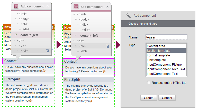
In the example below, the “teaser” section template is made available for the left-hand content area. This template now has to be created in the import project.
 To do this, open the “Edit entry” view for the HTML file again and click the required HTML area to open the overlay window. The selected section is located in the left-hand content area of the page. This means that the entries within the overlay window also show the “content_left” content area that was transferred previously. The current element is highlighted within the preview by means of a frame. Keep moving the mouse pointer up until the relevant section has a frame around it in the preview. If the correct DIV element has been identified, click the relevant entry in the overlay window. This opens the Add component dialog. Here, you must assign a name to the component, e.g., “teaser” and select the required type (in this case: “Section template”). You should leave the “Replace entire HTML tag” box unchecked (default behavior).
 If the box is checked, the entire HTML tag is replaced by FirstSpirit-specific syntax. This is only necessary for a small number of use cases and so the box is left unchecked by default.
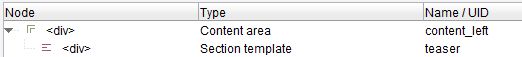
When you click the Create button, the new component is transferred to the list view in the bottom section of the window. The structure of the listed components matches the hierarchy shown within the HTML structure. Consequently, the “teaser” component (section template) is located below the “content_left” content area that was created previously (see Creating content areas).
Transferring changes to the import project
As soon as you click the  button to save the changes in the HTML preview, the new component is transferred to the “Overview” tab as well:
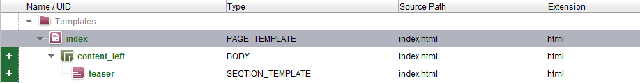
The element is labeled with the “New” state (see State information).
Using this technique, additional section templates can now be identified and created in the template wizard. After that, the next step is to add input components to the section template (see Creating input components).
Detection of variants
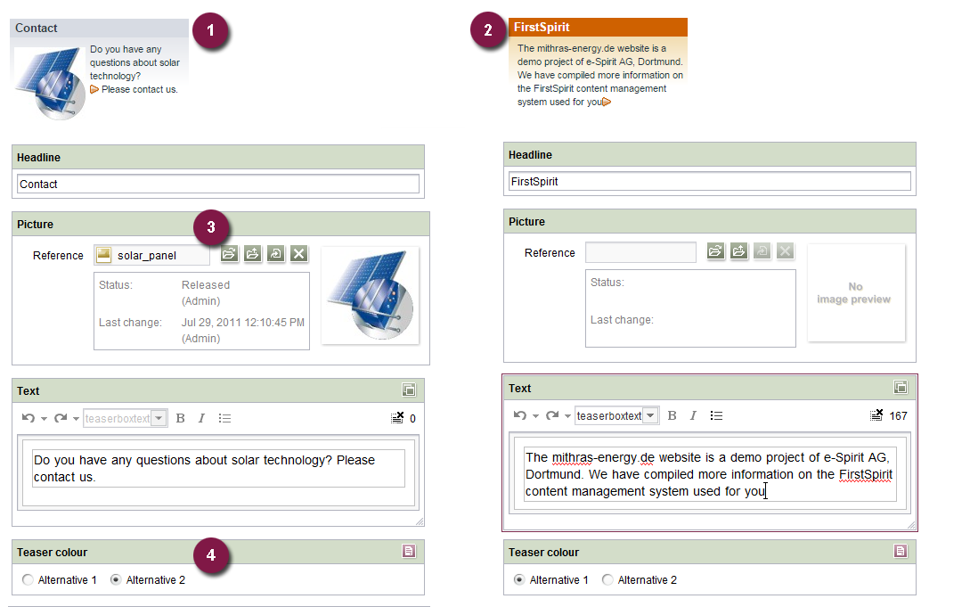
Design elements within the templates can be used to vary how sections are displayed. As a result, sections can be provided with a different appearance even though they are based on the same template and rely on the same form elements. In the example shown below, the “teaser” section template uses additional input components to allow greater customization of a particular section's appearance by the editor:
Input components can be defined as optional or mandatory via the template. In the example, the editor is required to enter a value for the “Title” input component but does not have to specify an image (3), because this is optional. In “teaser” variant (1), an image has been referenced but in “teaser” variant (2), no image has been included.
There is also a radio button (4) for changing the color of the teaser box. The corresponding switch in the template set must be created within the template (for example using $CMS_IF....$).
The template wizard is capable of creating different variants of a template. However, this is only possible if the VARIANT component template is present on the Settings tab (default setting).
If a “teaser” section template is created with the “st_headline” and “st_text” input components (see Creating input components) and then another “teaser” section template is created with the “st_headline”, “st_text”, and “st_picture” input components, only one section template is created when this content is imported into the FirstSpirit project (not two different ones). This single section template is capable of handling different content (e.g., optional input components) and different designs (e.g., background colors, alignment).
Prerequisites for detecting a variant:
- Component type (e.g., section template) and component name (unique identifier) must be identical
- VARIANT component template must be present on the Settings tab
In addition to the input components that were created via the template wizard (in this case: “st_headline”, “st_text”, and “st_picture”) the form for this section template also contains an additional input component once the content has been imported into the FirstSpirit project: <CMS_INPUT_COMBOBOX name="variant">. This combo box makes it possible to switch between the different display variants within the form.