

"Properties" tab
Some settings that apply to the corresponding section template can be changed on the “Properties” tab.
This tab is represented in the compact view by the  icon (see Compact view of tabs (→Documentation FirstSpirit SiteArchitect)).
General
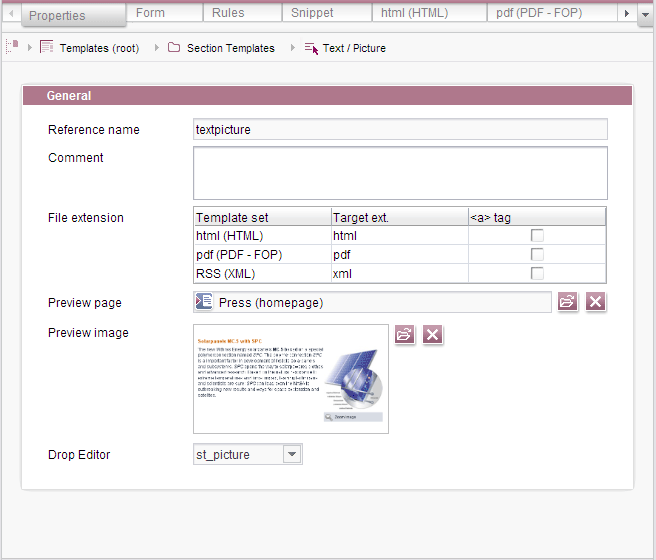
Reference name
The reference name is aunique identifier under which the template will be saved in the file system.
Comment
A comment that describes the section template in more detail can be entered here.
File extension
There is a line in the table for each template set which provides information about the template set, the target extension, and the use of <a> tags.
Template set: Name and type of the template sets which have been defined in the ServerManager for the current project.
Target ext.: The template extension that is to be linked. The extension can be edited by double-clicking in the field.
<a> tag: If the box is checked, anchor links which can subsequently be used within a link template are generated automatically from the reference name of the section.
Anchor links are used for internal links, for example. For more information, see the Internal links page.
Preview page
You can select a page from the Site Store here, in which this template is used.
So you can check the result of your configuration of the template (especially HTML definitions) directly on the corresponding tab of the template with the preview function. This will facilitate your work immensely.
Preview image
Make the editors' work easier in the FirstSpirit ContentCreator or SiteArchitect and create a meaningful screenshot for this template.
The screenshot should show how the template in question looks in the frontend or what it does. This way you support the editor in choosing the right template. Of course, it can also be another graphic if it conveys to the editor how to correctly apply the template in question.
Upload the screenshot using the  icon.
icon.
Drop Editor
New sections can be created using drag-and-drop of FirstSpirit objects (for example media, datasets, pages) or text (for example from word processing programs, from web pages etc.) in ContentCreator. For this purpose, an appropriately configured FS_BUTTON (for example with onDrop="class:NewSection") must exist on the desired page. For information about the HTML output see FS_BUTTON handler classes.
This combo box can be used to select which input component is to have the dropped object pre-assigned to it, and the object will be saved to this input component accordingly. It shows shows all the identifiers for input components of the following types that have been defined on the Form tab
- FS_BUTTON
- FS_REFERENCE
- FS_DATASET
- FS_INDEX
- CMS_INPUT_IMAGEMAP
- CMS_INPUT_DOM
- CMS_INPUT_TEXT
- CMS_INPUT_TEXTAREA
For example, FS_REFERENCE can be used to incorporate references on pages, page references, and media while FS_DATASET can be used to incorporate datasets. FS_BUTTON can be used in various scenarios, such as when you want to check which type of object may be dropped onto the drop zone (DROPTYPES / MIME, and TYPE tags), e.g., in the case of data originating from customer-specific reports. CMS_INPUT_DOM and other text input components can be used to incorporate dropped text.
In the context of ContentCreator, an editor who is performing a drop operation can choose from all section templates in which the input component type selected here is compatible with the object being dropped and which may be used in the relevant content area of the page (“Page template / tab: 'Properties' / Content areas / Allowed section templates”). If there is only one compatible section template, this is used automatically to create the section when the object is dropped (unless there are empty mandatory fields or certain rules are violated so as to prevent saving), , the dropped object is saved in the input component that was selected under “Drop Editor”.
If multiple section templates are available for selection, the editor can select the required template from a list. When the form opens, the object that is being dropped is pre-assigned to the input component selected under “Drop Editor”. The editor can choose to accept it or – depending on how the input component is configured – can change/delete it, and enter and save any additional section content in the usual manner. If the section that is being created contains mandatory fields (e.g., because of rules or the allowEmpty="no" parameter), the form likewise opens.
If the object being dropped is a section that is compatible with the body parameter, a direct copy of the section is created.
If no corresponding input component has been defined on the Form tab, the selection remains empty (<not assigned>). If <not assigned> is selected, the section template is not used for a drop operation (exception: if a compatible section is dropped).
Default values are defined on the Form tab.