

Creating forms and input components
Editorial content can be maintained in FirstSpirit using forms, which are an integral part of the templates. Each form can contain numerous input and design components, such as a text form field or an image selection component. The required input components are incorporated into the Form tab area of the template by the template developer (see Information on forms and input components).
In the course of the examples we have seen so far, only the basic structures for page and section templates have been created in the template wizard, but no forms or input components. As a result, the editorial content in the HTML mockup can only be created very rigidly within the HTML structure. If, for example, you were to import the “teaser” template section that was created previously (see Creating section templates) into the FirstSpirit project, only the HTML channel would be populated. For example, the “Contact” H3 title would be populated with:
<h3 class="h3back">Contact</h3>
and the lower-level section and link with:
<p><a href="...>Do you have any questions...?<img class="..." src="$CMS_REF(media:"icon_signlink")$" alt="" /></a></p>
If you want this content to be replaced dynamically, you must now create input components for the section template. The relevant expressions in the template set will then be replaced automatically with the relevant placeholders in FirstSpirit syntax.
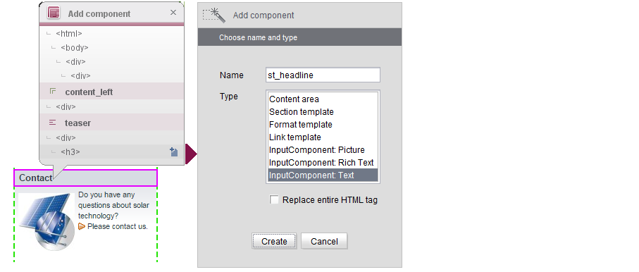
 To do this, open the "Edit entry" view for the HTML file again. Clicking the required HTML area opens the “Add components” overlay window. The selected content is located below the “content_left” (content area) and “teaser” (section template) components that have already been entered for the page.
Creating a text input component (CMS_INPUT_TEXT)
First of all, a text input component must be added to the “teaser” section template so that a title can be entered. To do this, go to the overlay window and click the <H3> tag in the HTML structure. The Add component dialog opens. Here, you must assign a name to the component, e.g., “st_headline” and select the required type (in this case: “Input component: Text”).
 If the box is checked, the entire HTML tag is replaced by FirstSpirit-specific syntax. This is only necessary for a small number of use cases and so the box is left unchecked by default.
You should leave the “Replace entire HTML tag” box unchecked in order to preserve the <H3> tag of the HTML template.
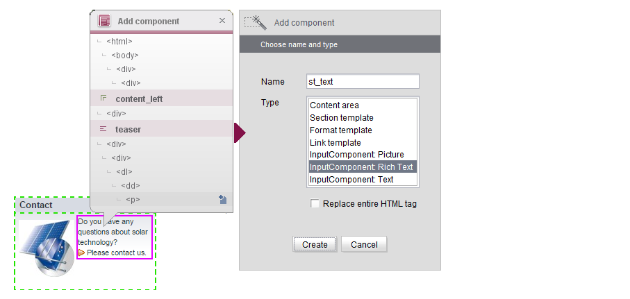
Creating a rich text input component
Then, the <P> tag below the title also has to be selected and used as the basis for creating an “Input component: Rich text” called “st_text”. Once again, this is done using the “Add component” dialog and the “Replace entire HTML tag” can be left unchecked:
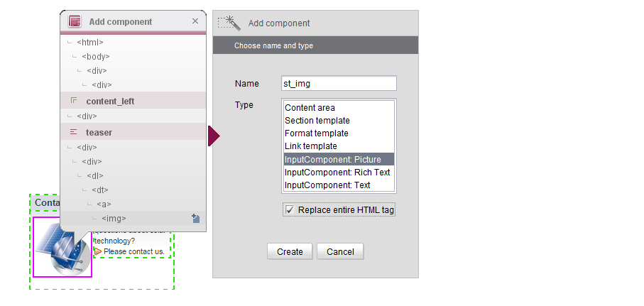
Creating a picture input component
The next step is to select the <img> tag and use the “Add component” dialog to create an “Input component: Picture” called “st_img”.
In this case, the “Replace entire HTML tag” checkbox should be checked. The original <img> tag has to be removed and replaced by the relevant FirstSpirit syntax.
Unless the tag is replaced in its entirety, the old image reference will be retained next to the new reference that points to the FirstSpirit input component:
<a href="#"><img src="Homepage/Solarkollektor_TeaserBox.jpg" alt="" ><img src="$CMS_REF(picture)$" /></img></a>
In this case, a new page within the project will display the message “broken image”.
Creating other input components
The Add component dialog only contains a few standard input components. However, further components can be added on the Settings tab and these are then made available via the selection dialog box as well. For more information on creating further input components, see Form builder.
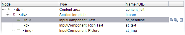
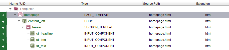
List view of the created components
When you click the Create button, the new components are transferred to the list view in the bottom section of the window. The structure of the listed components matches the hierarchy shown within the HTML structure. Consequently, the “st_headline”, “st_text”, and “st_img” input components are located below the “teaser” section template that was created previously (see Creating a section template):
Editing the list view:
 Edit an added component: Click this icon to open the “Edit component” dialog containing all the values that have been defined for the selected component. You can edit all the values and accept the changes by clicking the “Apply” button.
 View complete HTML structure for component: Click this icon to open a window showing the full HTML structure for the selected component.
 Remove component from list: Click this icon to remove the selected component from the list.
Transferring changes to the import project
As soon as you click the  button to save the changes in the HTML preview, the new component is transferred to the “Overview” tab as well:
The elements are labeled with the “New” state (see State information).
Using this technique, additional input components can now be identified and created in the template wizard. After that, the next step is to import the content into the FirstSpirit project.