

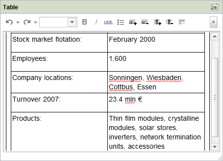
Tables (CMS_INPUT_DOMTABLE)
This input form can be used to input larger text entries with simple formatting and link inputs directly in the table view.
If the project developer has defined a default value for the input form, the “Reset to default value” icon  or the “Adopt default value” icon
 is located in the top right-hand corner.
Depending on the project's configuration, a spell checkcan be carried out within the input form.
 The height of the input component is continuously adjustable thanks to the adjustment handle in the bottom right-hand corner. However, the height of the input component cannot be reduced below the minimum height stipulated.
 Open in separate window: Click this icon to open the Editor window in full-screen size to be able to edit large amounts of text comfortably. The window is closed by clicking the “x” icon in the top right-hand corner or by switching to the view mode. The contents of the large window are then always automatically copied into the small window.
 Predefined formatting which is to apply to the selected text only can be selected here. The available formatting options are defined in the format templates and specified by the project developer.
 Bold: This icon can be used to highlight selected text in the editor with bold font. Furthermore, corresponding visible markers (
 ) are inserted at the start and end of the bold selected text. Click this icon within the markers to remove the formatting again.
 Italic: This icon can be used to highlight selected text in the editor with italic font. Furthermore, corresponding visible markers (
 ) are inserted at the start and end of the italicized selected text. Click this icon within the markers to remove the formatting again.
 Insert Link: Use this icon to insert a link at the cursor's current position. The procedure for setting a link is the same as that described for the “Link input” input component. (See section 11.8, page 290.) (
 )
)
 Insert List: Use this icon to insert a list in the current section.
 Add row: An entire row is added below the highlighted row by clicking on this icon.
You can even use the “Insert row above” context menu function to insert a new row above the very first row.
 Delete row: Click this icon to delete the entire row that contains the highlighted cell from the table.
 Add column: An entire column is added to the right of the highlighted cell by clicking on this icon.
You can even use the “Insert column to the left” context menu function to insert a new column to the left of the very first column.
 Delete column: Click this icon to delete the entire column that contains the highlighted cell from the table.
 Merge cells: Click this icon to merge the selected cells with each other. The content of the selected cells is retained.
 Split cells: Click this icon to split merged cells again. The content of the merged cells is retained in the extreme left-hand or top cell.
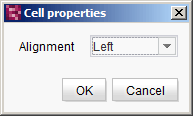
Cell properties
 Cell properties: Click this icon to open a window with the properties of the selected cell. The template developer specifies which cell properties can be changed. This could include, for example, text alignment, background color or number formats.
 Import: Click this icon to open a window for importing text (.txt) or CSV (.csv) files whose content is transferred directly into a table (see Import table). Each line of the text/CSV file is written into a table row; columns can be generated by separators. Important: An import deletes all the table content to date and replaces it with the imported content.
 Undo: This icon can be used to undo entries made or formatting set. Click the arrow to open a list with all the most recently made changes so that several changes can be undone simultaneously.
 Restore: Use this icon to restore entries and formatting which have been undone. Click the arrow to open a list with all the most recently undone changes so that several changes can be restored simultaneously.
 Show/hide lines: Use this icon to hide the table frame. Click the icon again to display the frame once more.

Import table
In this window you can specify the details of the file to be imported.
File: The  icon can be used to select the required file from the workstation's directory structure.
Encoding: The icon can be used to select the required encoding by which the source file is to be converged.
Delimiter: The delimiter which separates the content of adjacent cells can be defined here.
 |
Most of the functions of the rich text editor's context menu are also available in the “Table” input form. |
|
Additional formatting options and the integration of tables into continuous text are provided by the so-called inline tables. |
|
Depending on the template developer's specifications, the functionality of the license-dependent module FirstSpirit OfficeConnect may be available. This module is used for importing formatted content from Word documents using the  icon. For detailed information see the “FirstSpirit OfficeConnect” module documentation. icon. For detailed information see the “FirstSpirit OfficeConnect” module documentation. |