

Date/time selection (CMS_INPUT_DATE)
The date/time selection can be used to select a date and/or a time.
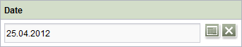
Click the  icon to open a window in which the date and/or time can be selected. Click the
  icon to remove the selected date and/or time from the input component.
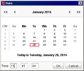
Selecting a date
A new date can be selected within this window and is then automatically transferred into the input form in the format which has been specified by the template developer. When the dialog box is opened the currently entered date is displayed as a default (red border). The user can click the calendar view to select a new date. Use the  icon to page forward/back a month and use the
  icon to page the calendar view forward/back a year. Regional and national public holidays are highlighted in the calendar view in different colors. A time can be entered in the lower area of this window.
According to the configuration set by the project developer, the date and/or time can also be entered directly into the input component, namely in a preset format. If the format of the entry differs from the requested format, the date/time cannot be saved and an error message will be displayed instead.
If the project developer has defined a default value for the input component, the “Reset to default value” icon  or the “Adopt default value” icon
  is located in the top right-hand corner.