

Selection list (CMS_INPUT_COMBOBOX)
Using a selection list (combobox), the user can
- select exactly one value from a set of values specified by the project developer or
- leave the selection empty.
Depending on the configuration, the user can enter a separate value as well.
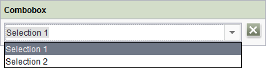
To make a selection, click the arrow symbol next to the input line. The selection list then opens so that you can select the required value. You can deselect the value again by clicking the  icon.
icon.
Alternatively, values can also be set via other input components in the form (depending on the project configuration).
If the project developer has defined a default value for the input component, the “Reset to default value” icon  or the “Adopt default value” icon
  is located in the top right-hand corner.