

Default values
The “Reset to default value” icon  can be seen in the top right-hand corner of input forms. This icon always appears if the template developer has specified a default value for this input form.
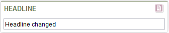
Component with modified content
Click the icon to reset the content of the input component back to the default value specified by the project developer.
A confirmation prompt appears asking whether you are sure you want to delete the current content.
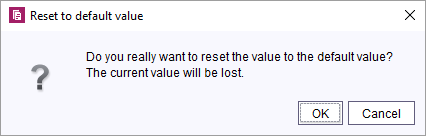
Confirm the prompt with OK to delete the current content of the input component and replace it with the default value.
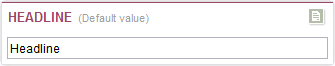
The input component is surrounded with a different-colored frame to indicate that its content is a default value. The “Adopt default value” icon  now appears in the top right-hand corner.
Input component with default value
The red form headline characterizes input component with default values. This color shows that the default value of a template is projected to a value-free input component.
Click on the icon to adopt the default value as input value. The color of the headline will then change to green.
For further information on Default values see Default values (→FirstSpirit Online Documentation).