

Toggle (CMS_INPUT_TOGGLE)
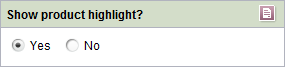
This input form does not allow users to enter content directly; instead, users can select from values specified by the project developer.
Toggles enable users to
- choose between precisely two specified values (e.g., on/off, right/left).
If one field is activated, the other is disabled.
The toggle can be shown as a radio button or a checkbox.
If the project developer has defined a default value for the input component, the “Reset to default value” icon  or the “Adopt default value” icon
  is located in the top right-hand corner.