

CMS_GROUP
CMS_GROUP - Frame
This component is a special case as it is not used for including editorial contents but for the graphical grouping of further input components. The required input components can be collated together to form a group.
There are two ways of grouping the input components:
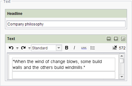
- The input components (like all other components too) are displayed under each other and are identified as a group by a surrounding frame.
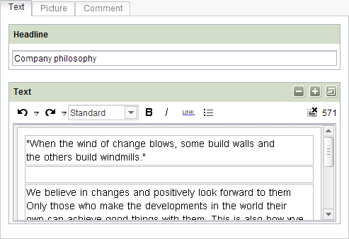
- Each input component is displayed in its own, separate tab.
| Contents |
| for example |
CMS_GROUP - Tab
Optional parameters
Optional parameters
Optional parameters
Optional parameters
Mandatory
Optional parameters
Optional parameters
Parameter
The CMS_GROUP component has three optional parameters:
- name: technical identifier of a grouping, e.g. for use in a BeanShell script
- scrollable: defines whether a grouping has scroll bars or not
- tab: display of input components as tabs
| Parameter | Mandatory | Since | Type | Default value |
|---|---|---|---|---|
| height | No | 4.0.28 | PositiveInteger | None |
| name | No | 4.2 | Designator | None |
| scrollable | No | 4.0 | GroupScrollMode | None |
| tabs | No | 4.0 | TabMode | NONE |
height
The height parameter is used to define the display height of the group in pixel.
The parameter expects an integer value, greater than 200. If the parameter is not specified, the height of the group will depend on the input components which are contained in the group.
If more than one tab is defined (parameter tabs) the height depends on the height of the input components of the depending tab.
| Parameter | Mandatory | Since | Type | Default value |
|---|---|---|---|---|
| height | No | 4.0.28 | PositiveInteger | None |
name
The optional parameter name can be used to assign an identifier to a grouping.
This identifier is used to enable programming access to a grouping, for example in a BeanShell script, or to display a message in the context of rules / dynamic forms (see page <MESSAGE/>: Displaying correction notes).
Unlike identifiers of input components (parameter name as well) the identifier for CMS_GROUP does not have to be unique within a form.
| Parameter | Mandatory | Since | Type | Default value |
|---|---|---|---|---|
| name | No | 4.2 | Designator | None |
scrollable
The optional parameter scrollable can be used to specify whether a grouping is to be capable of displaying scroll bars or not.
| Parameter | Mandatory | Since | Type | Default value |
|---|---|---|---|---|
| scrollable | No | 4.0 | GroupScrollMode | None |
tabs
The optional parameter tabs can be used to display input components in a grouping as tabs.
The orientation of the tabs can be specified.
It is possible to choose between left and right as well as top and bottom for the alignment of the tabs in SiteArchitect.
If the parameter is not given, no tabs are displayed.
Note: ContentCreator can only display tabs at the top!
| Parameter | Mandatory | Since | Type | Default value |
|---|---|---|---|---|
| tabs | No | 4.0 | TabMode | NONE |
LANGINFOS
Using the tag LANGINFOS language-dependent information can be defined for each input component, e.g. which title is to be used for the input component in the different project languages (parameter label), which tooltip is to be displayed (parameter description) etc. For reasons of clarity, definitions which are identical in multiple languages will be merged. For example,
<LANGINFOS>
 <LANGINFO lang="*" label="Datum"/>
 <LANGINFO lang="DE" label="Datum"/>
 <LANGINFO lang="EN" label="Datum"/>
</LANGINFOS>
will be merged to
 <LANGINFOS>
 <LANGINFO lang="*" label="Datum"/>
</LANGINFOS>
after saving.
 Up to and including FirstSpirit version 4.2R2 language definitions will be deleted only in the case if the values are identical in all languages (as in example above). Furthermore, only the parameters lang, description and label are taken into account when merging.
 Since FirstSpirit version 4.2R4 all parameters are taken into account (e.g. format and length). Furthermore, language definitions are also merged within LANGINFOS tags, if they are identical in at least two languages. For example,
<LANGINFOS>
 <LANGINFO lang="*" label="Date" format="dd.MM.yy"/>
 <LANGINFO lang="DE" label="Date" format="dd.MM.yy"/>
 <LANGINFO lang="EN" label="Date" format="MM/dd/yy"/>
</LANGINFOS>
will become
 <LANGINFOS>
 <LANGINFO lang="*" label="Date" format="dd.MM.yy"/>
 <LANGINFO lang="EN" label="Date" format="MM/dd/yy"/>
</LANGINFOS>
after saving.
The definition for the fallback value (*) will not be deleted in any case. If there are two or more language definitions with identical values the first one will be maintained, the other will be deleted.
IMPORTANT: Up to and including FirstSpirit version 4.2R2 at least one definition for the fallback labelling ("*") must be given:
<LANGINFOS>
 <LANGINFO lang="*" label="TEXT"/>
</LANGINFOS>
From FirstSpirit version 4.2R4 the fallback definition can be omitted. In this case, the language which is defined first will be used automatically as fallback value. For example,
<LANGINFOS>
 <LANGINFO lang="EN" label="Date"/>
 <LANGINFO lang="DE" label="Datum"/>
</LANGINFOS>
will become
 <LANGINFOS>
 <LANGINFO lang="*" label="Date"/>
 <LANGINFO lang="DE" label="Datum"/>
</LANGINFOS>
after saving.
LANGINFO
The LANGINFO tag is used to give values or attributes for a language as well for use as fallback values.
In order to state values or attributes for a language it is necessary to give the abbreviation of the project language in the lang parameter:
...
<LANGINFO lang="DE".../>
...
Fallback values are given with the special language abbreviation * ("for all languages"):
...
<LANGINFO lang="*".../>
...
The lang parameter is a mandatory parameter.
| Parameter | Mandatory | Since | Type | Default value |
|---|---|---|---|---|
| lang* | Yes | 3.1 | LanguageAbbreviation | None |
| description | No | 3.1 | String | None |
| label | No | 3.1 | String | None |
lang
The lang parameter is used to give the language abbreviation which is entered in the server properties see Language templates (→Documentation for Administrators)) to specify for which project languages the definitions are to apply, e.g. DE for German, EN for English, FR for French etc. The following characters can be used as often as required: -, _, 0-9 and A-Z. Lower case letters are transformed automatically into upper case letters after having saved the template. In addition * can be used for fallback values.
| Parameter | Mandatory | Since | Type | Default value |
|---|---|---|---|---|
| lang* | Yes | 3.1 | LanguageAbbreviation | None |
description
The description parameter can be used to specify a description of how the input component is to be used and filled by the editor. The text defined here is displayed as a tooltip on mouse-over at the relevant input component.
The text should serve as a guide for the editor and be as short as possible, understandable and relevant. It should match the label (label parameter) and complement it appropriately.
Make sure to use terminology that the editor knows and expects.
Example:
...description="Please enter the text for the headline here (H1)."...
Tip: If you would like to know how to better support and guide editors when filling input components, take a look at the chapter on Rules and other parameters and functions of forms.
| Parameter | Mandatory | Since | Type | Default value |
|---|---|---|---|---|
| description | No | 3.1 | String | None |
label
Use the label parameter to define the label of the input component.
Choose a label that is as short and meaningful as possible.
In combination with a relevant description (description parameter), you can help the editor to use the input component correctly and successfully.
Example:
... label="Headline (H1)" ...
| Parameter | Mandatory | Since | Type | Default value |
|---|---|---|---|---|
| label | No | 3.1 | String | None |

Example
An example of the form component CMS_GROUP:
<CMS_GROUP tabs="TOP">
  <LANGINFOS>
    <LANGINFO lang="*" label="TEXT_FALLBACK"/>
    <LANGINFO lang="DE" label="TEXT_DE"/>
    <LANGINFO lang="EN" label="TEXT_EN"/>
  </LANGINFOS>
  ...
</CMS_GROUP>