

Introduction / FirstSpirit SiteArchitect / FirstSpirit AppCenter / Integrated preview / Multi Perspective Preview / Display sizes
Different display sizes ("viewports")
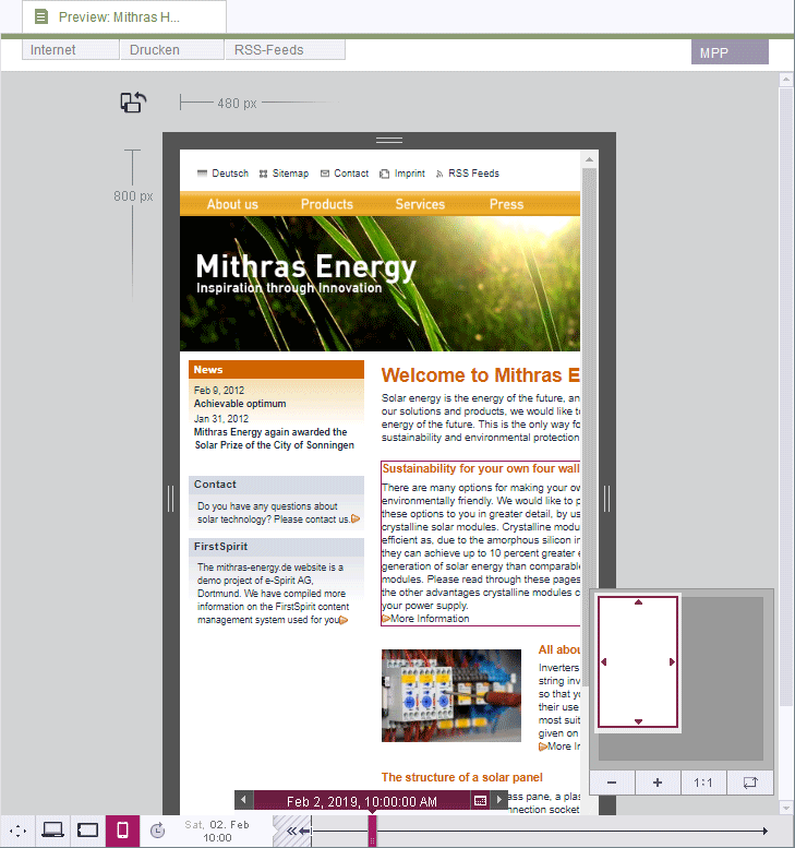
Click any of the following icons in the bottom left-hand area of the window to display the page in a different size and for a different presentation medium. The icons that are actually available and the sizes and presentation media they represent will depend on what settings are made under project properties (see “Configure preview viewports” under Options (→Documentation for Administrators)).
 Click this icon to display the current page in a standard browser view.
 Click this icon to display the view of the page in desktop browsers, for example.
 Click this icon to display the view of the page on notebooks, for example.
 Click this icon to display the view of the page on tablet PCs, for example.
 Click this icon to display the view of the page on smartphones, for example.
The dimensions of the selected view can be read from the top left-hand corner of the resolution.
The dimensions can be customized using the draggers on the four sides of the display.
 Click this icon to rotate the screen as you would on a smartphone or tablet PC. (The surrounding dimensions rotate but the content does not.)
Other functions
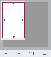
A scroll support is provided in the bottom right-hand corner. The visible area (“viewport”) can be moved with the mouse pointer.
 Click this icon to scale the viewport down gradually.
 Click this icon to scale the viewport up gradually.
 Click this icon to set the viewport to 100% and show the preview with accuracy to the pixel.
 Click this icon to scale the preview to the viewport insofar as this is possible.