

Introduction / FirstSpirit SiteArchitect / FirstSpirit AppCenter / Integrated preview / Multi Perspective Preview
Multi Perspective Preview
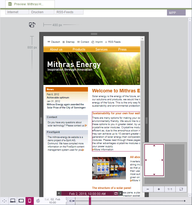
Multi Perspective Preview Multi Perspective Preview (preview for mobile content)
As Internet-enabled mobile devices such as notebooks, tablet PCs, and smartphones become more and more widespread, website designs need to be more and more flexible, with content which can be displayed perfectly on different display geometries and in different resolutions. With its “Multi Perspective Preview” (“MPP”) functionality, FirstSpirit provides editors with an easy way to check what website content looks like and how well it can be navigated with a variety of display sizes, while also allowing content, layout, and images to be perfectly adapted for the output device concerned.
Consequently, editors can use this function to display the current page in different dimensions so that they can simulate and check what it would look like on devices with smaller display sizes, such as a notebook, tablet PC, or smartphone.
For more information, see the Display sizes page.
Along with size considerations, other considerations can also be taken into account, such as the page's development over time (even in the future).
For more information, see the Time perspective page.
Other perspectives may be available for the preview, e.g., how the page looks to different user groups. The preview can then usually be manipulated by selecting an option (by selecting the required user group from a list, for example).
For more information, see also the User-specific perspective page.
To enable Multi Perspective Preview mode, go to the “MPP” tab in the integrated preview.
For information on how the values specified here by the editor can be accessed, see Multi Perspective Preview (→FirstSpirit Online Documentation).