

"Properties" tab
General settings that apply to the relevant link template can be changed in the “Properties” tab.
This tab is represented in the compact view by the  icon (see Compact view of tabs (→Documentation FirstSpirit SiteArchitect)).
General
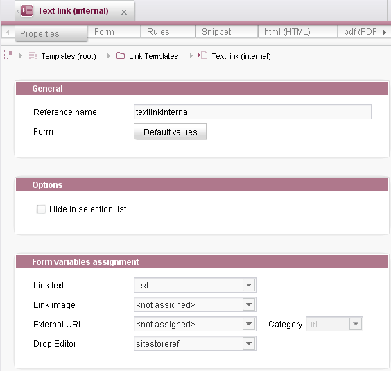
Reference name
Unique name of the link template under which the link template is saved in the file system.
Form
The “Default values” button is used to define default values for the link template input components. For more information, see Default values.
Options
Hide in selection list
If this option is selected, this link template will not appear in the selection list when adding a new link to the page or data store.
Form variables assignment
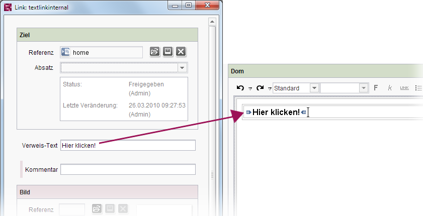
Link text
This combo box is used to select input components with content to be used as link text, e.g. in the DOM editor or in the DOM table. All identifiers of the CMS_INPUT_TEXT type input component defined on the “Form” tab are displayed here. The text that is entered in the input component with the selected identifier is used as link text (see Figure, opens in the same window). If no corresponding input component is defined, the selection remains empty (<not assigned>). If <not assigned> is selected, no link text is displayed.
If the editor adds a link in the DOM editor, for instance, text that was previously selected in the DOM editor is copied to the input component as link text.
searchRelevancy="none" must be set for the enclosing DOM editor or DOM table for being able to exclude link texts from the search index (see parameter searchRelevancy). If searchRelevancy="none" is set for the input component which is selected here, the related link text will be found nevertheless, if searchRelevancy="default", searchRelevancy="high" or no searchRelevancy parameter is set for the enclosing DOM component.
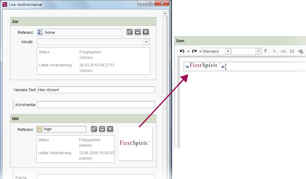
Link image
This combo box is used to select the input component with content that can be used as a link image (media object from the media store), e.g. in the DOM editor or in the DOM table. All identifiers of the FS_REFERENCE type input components defined on the “Form” tab are displayed here. The image that is selected via the input component with the specified identifier is used as the link image (see Figure, opens in the same window). If no corresponding input component is defined, the selection remains empty (<not assigned>). If <not assigned> is selected, no link image is used.
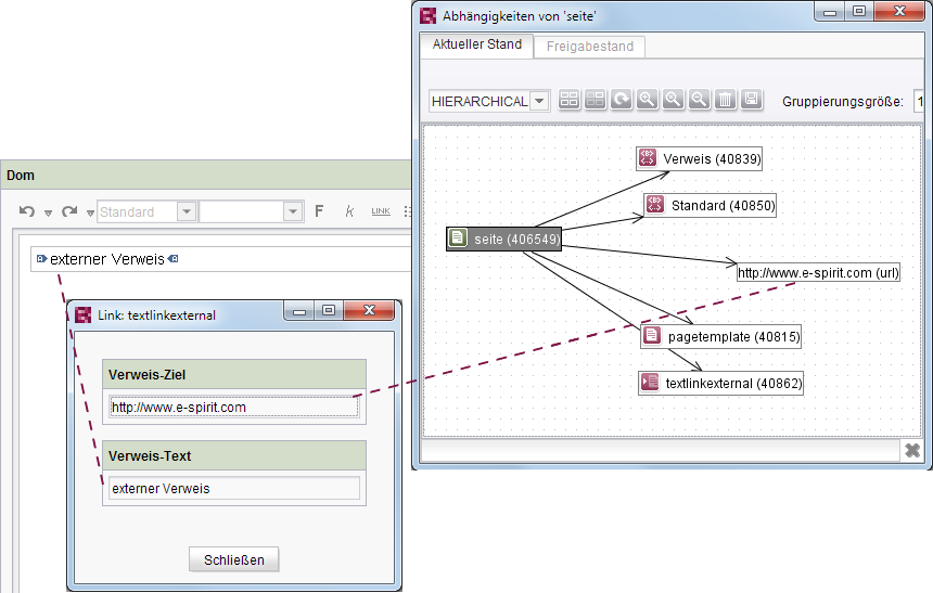
External URL
For link templates that are to be maintained via external links, this combo box can be used to select the input component that contains the external link (URL). All identifiers of the CMS_INPUT_TEXT type input components defined on the “Form” tab are displayed here. The reference graph, e.g. of pages or sections that contain a DOM editor or a DOM table with this external link, shows a dependency on the URL entered in the selected input component (see Figure opens in the same window). If no corresponding input component is defined, the selection remains empty (<not assigned>). If <not assigned> is selected, this dependency on the external URL does not appear in the reference graph.
Category
This combo box is used to select a category for external links. The options “url” and “email” are available by default. If necessary, however, an individual category can also be entered. A corresponding identifier must be entered in the field to do this. Categorization is used when searching for external references, for instance (“Extras” menu). External links are displayed with the particular category.
Tip: You can use the method getExternalReferences(String category, boolean release) of the interface Project (package de.espirit.firstspirit.access.project) to identify all external references for a category within a project, and the method getCategory() of the interface ReferenceEntry (package de.espirit.firstspirit.access) to identify the category of an external reference.
Drop Editor
This combo box is used to select the input components which are to be used as the drop zone in a DOM editor or DOM table in ContentCreator, and under whose identifier the drop zone is to be saved. All identifiers for the input components defined on the “Form” tab that are of the type
- FS_BUTTON
- FS_REFERENCE
- FS_DATASET
- FS_INDEX
- CMS_INPUT_IMAGEMAP
- CMS_INPUT_DOM
- CMS_INPUT_TEXT
- CMS_INPUT_TEXTAREA
are displayed here.
When used in ContentCreator, the editor can choose from all link templates where the input component type selected here is compatible with the object being dropped and which may be used in the relevant DOM editor (tag LINKEDITORS). If only one link template is compatible, the link is automatically created using this template.
If no corresponding input component is defined, the selection remains empty (<not assigned>). If <not assigned> is selected, dropping in ContentCreator is not possible.