
Input components
| Table of contents |
In FragmentCreator there is a series of input elements available to the editor for editing different content or types of content (for inputting text or selecting an image, for example).
This page only describes general configuration options for the input components supported.
This description is followed by an overview of the input components supported, with example code being provided for each one.
Mandatory parameters
name: Variable name of an input component. The value that the editor inputs into the input component is saved in this variable. In the output, the saved content can be accessed via this variable name.
useLanguages: In conventional FirstSpirit projects this parameter is used to specify whether an input component is to store different or deviating values for different languages (“multilingual”, “language-dependent”) or not (“monolingual”, “language-independent”). The default setting is to store different values for the different languages (...useLanguages="yes"...).
The approach to multiple languages in CXT projects is different to that in conventional FirstSpirit projects: In CXT projects, languages are accepted as variants of a fragment. Therefore, useLanguages="no" should be set for all input components used.
For documentation on the specified input component in the general online documentation for FirstSpirit, see CHECKBOX (→FirstSpirit Online Documentation).
Forcing an input
If input components are not updated by the editor (i.e., if a value is not assigned), the value of the variable will be null. A “rule” can be set to prevent this and force editing of the input component (“Rules” tab in the corresponding page template).
Example syntax:
<RULE>
       <WITH>
           <NOT>
               <PROPERTY name="EMPTY" source="text"/>
           </NOT>
       </WITH>
       <DO>
           <VALIDATION scope="RELEASE">
               <PROPERTY name="VALID" source="text"/>
               <MESSAGE lang="*" text="Please enter text"/>
               <MESSAGE lang="DE" text="Text eingeben"/>
           </VALIDATION>
       </DO>
</RULE>
See also Checking content ("Rules" tab).
Display side by side
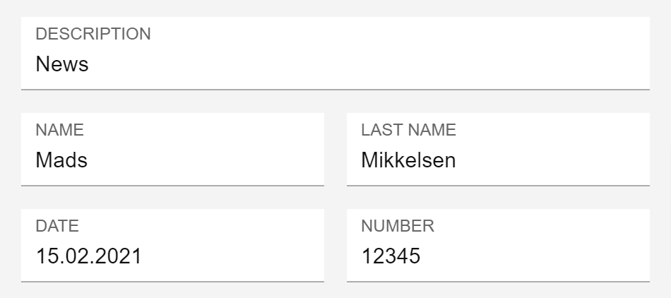
By default, input components in FragmentCreator are each displayed in one line.
After the input components
- CMS_INPUT_TEXT
- CMS_INPUT_NUMBER
- CMS_INPUT_DATE
the automatic line break can be suppressed, so components can be displayed side by side.
To do this, assign the value yes to the noBreak attribute:
noBreak="yes"
The default value for noBreak is no.
Note: If the width is too small (i.e. not all of the input components will fit in the intended line), form lines will be broken even if noBreak="yes" has been set; this is to ensure a minimum width for the input components.
The option of extending the input components across the full width (hFill attribute) is not supported.
Grouping (CMS_GROUP)
CMS_GROUP is used to group input components of a form graphically for better clarity.
Input components can be displayed
- on tabs
- one below the other with frames
Example syntax:
<CMS_GROUP tabs="top">
   <LANGINFOS>
     <LANGINFO lang="*" label="TEXT"/>
   </LANGINFOS>
   ...
</CMS_GROUP>
Attributes:
name: This optional attribute can be used to specify a technical identifier for the grouping.
Unlike identifiers of input components (also attribute name), the identifier for CMS_GROUP does not have to be unique within a form.
tabs: By default, groupings are displayed with frames below each other. To display them on individual tabs, tabs="top" can be used.
scrollable: This optional attribute can be used to specify whether scrollbars should be displayed or not.
Possible values are:
- fixed: Do not use scrollbars.
- vertical: Use vertical scrollbars.
- horizontal: Use horizontal scrollbars.
- both: Use horizontal and vertical scrollbars.
height: This optional attribute can be used to specify the display height of the grouping in pixels.
If this attribute is not specified, the height is based on the included input components.
LANGINFOS / LANGINFO: These tags are used to define the label. If these tags are not specified, no label will be displayed for the grouping.
Hiding a component
If components are not supposed to be visible for editors (if they are meant to be used for non-editorial tasks, for example), they can be hidden using the hidden parameter in the form definition (“Form” tab, hidden="yes").
Example syntax:
<CMS_INPUT_TEXT name="version" hidden="yes" useLanguages="no">
     <LANGINFOS>
       <LANGINFO lang="*" label="Version"/>
     </LANGINFOS>
</CMS_INPUT_TEXT>
If the parameter is not specified or the configuration reads hidden="no", input components will be shown by default.
Input components: example syntax
Formatted text
Input component for the input of formatted text
Minimal configuration / example syntax:
<FS_MARKDOWN name="text" useLanguages="no">
 <LANGINFOS>
 <LANGINFO lang="*" label="Text"/>
 </LANGINFOS>
</FS_MARKDOWN>
For more information, see FS_MARKDOWN configuration.
Display for the editor: MARKDOWN.
Plain text (one line)
Input component for the input of unformatted text, one line (for headings, for example)
Minimal configuration / example syntax:
<CMS_INPUT_TEXT name="headline" useLanguages="no">
    <LANGINFOS>
      <LANGINFO lang="*" label="Headline"/>
      <LANGINFO lang="DE" label="Überschrift"/>
    </LANGINFOS>
</CMS_INPUT_TEXT>
More configuration options:
- Automatic line break feature suppressed after this input component / input components displayed on one line: noBreak="yes".
Display for the editor: TEXT.
Plain text (multiple lines)
Input component for the input of unformatted text, multiple lines
Minimal configuration / example syntax:
<CMS_INPUT_TEXTAREA name="textarea" useLanguages="no">
    <LANGINFOS>
      <LANGINFO lang="EN" label="Multi-line text entry"/>
      <LANGINFO lang="*" label="Mehrzeilige Texteingabe"/>
    </LANGINFOS>
</CMS_INPUT_TEXTAREA>
Display for the editor: TEXTAREA.
Uploading and selecting images / media
Input component for uploading images and selecting media:
<FS_INDEX name="media" useLanguages="no">
    <LANGINFOS>
      <LANGINFO lang="*" label="Reference selection (media)"/>
      <LANGINFO lang="DE" label="Referenzauswahl (Medien)"/>
    </LANGINFOS>
    <SOURCE name="FirstSpiritMediaAccess/Connector">
      <PROJECT remote="mediapool"/>
    </SOURCE>
</FS_INDEX>
More configuration options:
- Display mode for the selected media (viewMode parameter)
- Restriction of the selection or upload to a folder in the remote project (FOLDER tag)
- Restriction of the number of media that can be selected (size rule property)
- Restriction of the media type (mode parameter)
See also Using media.
The file size can be limited via the web.xml file.
Display for the editor: INDEX.
Selection of other fragments
Input component for the selection of other fragments:
<FS_INDEX name="fragments" useLanguages="no">
    <LANGINFOS>
      <LANGINFO lang="*" label="Reference selection (fragments)"/>
      <LANGINFO lang="DE" label="Referenzauswahl (Fragmente)"/>
    </LANGINFOS>
    <SOURCE name="FirstSpiritFragmentAccess/FSFAConnector">
      <PROJECT remote="fragmentpool"/>
    </SOURCE>
</FS_INDEX>
More configuration options:
- Display mode for the selected fragments (viewMode parameter)
- Restriction of the selection to categories (CATEGORY tag)
- Creation of new fragments (CATEGORY tag)
See also Using fragments.
Display for the editor: INDEX.
Tagging
Input component for creating and editing tags
Minimal configuration / example syntax:
<FS_TAGGING name="tags" useLanguages="no">
    <LANGINFOS>
      <LANGINFO lang="*" label="Tags"/>
    </LANGINFOS>
 </FS_TAGGING>
For more information, see FS_TAGGING configuration.
Display for the editor: TAGGING.
Numbers
Input component for the input of numerical values.
Minimal configuration / example syntax:
<CMS_INPUT_NUMBER name="number" useLanguages="no">
   <LANGINFOS>
     <LANGINFO lang="*" label="Number"/>
     <LANGINFO lang="DE" label="Zahl"/>
   </LANGINFOS>
</CMS_INPUT_NUMBER>
Display for the editor: NUMBER.
More configuration options:
- type:
The type parameter can define the number type used to display and store numbers that are input in CMS_INPUT_NUMBER:- LONG (default setting): Integers (including negative numbers) can be entered (see also java.lang.Long). The exponential character (E or e) can be used as well.
Code snippet: ...type="LONG"... - DOUBLE: Decimal/floating-point numbers (including negative numbers) can be entered (see also java.lang.Double). The exponential character (E or e) can be used as well.
Code snippet: ...type="DOUBLE"...
- LONG (default setting): Integers (including negative numbers) can be entered (see also java.lang.Long). The exponential character (E or e) can be used as well.
- min and max:
The min and max parameters can be used to specify the minimum and maximum numerical values that can be entered in the input component.
By default (without specifying min and / or max), a numerical value of any height can be input. - noBreak:
Suppress automatic line break after this input component / display input components in one line: noBreak="yes".
Invalid entries are rejected with a corresponding message and are not saved.
Restrictions
(Browser-side restrictions are due to the way the individual browsers are implemented and are, therefore, not within the direct sphere of Crownpeak.)
- Browser / Entering characters: Mozilla Firefox and Apple Safari allow for the input of letters, but Google Chrome does not. Exception: the exponential character E or e, e.g., 1.7976931348623057e+308
- Browser / Display of characters: In Microsoft Edge and Google Chrome, the language of the operating system is primarily responsible for determining how the decimal separator (, or .) is displayed, not (only) the browser language.
In Mozilla Firefox, however, how the decimal separator is displayed depends on the browser language. - Configuration: By contrast with the use of CMS_INPUT_NUMBER in FirstSpirit ContentCreator and SiteArchitect, the format attribute in the LANGINFO tag is not supported for FragmentCreator.
- Thousands separator: There is no support for defining a thousands separator.
Input of date / time
Input component for the input of date and / or time
Minimal configuration / example syntax:
<CMS_INPUT_DATE name="date" useLanguages="no">
 <LANGINFOS>
 <LANGINFO lang="*" label="Date / time"/>
 <LANGINFO lang="DE" label="Datum / Uhrzeit"/>
 </LANGINFOS>
</CMS_INPUT_DATE>
More configuration options:
- Only select date or time:
The mode can be configured to define whether- Date and time (value datetime, mode="datetime")
- Date only (value date)
- Time only (value time)
can be selected by the editor.
- Suppress automatic line break after this input component / display input components in one line: noBreak="yes".
Display for the editor: DATE.
Combo box
Dropdown box for selecting a value
Minimal configuration / example syntax:
<CMS_INPUT_COMBOBOX name="language" preset="copy" useLanguages="no">
      <ENTRIES>
        <ENTRY value="DE">
          <LANGINFOS>
            <LANGINFO lang="*" label="German"/>
            <LANGINFO lang="DE" label="Deutsch"/>
          </LANGINFOS>
        </ENTRY>
        <ENTRY value="EN">
          <LANGINFOS>
            <LANGINFO lang="*" label="English"/>
            <LANGINFO lang="DE" label="Englisch"/>
          </LANGINFOS>
        </ENTRY>
      </ENTRIES>
      <LANGINFOS>
        <LANGINFO lang="*" label="Language"/>
        <LANGINFO lang="DE" label="Sprache"/>
      </LANGINFOS>
</CMS_INPUT_COMBOBOX>
Display for the editor: COMBOBOX.
Radio button
Input component for selecting a value
Minimal configuration / example syntax:
<CMS_INPUT_RADIOBUTTON name="gender" useLanguages="no">
    <ENTRIES>
      <ENTRY value="w">
        <LANGINFOS>
          <LANGINFO lang="*" label="Ms."/>
          <LANGINFO lang="DE" label="Frau"/>
        </LANGINFOS>
      </ENTRY>
      <ENTRY value="m">
        <LANGINFOS>
          <LANGINFO lang="*" label="Mr."/>
          <LANGINFO lang="DE" label="Herr"/>
        </LANGINFOS>
      </ENTRY>
    </ENTRIES>
    <LANGINFOS>
      <LANGINFO lang="*" label="Salutation"/>
      <LANGINFO lang="DE" label="Anrede"/>
    </LANGINFOS>
</CMS_INPUT_RADIOBUTTON>
Display for the editor: RADIOBUTTON.
Checkbox
Input component for selecting values
Minimal configuration / example syntax:
<CMS_INPUT_CHECKBOX name="checkbox">
    <ENTRIES>
      <ENTRY value="value_1">
        <LANGINFOS>
          <LANGINFO lang="*" label="Value 1"/>
          <LANGINFO lang="DE" label="Wert 1"/>
        </LANGINFOS>
      </ENTRY>
      <ENTRY value="value_2">
        <LANGINFOS>
          <LANGINFO lang="*" label="Value 2"/>
          <LANGINFO lang="DE" label="Wert 2"/>
        </LANGINFOS>
      </ENTRY>
      <ENTRY value="value_3">
        <LANGINFOS>
          <LANGINFO lang="*" label="Value 3"/>
          <LANGINFO lang="DE" label="Wert 3"/>
        </LANGINFOS>
      </ENTRY>
    </ENTRIES>
    <LANGINFOS>
      <LANGINFO lang="*" label="Check box"/>
      <LANGINFO lang="DE" label="Kontrollkästchen"/>
    </LANGINFOS>
</CMS_INPUT_CHECKBOX>
Display for the editor: CHECKBOX.
Toggle
Switch between two predefined values (e.g., on/off, right/left)
Minimal configuration / example syntax:
<CMS_INPUT_TOGGLE name="picture_position" useLanguages="yes">
         <LANGINFOS>
           <LANGINFO lang="*" label="Picture position"/>
           <LANGINFO lang="DE" label="Ausrichtung des Bildes"/>
         </LANGINFOS>
         <OFF>
           <LANGINFO lang="*" label="Right"/>
           <LANGINFO lang="DE" label="Rechts"/>
         </OFF>
         <ON>
           <LANGINFO lang="*" label="Left"/>
           <LANGINFO lang="DE" label="Links"/>
         </ON>
</CMS_INPUT_TOGGLE>
The different states are represented by the mandatory tags <ON> and <OFF>. A label must be defined for each state via the <LANGINFO> tag.
The radio buttons of the component are displayed one below the other with the <ON> state at the top and the <OFF> state at the bottom. This order cannot be changed.
Display for the editor: TOGGLE.
Multiple selection list
Dropdown box for selecting values
Minimal configuration / example syntax:
<CMS_INPUT_LIST name="list" useLanguages="no">
    <ENTRIES>
      <ENTRY value="value_1">
        <LANGINFOS>
          <LANGINFO lang="EN" label="Value 1"/>
          <LANGINFO lang="*" label="Wert 1"/>
        </LANGINFOS>
      </ENTRY>
      <ENTRY value="value_2">
        <LANGINFOS>
          <LANGINFO lang="EN" label="Value 2"/>
          <LANGINFO lang="*" label="Wert 2"/>
        </LANGINFOS>
      </ENTRY>
      <ENTRY value="value_3">
        <LANGINFOS>
          <LANGINFO lang="EN" label="Value 3"/>
          <LANGINFO lang="*" label="Wert 3"/>
        </LANGINFOS>
      </ENTRY>
    </ENTRIES>
    <LANGINFOS>
      <LANGINFO lang="*" label="Multiple selection list"/>
      <LANGINFO lang="DE" label="Mehrfach-Auswahlliste"/>
    </LANGINFOS>
</CMS_INPUT_LIST>
Display for the editor: LIST.