

Settings at menu level
Various settings can be made for each menu level in order to enhance navigation through the website. Edit mode must have been activated for the menu level in order to make such settings. The same views and setting options as in the menu levels are available for the root node of the Site Store. Exception: The root node of the Site Store is outside the navigation, therefore no navigation settings are made there.
Properties tab
Is represented in the Compact view of tabs by the  icon.
icon.
Folders view - Properties tab
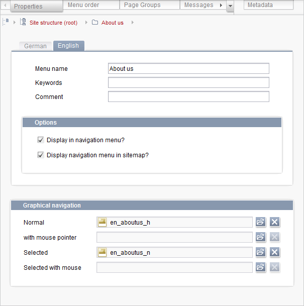
The website's navigation can be edited on the Properties tab. Setting options are available for graphical and textual navigation. The Properties tab is split into language-dependent information for textual navigation and language-independent information for graphical navigation.
Textual navigation
The settings for textual navigation are made in the language-dependent properties. Textual navigation means that no graphics are used for navigation and simple text which can be entered in HTML is used instead.
Menu name: In this field you enter text to represent this menu item within the navigation. This is the name for this navigation item really used on the website, which may differ from the name of the menu level in the Site Store.
Keywords: Several keywords for search functions can be entered in this field.
Comment: This field can be used to enter an explanatory comment on this menu item which, among other things, can be used as a tool tip on the website.
Options
These two options can be used irrespective of whether the navigation is graphical or textual.
Display in navigation menu?: This option must be activated, otherwise this menu item (including all submenus) is removed from the navigation! This option is useful for areas which are to be temporarily removed from the website but re-integrated later. This option saves having to create the structure for this area again.
Display navigation menu in sitemap?: Activate this option to specify whether this page is to be listed in the sitemap too.
Graphical navigation
The settings for graphical navigation are made in the language-independent properties. Graphical navigation means that navigation is not based on simple text entered in HTML and graphics of some sort are used instead. These can be buttons with text or real images without any text but with symbols or icons which will be clearly understood by visitors to the website.
Normal: In this field you specify which graphic is displayed if the menu item is not selected. Click the  icon to open a window in which the tree structure of the Media Store is displayed.
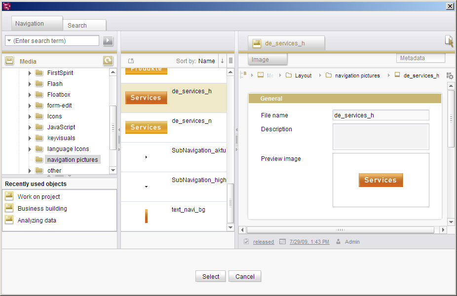
Selecting a medium for graphical navigation
The required image can now be selected from the navigation structure of the Media Store. The search function in the selection dialog lets you find the desired medium quicker.
After you select an image, the name of the medium you selected appears in the field. Click the Delete icon  to delete the selected graphic again.
with mouse pointer: In this field you specify which graphic is displayed if the mouse pointer is moved over the menu item.
Selected: In this field you specify which graphic is displayed if the menu item is selected.
Selected with mouse: In this field you specify which graphic is displayed if the mouse pointer is moved over the menu item and the menu item has been selected.
These are all the states a graphic can have on a website. If you have defined an image from the Media Store for all these cases, graphical navigation for this menu item is complete.
 |
As the images for graphical navigation are probably buttons with text in most cases, it must be ensured that language-dependent images are used, otherwise the buttons in one language would be displayed in all languages. |
Menu order tab
Is represented in the Compact view of tabs by the  icon.
icon.
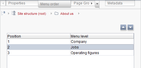
Folders view – Menu order tab
The Menu order tab can be used to subsequently change the order in which the menu entries are to appear in the navigation. All menu items below the selected navigation level are listed.
Click the Move up  or Move down
  icon to move the selected menu level up or down by one position in the list.
Page Groups tab
Is represented in the Compact view of tabs by the  icon.
icon.
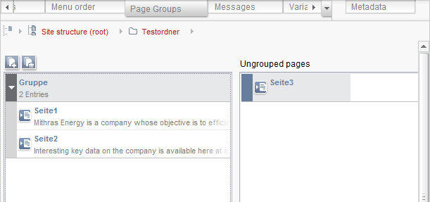
Folders view – Page Groups tab
Page groups are a further form of navigation. They are pages created in the Site Store but which are connected to each other by template programming so that it is possible to page forward and backward in them. All page references at this menu level which have not yet been assigned to a page group are listed under “Ungrouped pages”:
All page groups of the menu level are listed in the left-hand column, together with their assigned pages. The  and
and  icons or double-click on the page group can be used to show/hide the pages in a group.
 Create New Group: Click this icon to open a window in which the name for the new page group can be entered. Confirm your input with OK to add the new page group.
 Delete Group: Click this icon to remove the selected page group.
Pages are added to, re-sorted in or removed from a group by means of drag-and-drop. A page reference from the “Ungrouped pages” column is dragged and dropped on the required page group. When re-sorting page references, a red line indicates that the page reference is being sorted below the selected element. Several page references can be selected at the same time by pressing the mouse button and Ctrl or Shift. To remove a page reference from a group, simply move it back to the “Ungrouped pages” column using drag-and-drop.
|
If individual pages are to be hidden from a page group (e.g., because they do not have any content in some languages), the check mark next to the “Show in page group” entry must be removed in the settings at page reference level. The result is that the corresponding page is not taken into account in the page group for the respective language. (However, the page is generated nevertheless.) If a reference to this page group has been set, the top page is referenced. |
Messages tab
The Messages tab contains a message board.
Detailed information on the use of message boards is given in section The message board.
Variables tab
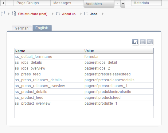
Folders view – Variables tab
The contents of all input elements of the current page or the current section are stored in variables within FirstSpirit. The “Variables” tab can be used to define variables, with which changes are to be made from subtree to subtree. For example, if a different layout (e.g., a different background color) is to be used for the individual subareas of the structure, this can be done using the so-called “structure variables”.
 Create a New Variable: Click this icon to open a window in which the name for the new variable can be entered. Confirm your input with OK to add the new variable; a window for editing the new variable automatically opens.
 Delete Variable: Click this icon to remove the selected variable.
 Edit Variable: Click this icon to open a window for editing the selected variable.
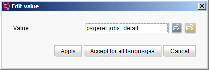
Editing a variable
In this window you can enter the value of the variable manually or you can select a page reference or a medium  as the value.
Click the Apply button to accept the selected variable value for the current language.
Click the Accept for all languages button to accept the selected variable value for all the project languages at the same time.
|
The variables must be referenced within a template in order to have an effect. More precise information on programming templates see Template development (→FirstSpirit Online Documentation). |
|
If the value of a variable is changed without releasing the Site Store and then a preview of a page is requested from the Page Store and this variable is valid for its page reference, the current state (i.e., not released) of the variable is displayed. |