

Startseite / Plugin-Entwicklung / SiteArchitect-Erweiterungen / Interaktive Features / Toolbar-Aktionen / Codebeispiel
Toolbar Items: Code Example
This example illustrates the code structure to implement buttons that will be shown in SiteArchitect's editorial toolbar.
A toolbar items plug-in consists of a two-tier class structure:
The first tier defines the plug-in itself and determines which second-tier objects (see below) should be offered in the editorial toolbar, depending on the current operational context.
- Editorial Toolbar Items Plug-In
serves as a container for and provider of one or more individual plug-in items that represent individual toolbar buttons
The second tier defines individual plug-in items; each item will be represented by its own button, may define its own visibility context (based on store elements or other criteria) and provides its own, specific action.
- Executable Toolbar Item
provides a button definition including title and icon, and defines an executable action that will be executed on the server side and handle interaction with users - Toggleable Toolbar Item
provides a button definition including title and icon. Unlike the previous toolbar items, this button item does not hold an executable action that will be executed on-click, but acts as a toggle switch; listener classes may then react to state changes of this button item. - Executable Grouping Toolbar Item
provides a button definition including title and icon, and defines an executable action that will be executed on the server side and handle interaction with users; this button may also specify one or context menu item objects which will be rendered in a drop-down list alongside the toolbar button
 |
A toolbar items plug-in may contain one or more of the second-tier item classes. Each item will be represented by an individual button, provide its own actions and define its own availability based on criteria such as context store element, etc. However, each of the second-tier button items returned by getItems() should return a unique label and use distinguishable icon graphics. |
The Editorial Toolbar Items Plug-In
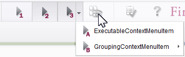
Three different toolbar buttons (numbers 1, 2, and 3), inserted into the editorial toolbar by the same toolbar items plug-in
The toolbar items plug-in implements the interface JavaClientEditorialToolbarItemsPlugin and is responsible for collecting and returning a list of action items that will be shown as individual buttons in the editorial toolbar. This class on its own has no representation in ContentCreator's user interface.
public class ExampleJavaClientEditorialToolbarItemsPlugin implements JavaClientEditorialToolbarItemsPlugin {

    // Field definitions for objects that are required during the lifetime of a class instance.
    private BaseContext _context;


    @Override
    public void setUp(@NotNull final BaseContext context) {
        _context = context;
    }


    @Override
    public void tearDown() {
    }


    @NotNull
    @Override
    public Collection<? extends JavaClientToolbarItem> getItems() {
        // Create and return an array list that includes individual button item objects.
        return Arrays.asList(
            new ExampleExecutableToolbarItem(),
            new ExampleToggleableToolbarItem(),
            new ExampleExecutableGroupingToolbarItem()
        );
    }


    /* Include one or several private static classes that implement action item interfaces,
       either ExecutableToolbarItem, ExecutableGroupingToolbarItem or ToggleableToolbarItem. */

}
void setUp()
This method is called by the SiteArchitect to set up the plug-in prior to polling it for available toolbar items.
void tearDown()
This method is called by the SiteArchitect as the toolbar items plug-in is about to be destroyed.
Collection<? extends SiteArchitectToolbarItem> getItems()
After instantiating and setting up the toolbar items plug-in object, SiteArchitect will call getItems() to poll for a list of available toolbar items. This method should return all available items defined as nested classes within the plug-in class; SiteArchitect will autonomously call the appropriate, item-specific methods of each item returned by getItems() to determine in which context(s) each item should be shown and marked as active.
Executable Toolbar Item
The following code implements an executable toolbar button item based on the interface ExecutableToolbarItem and action that is able to use the full FirstSpirit APIs to produce functionality.
In this example, it is a private class nested within its parent, editorial toolbar items plug-in class.
    private static class ExampleExecutableToolbarItem implements ExecutableToolbarItem {

        ExampleExecutableToolbarItem() {
        }


        public String getLabel(@NotNull final ToolbarContext context) {
            return "Example Executable Toolbar Item";
        }


        public Icon getIcon(@NotNull final ToolbarContext context) {
           return null;
        }


        public Icon getPressedIcon(@NotNull final ToolbarContext context) {
           return null;
        }


        public Icon getRollOverIcon(@NotNull final ToolbarContext context) {
           return null;
        }


        public boolean isVisible(@NotNull final ToolbarContext context) {
            return true;
        }


        public boolean isEnabled(@NotNull final ToolbarContext context) {
            final IDProvider element = context.getElement();
            return (element instanceof Page);
        }


        public void execute(@NotNull final ToolbarContext context) {
            final OperationAgent operationAgent = context.requireSpecialist(OperationAgent.TYPE);
            final RequestOperation requestOperation = operationAgent.getOperation(RequestOperation.TYPE);
            requestOperation.setKind(RequestOperation.Kind.INFO);
            requestOperation.perform("This message box is generated by the Example Executable Toolbar Item.");
        }
    }
String getLabel()
This method is responsible for providing the item's display name that will be shown in its button's tool tip.
Icon getIcon()
Icon getRollOverIcon()
Icon getPressedIcon()
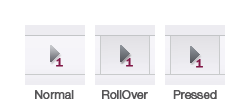
SiteArchitect button styling for executable toolbar button states
These methods provide Icon graphics used to visualize various states of the button item, based on user interaction with the button.
Executable toolbar items have three states:
- Normal
The button does not experience any user interaction which needs to be visualized. - RollOver
The button is highlighted, but not activated, by hovering the mouse pointer over its rectangle or placing focus upon it using keyboard commands. - Pressed
The button is depressed (activated) using a mouse click or a keyboard command. When this depressed state is released, the buttons execute() method will be called.
General button styling is handled by the SiteArchitect: the Normal state will display a borderless icon, while the RollOver and Pressed states will display an icon with borders and background shading. In the interest of usability, the icon graphics supplied for each state should indicate - especially for RollOver and Pressed states, using tinting/shading and shifting - interaction.
Icon graphics used in this context should be sized 25x25 pixels and provided in PNG format with an alpha channel. The icon features should generally use shades of dark grey, as SiteArchitect toolbar buttons are always drawn with a light grey background.
boolean isVisible()
This method is responsible for determining in which context the button item is to be displayed. If the item is to be displayed, the boolean value true should be returned; the value false will suppress display of this item's button.
Standard use cases involve determining visibility depending on attributes specific to the client session, e.g. should the toolbar button be shown in a certain project or to a certain user group. If an item implements functionality that should only be available conditionally, the method isVisible() should return true in cases when the button should be visible and otherwise return false.
It is not recommended that a toolbar button's visibility be set and reset dynamically throughout a single client session, as this may not lead to expected results after the plug-in component is first loaded. Furthermore, a toolbar's set of buttons should be kept constant so that users do not have to adjust to changing button positions during a single client session. In order to make button functionality accessible based on dynamic conditions during a client session, set the button's active state using the method isEnabled() (see below).
boolean isEnabled()
The method isEnabled() indicates if the item's button should be active in a given context. If the button is to be active, this method should return the boolean value true. If this button is to be inactive, the boolean value false will cause the button icon to be displayed with decreased contrast to produce a muted representation; while the button will remain visible (given that isVisible() returns true in the same context), the item's action code will not be executed on-click.
Standard use cases involve discriminating between context store elements. If an item implements functionality that should only be available when a Section object is in the active editorial tab, the method isEnabled() should determine if the context element (always a store element) is an instance of Section--if so, the toolbar button may be enabled (return true), otherwise disabled (return false). For this purpose, a ToolbarContext object is provided; the related store element can be obtained by calling context.getElement().
void execute()
This method will be called by the SiteArchitect once a user clicks the item's button in the editorial toolbar. execute() is treated as a point of entry into executable code to carry out the item's action and is not expected to return any value.
Toggleable Toolbar Item
The following code implements a toggleable toolbar button item based on the interface ToggleableToolbarItem.
In this example, it is a private class nested within its parent, editorial toolbar items plug-in class.
    private static class ExampleToggleableToolbarItem implements ToggleableToolbarItem {

        private ToggleableToolbarItem.SelectionListener _selectionListener;


        ExampleToggleableToolbarItem() {
        }


        public String getLabel(@NotNull final ToolbarContext context) {
            return "Example Toggleable Toolbar Item";
        }


        public Icon getIcon(@NotNull final ToolbarContext context) {
           return null;
        }


        public Icon getPressedIcon(@NotNull final ToolbarContext context) {
           return null;
        }


        public Icon getRollOverIcon(@NotNull final ToolbarContext context) {
           return null;
        }


        public Icon getSelectedIcon(@NotNull final ToolbarContext context) {
            return null;
        }


        public boolean isVisible(@NotNull final ToolbarContext context) {
            return true;
        }


        public boolean isEnabled(@NotNull final ToolbarContext context) {
            final IDProvider element = context.getElement();
            return (element instanceof Page);
        }


        public void setSelectionListener(final SelectionListener selectionListener) {
            _selectionListener = selectionListener;
        }


        public void setSelected(@NotNull final ToolbarContext context, final boolean selected) {
            final OperationAgent operationAgent = context.requireSpecialist(OperationAgent.TYPE);
            final RequestOperation requestOperation = operationAgent.getOperation(RequestOperation.TYPE);
            requestOperation.setKind(RequestOperation.Kind.INFO);
            requestOperation.perform("This message box is generated by the Example Toggleable Toolbar Item." +
                "Its status is now " + selected.toString() + '.');
        }
    }
String getLabel()
This method is responsible for providing the item's display name that will be shown in its button's tool tip.
Icon getIcon()
Icon getRollOverIcon()
Icon getPressedIcon()
Icon getSelectedIcon()
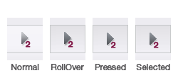
SiteArchitect button styling for toggleable toolbar button states
These methods provide Icon graphics used to visualize various states of the button item, based on user interaction with the button.
Toggleable toolbar items have four states:
- Normal
The button does not experience any user interaction which needs to be visualized. - RollOver
The button is highlighted, but not activated, by hovering the mouse pointer over its rectangle or placing focus upon it using keyboard commands. - Pressed
The button is depressed (activated) using a mouse click or a keyboard command. When this depressed state is released, the button's state will be toggled from "not selected" to "selected" and vice versa. - Selected
The state of this button is set to "selected" based on mouse/keyboard activation.
General button styling is handled by the SiteArchitect: the Normal state will display a borderless icon, while the RollOver, Pressed, and Selected states will display an icon with borders and background shading. In the interest of usability, the icon graphics supplied for each state should indicate - especially for non-Normal states, using tinting/shading and shifting - interaction.
Icon graphics used in this context should be sized 25x25 pixels and provided in PNG format with an alpha channel. The icon features should generally use shades of dark grey, as SiteArchitect toolbar buttons are always drawn with a light grey background.
void setSelected()
This method is called as the button's "selected" state is changed by mouse/keyboard interaction. Depending on the new state of the toggle button, a boolean flag with value true (selected) or false (not selected) is passed as a parameter.
void setSelectionListener()
This method receives a listener object of type ToggleablePluginItem.SelectionListener.
When a JavaClientEditorialToolbarItemsPlugin implementation is instantiated, SiteArchitect calls this method for each object that is based on an implementation of the interface ToggleableToolbarItem.
The listener object can then be registered using the ClientServiceRegistryAgent and used by other plug-ins or classes to control the state of this toggleable toolbar button. As SelectionListener#onSelectedChange() is called, SiteArchitect passes the new selection state to the setSelected() method of the corresponding ToggleableToolbarItem object.
boolean isVisible()
This method is responsible for determining in which context the button item is to be displayed. If the item is to be displayed, the boolean value true should be returned; the value false will suppress display of this item's button.
Standard use cases involve determining visibility depending on attributes specific to the client session, e.g. should the toolbar button be shown in a certain project or to a certain user group. If an item implements functionality that should only be available conditionally, the method isVisible() should return true in cases when the button should be visible and otherwise return false.
It is not recommended that a toolbar button's visibility be set and reset dynamically throughout a single client session, as this may not lead to expected results after the plug-in component is first loaded. Furthermore, a toolbar's set of buttons should be kept constant so that users do not have to adjust to changing button positions during a single client session. In order to make button functionality accessible based on dynamic conditions during a client session, set the button's active state using the method isEnabled() (see below).
boolean isEnabled()
The method isEnabled() indicates if the item's button should be active in a given context. If the button is to be active, this method should return the boolean value true. If this button is to be inactive, the boolean value false will cause the button icon to be displayed with decreased contrast to produce a muted representation; while the button will remain visible (given that isVisible() returns true in the same context), the item's action code will not be executed on-click.
Standard use cases involve discriminating between context store elements. If an item implements functionality that should only be available when a Section object is in the active editorial tab, the method isEnabled() should determine if the context element (always a store element) is an instance of Section--if so, the toolbar button may be enabled (return true), otherwise disabled (return false). For this purpose, a ToolbarContext object is provided; the related store element can be obtained by calling context.getElement().
Executable Grouping Toolbar Item
The following code implements an executable toolbar button item based on the interface ExecutableGroupingToolbarItem and action that is able to use the full FirstSpirit APIs to produce functionality. Additionally, this toolbar button will receive drop-down functionality that may group one or more context menu items.
In this example, it is a private class nested within its parent, editorial toolbar items plug-in class.
    private static class ExampleExecutableGroupingToolbarItem implements ExecutableGroupingToolbarItem {

        ExampleExecutableGroupingToolbarItem() {
        }


        public String getLabel(@NotNull final ToolbarContext context) {
            return "Example Executable Grouping Toolbar Item";
        }


        public Icon getIcon(@NotNull final ToolbarContext context) {
           return null;
        }


        public Icon getPressedIcon(@NotNull final ToolbarContext context) {
           return null;
        }


        public Icon getRollOverIcon(@NotNull final ToolbarContext context) {
           return null;
        }


        public boolean isVisible(@NotNull final ToolbarContext context) {
            return true;
        }


        public boolean isEnabled(@NotNull final ToolbarContext context) {
            final IDProvider element = context.getElement();
            return (element instanceof Page);
        }


        // Use context menu items as entries of this toolbar button's drop-down menu.
        public List<? extends JavaClientContextMenuItem> getSubItems(@NotNull final ContextMenuContext context) {
            return Arrays.asList(
                new ExampleExecutableJavaClientContextMenuItem(),
                new ExampleExecutableGroupingJavaClientContextMenuItem()
            );
        }


        public void execute(@NotNull final ToolbarContext context) {
            final OperationAgent operationAgent = context.requireSpecialist(OperationAgent.TYPE);
            final RequestOperation requestOperation = operationAgent.getOperation(RequestOperation.TYPE);
            requestOperation.setKind(RequestOperation.Kind.INFO);
            requestOperation.perform("This message box is generated by the Example Executable Grouping Toolbar Item.");
        }
    }
String getLabel()
This method is responsible for providing the item's display name that will be shown in its button's tool tip.
Icon getIcon()
Icon getRollOverIcon()
Icon getPressedIcon()
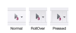
SiteArchitect button styling for executable grouping toolbar button states
These methods provide Icon graphics used to visualize various states of the button item, based on user interaction with the button.
Executable grouping toolbar items have three states:
- Normal
The button does not experience any user interaction which needs to be visualized. - RollOver
The button is highlighted, but not activated, by hovering the mouse pointer over its rectangle or placing focus upon it using keyboard commands. - Pressed
The button is depressed (activated) using a mouse click or a keyboard command. When this depressed state is released, the buttons execute() method will be called.
General button styling is handled by the SiteArchitect: the Normal state will display a borderless icon, while the RollOver and Pressed states will display an icon with borders and background shading. In the interest of usability, the icon graphics supplied for each state should indicate - especially for RollOver and Pressed states, using tinting/shading and shifting - interaction.
Icon graphics used in this context should be sized 25x25 pixels and provided in PNG format with an alpha channel. The icon features should generally use shades of dark grey, as SiteArchitect toolbar buttons are always drawn with a light grey background.
boolean isVisible()
This method is responsible for determining in which context the button item is to be displayed. If the item is to be displayed, the boolean value true should be returned; the value false will suppress display of this item's button.
Standard use cases involve determining visibility depending on attributes specific to the client session, e.g. should the toolbar button be shown in a certain project or to a certain user group. If an item implements functionality that should only be available conditionally, the method isVisible() should return true in cases when the button should be visible and otherwise return false.
It is not recommended that a toolbar button's visibility be set and reset dynamically throughout a single client session, as this may not lead to expected results after the plug-in component is first loaded. Furthermore, a toolbar's set of buttons should be kept constant so that users do not have to adjust to changing button positions during a single client session. In order to make button functionality accessible based on dynamic conditions during a client session, set the button's active state using the method isEnabled() (see below).
boolean isEnabled()
The method isEnabled() indicates if the item's button should be active in a given context. If the button is to be active, this method should return the boolean value true. If this button is to be inactive, the boolean value false will cause the button icon to be displayed with decreased contrast to produce a muted representation; while the button will remain visible (given that isVisible() returns true in the same context), the item's action code will not be executed on-click.
Standard use cases involve discriminating between context store elements. If an item implements functionality that should only be available when a Section object is in the active editorial tab, the method isEnabled() should determine if the context element (always a store element) is an instance of Section--if so, the toolbar button may be enabled (return true), otherwise disabled (return false). For this purpose, a ToolbarContext object is provided; the related store element can be obtained by calling context.getElement().
List<? extends JavaClientContextMenuItem> getSubItems()
This method may provide a collection of one or more context menu items and/or separator objects.
See the documentation on SiteArchitect context menu items for implementation details.
void execute()
This method will be called by the SiteArchitect once a user clicks the item's button in the editorial toolbar. execute() is treated as a point of entry into executable code to carry out the item's action and is not expected to return any value.