CMS_INPUT_DOM
| Contents |
| for example |
| to the methods: DomElement |
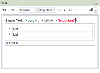
The CMS_INPUT_DOM input component is provided for larger formatted text inputs. Formatting can be defined both for highlighted text fragments and for whole paragraphs. In addition, this input component provides the possibility of inserting links in the text by using link templates.
Apart from the standard formatting (bold, italic, underline), project-specific formatting can also be defined (see Format templates).
In addition, (nested) lists (with bullet points or numbering) and tables (so-called “inline” tables, see also Chapter Inline tables and system objects #style and #table) can be generated in the input component, if configured.
 |
The input component CMS_INPUT_DOM is supported by the ContentCreator. For restrictions see chapter Restrictions in ContentCreator. |
For information about transfer types which are supported for drag-and-drop please see also page Drag-and-drop.
Mandatory
Optional parameters
Optional parameters
Optional parameters
Optional parameters
Optional parameters
Optional parameters
Optional parameters
Optional parameters
Optional parameters
Optional parameters
Optional parameters
Optional parameters
Optional parameters
Optional parameters
Optional parameters
Optional parameters
Optional parameters
Optional parameters
Mandatory
Mandatory
Optional parameters
Optional parameters
Mandatory
Parameter
The following table gives the parameters of the DOM input component.
name
The attribute "name" is the variable name of an input component with which the the result object of the input component can be used in the templates - with the help of $CMS_VALUE()$ - or the content can be output.
| Parameter | Mandatory | Since | Type | Default value |
|---|---|---|---|---|
| name* | Yes | 3.1 | Designator | None |
allowEmpty
The "allowEmpty" parameter is used to specify whether a value has to be entered for an input value or not.
If allowEmpty="YES" input is not mandatory; however, it is if allowEmpty="NO".
Input components with allowEmpty="NO" are also called mandatory input components.
The default value for allowEmpty is YES.
| Parameter | Mandatory | Since | Type | Default value |
|---|---|---|---|---|
| allowEmpty | No | 3.0 | YesNo | YES |
bold
The bold parameter can be used to overlay or hide the Bold button in the input component.
If the parameter is not given the button is overlaid as a default.
If NO (...bold="NO"...) is specified the button is hidden and if YES is given it is overlaid.
| Parameter | Mandatory | Since | Type | Default value |
|---|---|---|---|---|
| bold | No | 2.0 | YesNo | YES |
develop
Enable debug mode using Java-Console for output.
| Parameter | Mandatory | Since | Type | Default value |
|---|---|---|---|---|
| develop | No | 2.1 | YesNo | NO |
enableImport
The parameter enableImport is used for enabling the functionality of the module FirstSpirit OfficeConnect.
By default, this functionality is not active. If the parameter is set to YES the button "Insert Word content from clipboard" will be displayed.
 |
A valid licence for the module FirstSpirit OfficeConnect is required to be able to use this attribute. |
| Parameter | Mandatory | Since | Type | Default value |
|---|---|---|---|---|
| enableImport | No | 4.2 | YesNo | NO |
hFill
An input component is always displayed with a pre-defined width.
However, if the input component is to use the full available display width the parameter hFill must be given with the value YES .
| Parameter | Mandatory | Since | Type | Default value |
|---|---|---|---|---|
| hFill | No | 2.0 | YesNo | NO |
hidden
With the "hidden" parameter an input component can be hidden from the editor.
If hidden="YES" the input component is not visible for the editor, if hidden="NO" it is visible.
The default value for hidden is NO.
| Parameter | Mandatory | Since | Type | Default value |
|---|---|---|---|---|
| hidden | No | 4.0.44 | YesNo | NO |
importRuleset
Using the parameter importRulesets the selectable xml rule sets can be restricted for the respective input component if the functionality of the module FirstSpirit Office is active. For this purpose the parameter importRulesets must be given with the name/s of the desired rule set/s, defined in the server and project properties, in quotation marks and separated by comma.
If the parameter is not given all xml rule sets which are defined for the respective project are offered for selection.
 |
This parameter is only evaluated if the parameter enableImport is set to YES. |
For further information about the module FirstSpirit OfficeConnect please refer to the related module documentation.
| Parameter | Mandatory | Since | Type | Default value |
|---|---|---|---|---|
| importRuleset | No | 4.2 | String | None |
italic
The italic parameter can be used to overlay or hide the Italic button in the input component.
If the parameter is not given the button is overlaid as a default.
If NO (...italic="NO"...) is specified the button is hidden and if YES is given it is overlaid.
| Parameter | Mandatory | Since | Type | Default value |
|---|---|---|---|---|
| italic | No | 2.0 | YesNo | YES |
list
The list parameter can be used to overlay or hide the Insert/Add List button in the input component.
If the parameter is not given the button is overlaid as a default.
If NO (...list="NO"...) is specified the button is hidden and if YES is given it is overlaid.
Lists can be configured using the listConfig and listDefaultConfig parameters.
| Parameter | Mandatory | Since | Type | Default value |
|---|---|---|---|---|
| list | No | 2.3 | YesNo | YES |
listConfig
The listConfig parameter can be used to freely configure the dialog which opens when you click the "Change list type" (SiteArchitect) or "Edit list properties" (ContentCreator) in the context menu for entries in lists.
If listConfig is not set, a dialog appears in which the list symbol ("type") can be selected from a combo box or a user-defined text can be entered in a text box.
If listConfig is set to an empty value (listConfig=""), the "Change list type" (SiteArchitect) entry in the context menu is hidden. The editor is unable to modify the list type.
listConfig can be used to define one or a number of form fields. The following information must be provided for each form field:
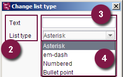
(SiteArchitect)
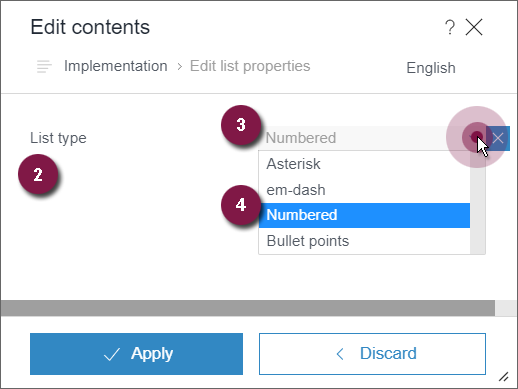
(ContentCreator)
- Identifier: Unique identifier via which the value of the form field entered by the editor can be read out.
- Label: Form field label which is displayed in the dialog.
- Type: Definition of the data type of the form field (introduced by the type attribute).
- Parameter list: Affects how values are entered.
The syntax is:
IDENTIFIER:LABEL[type=TYPE;PARAMETERLIST]
Multiple form fields should be separated using commas.
type
The following keywords are available for the form field type:
- text: Field for entering text
- number: Field for entering numbers
- boolean: Checkbox which can be deactivated
- color: Selection dialog from which a color can be selected
ContentCreator supports text but its support for the other keywords is limited.
If the type parameter is not specified, a form field for text or numbers is displayed.
Entering a list with parameters separated by pipe symbols (|) creates a combo box. The label can be defined after the parameter with a colon, e.g.,
list:List type[choice1:Auswahl1|choice2:Auswahl2|choice3:Auswahl3]
If the keywords are used without additional parameters (see below: "Parameter list"), the keyword can also be specified without a preceding type, e.g.,
a:Text[text],
b:Color[color]
Parameter list
In SiteArchitect, the following parameters can be used for most input types (text, number, color). However, not all combinations are logical:
- maxlen: This parameter specifies the maximum input length (in characters) (e.g., maxlen=20).
- upcase=true: This parameter converts all inputs into uppercase letters.
- allowed=character string: All characters that are permitted for use are passed as a value for this parameter (e.g., allowed=abcdef).
maxlen is also supported in ContentCreator.
Example:
... listConfig="
 a:Text[type=text;maxlen=30;upcase=true;allowed=abcdefghijklmnopqrstuvwxyzABCDEFGHIJKLMNOPQRSTUVWXYZ],
 b:List type[4:Capital letter|2:Numbers|6:roman numbers],
 c:Checkbox[boolean],
 d:Number[type=number;maxlen=3],
 f:Color[color],
 g:Free text
 " ...
Dialog:
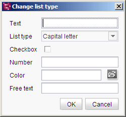
In the format templates with the tags ul and li, the saved value is available for a form field with the defined IDENTIFIER.
The saved value can be output with the #list system object and the attr method:
$CMS_VALUE(#list.attr("IDENTIFIER"))$| Parameter | Mandatory | Since | Type | Default value |
|---|---|---|---|---|
| listConfig | No | 2.3 | String | None |
listDefaultConfig
The parameter listDefaultConfig can be used to configure preassignments for lists. You can use
- reserved variable names (for defining which list typ is to be used initially) or
- the identifiers which may be defined via listConfig (preassignments within the dialog)
To this end, the parameter listDefaultConfig expects the variable name or the identifier and the desired default value, separated by an equal sign ("="). If you would like to configure more than one preassignment, use a comma-separated list.
The syntax is:
listDefaultConfig="a=Text,b=6,c=true,d=000,f=#000000,g=Max. 30 characters"
The preassignment in this example only have an effect if listConfig configured adequately (see related example for listConfig), for example
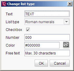
The preassigned default values can be modified by the editor if necessary.
Reserved variable names
========================
style
Use this reserved variable name to define which list type is to be preassigned and thereby used for creating a new list:
- Type 0: em-dash; a dash (-) is displayed as the list symbol.
- Type 1: Bullet; a blue triangle (
 ) or the contents of the reserved list variable mediaref are displayed as the list symbol (default setting).
 - Type 2: Numbered; Arabic numerals are used as the numbering symbols (1, 2, 3...).
- Type 3: Alphabetical (lower case letters); Latin lower case letters (a, b, c...) are used as the numbering symbols.
- Type 4: Alphabetical (upper case letters); Latin upper case letters (A, B, C...) are used as the numbering symbols.
- Type 5: Roman numbers (lower case letters); Roman numbers in lower case letters (i, ii, iii, iv...) are used as the numbering symbols.
- Type 6: Roman numbers (upper case letters); Roman numbers in upper case letters (I, II, III, IV...) are used as the numbering symbols.
- Type 7: Empty (indent only); no list symbols are used; however, the whole list is indented.
- Type 8: User defined; the contents of the reserved pre list variable (see below) are displayed as the list symbol or numbering symbol.
style expects as value the number of the type (see list).
Example:
listDefaultConfig="style=6"
If listConfig is specified, the value of listDefaultConfig / style should be chosen suitably.
If style is not specified, the type is 1 by default (i.e. bullet or image, which is specified via mediaref).
mediaref
This reserved list variable name can be used to select a picture from the media store which is displayed in front of the list for list type 1. To this end, use media:, followed by the reference name of the desired image.
The syntax is:
listDefaultConfig="mediaref=media:REFERENCENAME_OF_THE_IMAGE"
Example:
listDefaultConfig="mediaref=media:bullet"
pre
This reserved list variable name is used to define the display of the bullets for list type 8. The value which is specified for pre will be shown in the field for user-defined input.
The following key terms can be used:
- %index% (number of the current element),
- %count% (number of elements) and
- %count2% (number of the last element)
Example:
listDefaultConfig="style=8,pre=%index% of %count%"
start
This reserved list variable name is used to specify the starting point of numbering. If start is not specified the numbering will start by default with 1.
 |
The starting point must always be specified as a number, irrespective of which numbering type is used. |
Example:
listDefaultConfig="start=3"
Tip: If the editor is to add entries, use number (see parameter listConfig) and assign the default value "1".
The reserved list variables can be combined.In this case, they must be separated by commas, for example:
listDefaultConfig="style=2,mediaref=media:note,pre=%index%/%count2%,start=3"
Access to the information of a list created by the editor in a DOM (for example: selected list type, number of list entries) is usually via the system objects #list (whole list) and #listitem (one list item).
| Parameter | Mandatory | Since | Type | Default value |
|---|---|---|---|---|
| listDefaultConfig | No | 2.3 | String | None |
maxCharacters
The maxCharacters parameter can be used to limit the number of characters for input in an input component.
As a default, any number of characters can be entered in an input component.
The parameter expects an integer value.
If a value is specified with maxCharacters it is not possible to enter more than the given number of characters in the input component.
| Parameter | Mandatory | Since | Type | Default value |
|---|---|---|---|---|
| maxCharacters | No | 3.0 | PositiveInteger | None |
preset
Using the preset attribute the handling of default values in an input component can defined (see also chapter Default values). If preset="default" is set, the fall-back value defined in the form is used. If this value in the form is changed later on, these changes will be affect all usages of this default value in the input components maintained by the editor, as long as a value will be set manually in the input component. This is the default setting. If preset="copy" is set, the value entered by the editor is copied directly into the input component. Subsequent changes to the default value in the form do not have any effect on the usages of this default value in the input components maintained by the editor.
| Parameter | Mandatory | Since | Type | Default value |
|---|---|---|---|---|
| preset | No | 4.0 | Preset | DEFAULT |
rows
The rows parameter can be used to specify the height of the input component.
If the parameter is not given the height of the input component is 4 rows.
...rows="20"...
If the input component is used within a group (CMS_GROUP), the height will comply with the height of the highest input component of the group.
| Parameter | Mandatory | Since | Type | Default value |
|---|---|---|---|---|
| rows | No | 2.0 | PositiveInteger | 4 |
searchRelevancy
This parameter can be used for determining the weighting of content of this input component in search results (SiteArchitect: Global search (→Documentation FirstSpirit SiteArchitect), search in data sources | ContentCreator: search in report area). For example, using this parameter, template developers may specify that elements that contain a search term in a headline input component should be displayed more prominently in search results than elements that only contain the search term in a body text input component. Additionally, contents of individual input components may be configured so that they be ignored during indexing for search, which may increase indexing performance.
Input components may be configured with the following values to specify their contents' weight in search indexing:
- none: The contents of an input component that is configured with this search relevancy value will not be indexed. Pages, sections, and datasets which contain contents in input components configured with this search relevancy value will not appear in search results if the search term only appears in these input components. Searching for contents of such input components using drag-and-drop will yield no results ("The field is not eligible for search, as it is marked non-relevant for searching."). Such fields are also marked accordingly in "Simple Search" in data sources ("Not eligible for searching.").
- default: The input component's content receives default weight in the search index (default setting).
- high: The contents of an input component that is configured with this search relevancy value will be displayed more prominently in search results (exception: search for datasets). This means that if a search term appears in both an element with an input component configured with high search relevancy and an element with an input component configured with default search relevancy, the element which contains the search term in a high-relevancy input component will be shown in a higher position in search results.
If the parameter is not specified for an input component, the component's contents will be indexed with a default weight (searchRelevancy="default").
Notes:
- Header fields of snippets (tab Snippet in templates, "Label" field) are also indexed. If an input component is configured with a weighting none (searchRelevancy="none") but its value is included in the template's snippet header field, searching for the input component's value will cause the associated element to appear in search results.
- If you used links in the DOM, you should set searchRelevancy="none" for this DOM component for being able to exclude link texts from the search index. If searchRelevancy="none" is set for the link text of the related link template, the link text will nevertheless be found, if searchRelevancy="default" or searchRelevancy="high" is set for the enclosing DOM component or if the parameter searchRelevancy is not set.
This restriction does not apply to other input components of the link template: The definition within the link template is taken into account for other input components as well as for the weighting of link texts (searchRelevancy="default" and searchRelevancy="high").
Changing the weighting setting of an input component in a template does not immediately affect existing elements based upon that template, and search results will continue to reflect the old weighting until elements based upon that template are modified (at which time they will be reindexed in the background). Alternatively, the entire project or parts of it may be reindexed via a schedule task or the FirstSpirit APIs, which does not require elements to be changed (see FirstSpirit Manual for Administrators, Chapter "Rebuild search index (→Documentation for Administrators)"). However, reindexing large numbers of elements is memory and CPU-intensive and should only be performed during a planned maintenance period!
For further information, see
- interface GomSearchRelevancy (package de.espirit.firstspirit.access.store.templatestore.gom, FirstSpirit Access API)
- interface SearchService (package de.espirit.firstspirit.access.search, FirstSpirit Access API)
- interface QueryAgent (package de.espirit.firstspirit.agency, FirstSpirit Access API)
| Parameter | Mandatory | Since | Type | Default value |
|---|---|---|---|---|
| searchRelevancy | No | 5.2.305 | Relevancy | DEFAULT |
table
Using the table parameter buttons for including and editing tables can be displayed or hidden in the input component. They are hidden at default. If the parameter is set to YES tables can be inserted into the textflow.
| Parameter | Mandatory | Since | Type | Default value |
|---|---|---|---|---|
| table | No | 4.0.120 | YesNo | NO |
useLanguages
The useLanguages parameter can be used to specify whether or not an input component is to store different or deviating values for different languages (multi-lingual maintenance).
If the parameter is not given, deviating values are stored for the different languages as a default.
If NO (...useLanguages="NO") is specified, one value is stored for all languages.
 useLanguages="YES" will potentially no longer be evaluated in FirstSpirit version 5.2R5 and higher. See also parameter forbidPolyglotDataHierarchy (FS_CATALOG).
| Parameter | Mandatory | Since | Type | Default value |
|---|---|---|---|---|
| useLanguages | No | 2.0 | YesNo | YES |
width
The width parameter can be used to specify the display width of the input component in pixels.
The parameter expects an integer value.
If the parameter is not given the default width is 480 pixels.
 |
The parameter does not have any effect if the hFill parameter is used. |
| Parameter | Mandatory | Since | Type | Default value |
|---|---|---|---|---|
| width | No | 2.0 | PositiveInteger | None |
FORMATS
The FORMATS tag can be used to specify the quantity of format templates usable in the input component.
The TEMPLATE tag can be given in the tag.
A usable format template corresponds to a TEMPLATE tag.
If FORMATS is not specified, all format templates existing in the project can be used.
TEMPLATE
A TEMPLATE tag is used to precisely define a format template within the FORMATS tag, which is to be available for use in the input component.
The tag has the mandatory parameter name, which must contain the unique identifier (abbreviation) of the format template.
| Parameter | Mandatory | Since | Type | Default value |
|---|---|---|---|---|
| name* | Yes | 3.0 | String | None |
name
The name parameter in the TEMPLATE tag is used to given the reference name of the template which is to be available for selection in the input component.
| Parameter | Mandatory | Since | Type | Default value |
|---|---|---|---|---|
| name* | Yes | 3.0 | String | None |
LANGINFOS
Using the tag LANGINFOS language-dependent information can be defined for each input component, e.g. which title is to be used for the input component in the different project languages (parameter label), which tooltip is to be displayed (parameter description) etc. For reasons of clarity, definitions which are identical in multiple languages will be merged. For example,
<LANGINFOS>
 <LANGINFO lang="*" label="Datum"/>
 <LANGINFO lang="DE" label="Datum"/>
 <LANGINFO lang="EN" label="Datum"/>
</LANGINFOS>
will be merged to
 <LANGINFOS>
 <LANGINFO lang="*" label="Datum"/>
</LANGINFOS>
after saving.
 Up to and including FirstSpirit version 4.2R2 language definitions will be deleted only in the case if the values are identical in all languages (as in example above). Furthermore, only the parameters lang, description and label are taken into account when merging.
 Since FirstSpirit version 4.2R4 all parameters are taken into account (e.g. format and length). Furthermore, language definitions are also merged within LANGINFOS tags, if they are identical in at least two languages. For example,
<LANGINFOS>
 <LANGINFO lang="*" label="Date" format="dd.MM.yy"/>
 <LANGINFO lang="DE" label="Date" format="dd.MM.yy"/>
 <LANGINFO lang="EN" label="Date" format="MM/dd/yy"/>
</LANGINFOS>
will become
 <LANGINFOS>
 <LANGINFO lang="*" label="Date" format="dd.MM.yy"/>
 <LANGINFO lang="EN" label="Date" format="MM/dd/yy"/>
</LANGINFOS>
after saving.
The definition for the fallback value (*) will not be deleted in any case. If there are two or more language definitions with identical values the first one will be maintained, the other will be deleted.
 IMPORTANT: Up to and including FirstSpirit version 4.2R2 at least one definition for the fallback labelling ("*") must be given:
<LANGINFOS>
 <LANGINFO lang="*" label="TEXT"/>
</LANGINFOS>
 From FirstSpirit version 4.2R4 the fallback definition can be omitted. In this case, the language which is defined first will be used automatically as fallback value. For example,
<LANGINFOS>
 <LANGINFO lang="EN" label="Date"/>
 <LANGINFO lang="DE" label="Datum"/>
</LANGINFOS>
will become
 <LANGINFOS>
 <LANGINFO lang="*" label="Date"/>
 <LANGINFO lang="DE" label="Datum"/>
</LANGINFOS>
after saving.
LANGINFO
The LANGINFO tag is used to give values or attributes for a language as well for use as fallback values.
In order to state values or attributes for a language it is necessary to give the abbreviation of the project language in the lang parameter:
...
<LANGINFO lang="DE".../>
...
Fallback values are given with the special language abbreviation * ("for all languages"):
...
<LANGINFO lang="*".../>
...
The lang parameter is a mandatory parameter.
| Parameter | Mandatory | Since | Type | Default value |
|---|---|---|---|---|
| lang* | Yes | 3.1 | LanguageAbbreviation | None |
| description | No | 3.1 | String | None |
| label | No | 3.1 | String | None |
lang
The lang parameter is used to give the language abbreviation which is entered in the server properties see Language templates (→Documentation for Administrators)) to specify for which project languages the definitions are to apply, e.g. DE for German, EN for English, FR for French etc. The following characters can be used as often as required: -, _, 0-9 and A-Z. Lower case letters are transformed automatically into upper case letters after having saved the template. In addition * can be used for fallback values.
| Parameter | Mandatory | Since | Type | Default value |
|---|---|---|---|---|
| lang* | Yes | 3.1 | LanguageAbbreviation | None |
description
The description parameter can be used to specify a description of how the input component is to be used and filled by the editor. The text defined here is displayed as a tooltip on mouse-over at the relevant input component.
The text should serve as a guide for the editor and be as short as possible, understandable and relevant. It should match the label (label parameter) and complement it appropriately.
Make sure to use terminology that the editor knows and expects.
Example:
...description="Please enter the text for the headline here (H1)."...
Tip: If you would like to know how to better support and guide editors when filling input components, take a look at the chapter on Rules and other parameters and functions of forms.
| Parameter | Mandatory | Since | Type | Default value |
|---|---|---|---|---|
| description | No | 3.1 | String | None |
label
Use the label parameter to define the label of the input component.
Choose a label that is as short and meaningful as possible.
In combination with a relevant description (description parameter), you can help the editor to use the input component correctly and successfully.
Example:
... label="Headline (H1)" ...
| Parameter | Mandatory | Since | Type | Default value |
|---|---|---|---|---|
| label | No | 3.1 | String | None |
LINKEDITORS
The LINKEDITORS tag can be used to specify the quantity of link templates usable in the input component.
The LINKEDITOR tag can be given in this tag. A usable link template corresponds to a LINKEDITOR tag.
If LINKEDITORS is not specified, all link templates existing in the project can be used by default.
If no link templates should be used, a LINKEDITOR definition with an empty name attribute must be specified. The corresponding icon for inserting a link is then hidden.
LINKEDITOR
A LINKEDITOR tag is used to precisely define a link template within the LINKEDITORS tag, which is to be available for use in the input component.
The tag has the mandatory parameter name, which must contain the reference name of the link template.
| Parameter | Mandatory | Since | Type | Default value |
|---|---|---|---|---|
| name* | Yes | 3.0 | String | None |
name
The name parameter in the LINKEDITOR tag is used to given the reference name of the link template which is to be available for selection in the input component.
If no link template should be used, a LINKEDITOR definition with an empty name attribute must be specified, for example
...
<LINKEDITORS>
 <LINKEDITOR name="" />
</LINKEDITORS>
...
| Parameter | Mandatory | Since | Type | Default value |
|---|---|---|---|---|
| name* | Yes | 3.0 | String | None |
Example
An example of the input component DOM:
<CMS_INPUT_DOM hFill="YES" rows="10" name="IDENTIFIER" useLanguages="YES">
  <LANGINFOS>
    <LANGINFO lang="*" label="TEXT_FALLBACK" description="TEXT_FALLBACK"/>
    <LANGINFO lang="DE" label="TEXT_DE" description="TEXT_DE"/>
    <LANGINFO lang="EN" label="TEXT_EN" description="TEXT_EN"/>
  </LANGINFOS>
  <FORMATS>
    <TEMPLATE name="IDENTIFIER"/>
    <TEMPLATE name="IDENTIFIER"/>
    <TEMPLATE name="IDENTIFIER"/>
  </FORMATS>
</CMS_INPUT_DOM>
Example of use in the template syntax
The content of a DOM input component can be output via a $CMS_VALUE(...)$instruction.
$CMS_VALUE(st_dom)$
The result would then be the output:
<p>
  That is a
  <b>Dummy Text.</b>
  That is a dummy text. That is a dummy text. That is a dummy text. That is a
  <i>Dummy Text.</i>
  That is a
  <strong style="color:#ff0;">Dummy Text.</strong>
  That is a dummy text. That is a dummy text.
</p>


