Default values
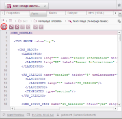
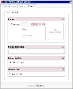
Default selection of the input components (e.g. with a date, a specific selection, etc.) takes place in FirstSpirit in a separate maintenance dialog. After the XML definition of the input components in the template has been completed and saved, this dialog can be opened using the icon “Default values” ![]() on the “Form” tab of templates (see for example in the case of page templates: page Form).
on the “Form” tab of templates (see for example in the case of page templates: page Form).
 |
The values in the dialog can only be edited and/or saved if the template is in the edit mode. |
The main advantage of maintenance in a separate dialog is that the input components and their default values are displayed like the editor sees them during maintenance.
In the maintenance dialogue you can either define a value for a specific language or define so-called Fall-back values.
Fall-back values are used as default values precisely when no value has been stored in the input component and a default value has not been defined for a language.
Note: Fall-back values should at least be defined for set-valued input components, e.g. CHECKBOX, COMBOBOX and RADIOBUTTON. If no fall-back values are stored in these input components the input component has no value. This can be undesirable, especially for the RADIOBUTTON input component as this input component is frequently used for “Yes/No” questions.
The special feature of the values defined in the dialogue is that these values are not automatically saved in the input component.
The defined value is however displayed in the input component and is also taken into account in the preview and generation.
Such values are called Default values, because the editor can decide whether he wants to save the value in the input component or not.
The advantage here is that changes to the Default Values made in the template are automatically taken into account in the preview and generation without all the saved values having to be adjusted by an editor.
In the input components it is indicated whether the displayed value is a Default or a saved value.
There are two ways of displaying an input component:
1. The displayed value is a Default Value.
The usage of default values is indicated by pink marking and a corresponding icon in the right upper corner.
2. The displayed value is a saved value.
The icon in the right upper corner indicates that default values are defined for this input component:
The display (and thus the saving of a value) can be switched using the icons in the right upper corner. If the switch is made from a saved value to a default value you will get the following confirmation dialog: “Do you really want to reset the value to the default value? The current value will be lost.”
 |
Using the attribute preset you can influence the saving mechanism for default values in input components. Further information about the setting options see attribute preset of the respective input component. |
 |
Note for table templates: If an input component is mapped to a foreign key relation ship (see Chapter Data base schemata, especially page Mapping), default values will be stored in this input component (i.e. behavior like preset=“copy”), even if preset=“default” is set. |
 |
Note about default values in ContentCreator: The “preset” attribute of the input component is ignored in ContentCreator, preset=“copy” is always used. For more information about default values in ContentCreator see Chapter ContentCreator / Restrictions. |


