

Table format templates
| Contents |
Each table format template can be assigned precisely one standard style template (for the entire table) and multiple additional style templates for defining separate display formats for individual table cells.
Properties – General
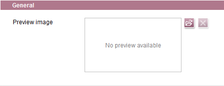
Preview image
Make the editors' work easier in the FirstSpirit ContentCreator or SiteArchitect and create a meaningful screenshot for this template.
The screenshot should show how the template in question looks in the frontend or what it does. This way you support the editor in choosing the right template. Of course, it can also be another graphic if it conveys to the editor how to correctly apply the template in question.
Upload the screenshot using the  icon.
icon.
Properties – Table size
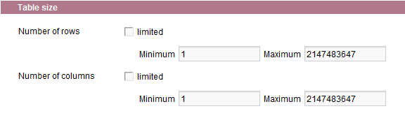
Number of rows
If the “limited” checkbox is checked, it is possible to define the minimum or maximum number of rows to be included in the table.
Number of columns
If the “limited” checkbox is checked, it is possible to define the minimum or maximum number of columns to be included in the table.
If the editor subsequently inserts an inline table with this table format template into the DOM editor, the table is automatically created with the minimum number of rows and columns specified here. The editor cannot exceed or go below the default values when editing the table. In this case, the corresponding buttons are disabled. For instance, if a minimum row count of four rows is defined, the “Remove row” icon is disabled in the DOM editor as soon as there are only four rows left in the table.
Properties – Display rules
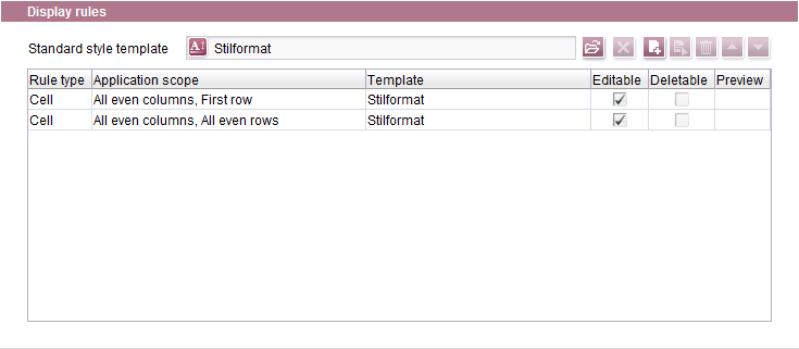
Standard style template
This row specifies the style template on which the entire table is to be based. The desired style template to be used in this way can be selected by clicking the icon. All of the available style templates are displayed in the selection dialog. The desired style template can be selected from the tree structure and the selection confirmed by clicking Select.
The standard style template serves as the basis for the layout of a table. Additional layout options for formatting rows, columns and individual cells that overwrite the layout settings in the standard style template can be made available to the editor in the Display rules area. These layout options are based on the previously created style templates.
The other icons on the line can be used to perform the following actions:
 This icon can be used to remove the selected standard style template again.
 This icon can be used to create a new display rule. Clicking it opens the Add display rule window.
 Clicking this icon (or double-clicking the display rule) opens an existing display rule for editing.
 Clicking this icon deletes the highlighted display rule.
 If multiple display rules are present, they can be moved up or down by one position in the list using these icons.
Table of defined display rules
- Rule type: Specifies whether the rule applies to rows, columns or cells
- Application scope: Specifies which areas of the table the rule applies to
- Template: Specifies which style template is applied
- Editable: This checkbox is checked by default. As a result, the editor can modify the properties of the cell(s) that the display rule applies to. The editor cannot change the properties for the associated cell(s) if this checkbox is unchecked.
- Deletable: This checkbox is checked by default if the rule is for rows or columns. The editor can delete the row(s) or column(s) that this display rule applies to. The editor cannot delete the associated row(s) or column(s) if the checkbox is unchecked. The checkbox is unchecked if the rule applies to a cell. It cannot be checked since individual cells cannot be deleted from tables.
- Display in the editor: This column shows the background color and the text alignment of the row/column/cell if the corresponding values are defined.
 |
If multiple rules are present in the list, they are evaluated from top to bottom. |
Adding and editing display rules
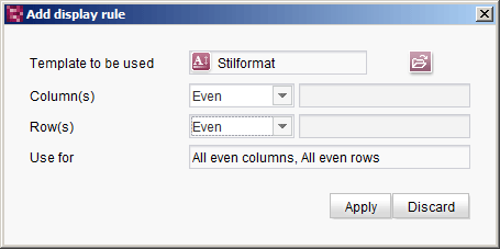
Template to be used
The desired style template to be applied for the display rule can be selected by clicking the icon. All of the available style templates are displayed in the window that opens. The desired style template can be selected from the tree structure and the selection confirmed by clicking OK.
Row(s) and Column(s)
These combo boxes are used to define conditions for applying the rule, and in turn, the selected style template. Both conditions have to be met in order for the rule to be applied. The following conditions are possible:
- ALL: The display rule applies to all rows or columns without restriction. If, for example, the “ALL columns” option is selected, the display rule only takes the restriction defined under the “Rows” option into account, and vice versa.
- Even: The display rule applies to even rows or columns (starting with the second row/column).
- Odd: The display rule applies to odd rows or columns (starting with the first row/column).
- First: The display rule applies to the first row or column.
- Last: The display rule applies to the last row or column.
- User-defined: The display rule applies to a specific row or column. The number for the specific row/column has to be entered in the field to the right of the combo box if this option is enabled.
Use for
This field continues to show which row(s) and column(s) the selected style template applies to.
|
It is not possible to define a display rule that affects ALL columns and ALL rows. A rule of that type would correspond to the standard style template. |
Evaluation rules
Once created, the table format templates, style templates and display rules are evaluated as follows:
- First, the display rules in the table of defined display rules are evaluated top-down.
- The standard style template is used for cells to which no display rule applies.