Input elements in FragmentCreator
| Table of contents |
In FragmentCreator there is a series of Input elements available to the editor for editing different contents.
Entering text
Single-line text entry (TEXT)
This input element is intended for single line text entries (e.g. headings).
Formatting (bold, italics, etc.) cannot be selected here; they are specified consistently by the project developer.
Multi-line text entry (TEXTAREA)
This input element is intended for larger text entries.
Formatting (bold, italics, etc.) cannot be selected here; they are specified consistently by the project developer.
Selecting values and states
Check box (CHECKBOX)
This input element offers a selection option for values specified by the project developer.
It is possible
- to make more than one selection simultaneously or
- to leave the selection empty.
If a box is checked, any previously selected box is not unchecked.
Combo box (COMBOBOX)
This input element offers a selection option for values specified by the project developer.
It is possible
- to select exactly one value or
- to leave the selection empty
Multiple Selection List (LIST)
This input element offers a selection option for values specified by the project developer.
It is possible
- to make more (or fewer) than one selection at the same time or
- to leave the selection empty.
Radio button (RADIOBUTTON)
This input element offers a selection option for values specified by the project developer.
It is possible
- to select exactly one value from a group of values.
If one button is activated, the previously selected button is deactivated.
Toggle (TOGGLE)
This input element allows you to choose between exactly two values, which are determined by the project developer (e.g. on/off, right/left).
It is possible
- to select exactly one value.
Creating references (media, pages, fragments)
Reference selection (INDEX)
This input element can be used to reference entries from any data object sources that have been made available.
Possible objects to be referenced include, for example:
- images or files in other formats
(see also page Using media) - pages
(see also page FirstSpirit PageRef Access) - fragments from other projects
(see also page Using fragments)
In addition, files can also be uploaded using this input element. See paragraph Upload.
With appropriate configuration by the project developer, fragments can not only be selected but also existing ones can be edited and new ones can be created.
Upload
Reference selection (INDEX)
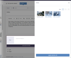
In addition to selecting and referencing media, media (images and files of different formats) can also be uploaded via this input element:
Clicking the button opens a window which enables the required files to be selected from the workstation PC using drag-and-drop or using the file selection dialog.
Images can (depending on the configuration of the server that delivers the image) also be moved from a different browser window/tab to the upload window using drag-and-drop.
It is also possible to upload entire directory structures (folders), including any images and files of different formats they contain, from the workstation PC. However, drag-and-drop has to be used for this. Once the folders have been dropped, all media contained in the folders are displayed in the dialog. The folder path for the media to be uploaded is displayed underneath the media, along with the file name. Empty folders are not taken into account during the upload.
As a rule, all media are referenced once they have been uploaded, including in the associated input element (visualized by the tick icons). They can be selected/deselected by clicking the required media. The number of media that can be selected can be restricted by the project developer, as can the file size and file name extension. Likewise, it is possible to set up a configuration that only allows images or files of different formats to be uploaded.
The media are uploaded to the folder displayed in the “Location” field. (This may be a folder that is inside another folder, known as a “remote project”, see Projects.) Depending on the configuration settings made by the project developer, the folder that is required can be selected from the drop-down list here.
Once all the required media have been selected, the upload can be started by clicking “Upload”. The upload dialog closes automatically once the media have been uploaded successfully. Exception: In the event of an error, the dialog stays open, displays a corresponding error message, and the media affected are not uploaded.
The upload is canceled if the dialog is closed while the upload is ongoing. Media that have not yet been uploaded will then no longer be taken into account for the upload.
If a directory has been selected for upload, the files and folders in this structure are stored in the project.
Tagging
Specify keyword (TAGGING)
This input element is intended for creating and editing tags in the FragmentCreator.
Tags are used to organize and sort fragments and variants according to specific topics. Tags are additional information saved for a variant.
Addding tags
To create another tag for a variant, the required text simply needs to be entered into the tagging field.

Auto completion
Entering a letter and then pressing Ctrl+Space will display a selection of existing tags. This makes it easy to ensure that the same spelling is used for the same tags.
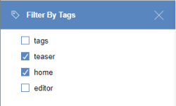
![]() The Filter by tags filter can be used to filter the list of fragments by tags which have been assigned already. The 10 most frequently used tags are always available for selection here.
The Filter by tags filter can be used to filter the list of fragments by tags which have been assigned already. The 10 most frequently used tags are always available for selection here.
If searching for a variant using a tag that is not displayed in the tag list, the required tag can also be entered directly into the search field.
Removing tags
If a tag is no longer required, it can be removed simply by clicking the X after the tag in question.
Release
Like any change to the contents of an input element of a variant, adding, removing, or editing tags results in a modification of the variant that must be released in order to be published. (For information on releases, see the Release (standard) page.)
Numeric values and dates
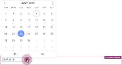
Input of numbers (NUMBER)
This input element is intended for the input of numeric values.
The project developer determines
- the value range from which the numbers may originate (e.g. “1-100”) and
- the type that it must be (e.g. whole number or decimal / floating-point number)
Negative numbers can also be entered. In addition, the exponential character E or e can be used.
Note: Depending on the browser used, the user's handling is different: Mozilla Firefox and Apple Safari for example allow the input of letters, Google Chrome does not. Exception: the exponential character E or e, for example 1.7976931348623057e+308. The display of decimal separators (, or .) in Microsoft Edge and Google Chrome depends primarily on the operating system language (i.e. client language), while Mozilla Firefox takes the browser language into account. These differences are due to the way the individual browsers are implemented and are therefore not within the direct sphere of influence of Crownpeak.


