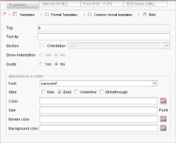
Properties of format templates
The "Properties" tab can be used to define the properties of a format template. The example on the left-hand side represents the properties of the default "Bold" format template.
The individual fields of the input form are explained in detail in the table:
Field name | Description |
|---|---|
Tag | The "Tag" field contains the internally used abbreviation for the format template (e.g. "b" for "Bold"). The abbreviation must be unique throughout the whole project and may not contain any special characters. A unique abbreviation is automatically assigned when a new format template is created (after the name of the format template). The abbreviation is needed in the form area of the page or section template to give the valid format template for the input component (see page on the use of format templates). The corresponding XML tag name is formed from the abbreviation, e.g. for the format template "Bold". |
Tooltip | Field for the optional input of a "Tooltip". Tooltips can contain a brief description which is only displayed if the user passes over the formatted text location with the mouse. In this case a small window opens with the given message. |
Section | If the "Section" checkbox is selected, the formatting affects the whole section in the input component (e.g. DOM Editor) (up to the next line break). Format templates which use this section formatting can be selected by the editor from the left-hand format template selection list. Selection is only possible if no text is highlighted (selected). |
Alignment | The selection list can be used to set the alignment of the section. The list contains three standard alignments: LEFT (left alignment), RIGHT (right alignment) or CENTER (centred). The alignment selected here only affects the display of the formatted section in the input component. The "Alignment" fold-down list is only active if the "Section" checkbox was activated beforehand. This means the alignment can be set for section formatting only. |
Show indentation | The "Show Indentation" radiobutton is used to define how spaces are to be dealt with within the formatting. |
Quote | The "Quote" radiobutton is used to define how the conversion rules are to be treated within the formatting. A conversion rule consists of two parts. The "convert" block is always evaluated if a conversion rule has been activated for a format template. The "quote" block is only evaluated if "Quote" has been activated. |
Font | A font for the display of the formatted text in the input component (e.g. DOM Editor) can be selected from the "Font" selection list. |
Style | The "Style" checkbox can be used to format the formatted text for display in the input component (e.g. DOM Editor). The formatting selected here should match the format template. For example, the "bold" checkbox can be selected for the standard "Bold" format template. The text formatted with the "Bold" format template is then also displayed in "bold" in the input component and therefore offers clear WYSIWYG display for the editor. |
Color | The "Color" text field can be used to define the color for display of the formatted text in the input component. The color value (chromaticity) must be given as a hexadecimal value (e.g: #000000 for black), but it is also possible to select a color. Click the folder symbol (on the right, next to the input field) to open a window for selecting the color. |
Size | The "Size" text field can be used to define the font (type) size for display of the formatted text in the input component. Integers only can be entered. The size unit is point. |
Border color | The "Border color" text field can be used to define the color for a border around the formatted text in the input component. The color value (chromaticity) must be given as a hexadecimal value (e.g: #000000 for black), but it is also possible to select a color. Click the folder symbol (on the right, next to the input field) to open a window for selecting the color. |
Background color | The "Background color" text field can be used to define a color for the background of the formatted text in the input component. The color value (chromaticity) must be given as a hexadecimal value (e.g: #000000 for black), but it is also possible to select a color. Click the folder symbol (on the right, next to the input field) to open a window for selecting the color. |

